Data Visualization in R using ggplot2
Visualizations bring data to life. A good visualization will give you new insights and will often lead to new ideas for additional analyses or visualizations. As humans we are much better at processing visual information than numeric information - both in terms of comprehension and speed. So unless you can think of any reason otherwise, you should should always present your raw data AND the results of any analysis you have done as a visualization.
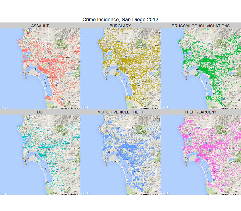
One of the real strengths of R is the ability to visualize even very complex data. See the map on the right? This shows incidents of 6 types of crimes in San Diego for the year 2012. This map shows both the geographical dispersion of different crimes and their actual incidence. You can produce this map with one line of code (you will see how in the maps section). You can even make interactive maps allowing the user obtain further information by clicking on the map.
In this section we will focus on using the powerful ggplot2 library. When you mastered this you will have a wide range of visualization tools at your disposal with very little coding effort. You can download an R project with code and data for this section here.
Using ggplot2
The ggplot2 library is one of the gems of R. The syntax for producing plots may appear at bit strange at first, but once you “get it”, you will be producing beautiful and insightful visualizations in no time. With ggplot2 you create visualizations by adding layers to a plot.
- Any plot in ggplot2 consists of
- Data: what you want to plot, duh!
- Aesthetics: which variables go on the x-axis, y-axis, colors, styles etc.
- Style of plot: Bar, scatter, line etc. These are called plot layers in ggplot and are specified using the syntax geom_layer, e.g., geom_point, geom_line, geom_histogram etc.
Let’s get some data to plot.
Case Study: New York Taxi Cabs
This is the data we introduced when discussing data transformations. In the following we will visualize aspects of this data using the ggplot2 library. Let’s read in the data and perform some simple transformations:
library(tidyverse)
library(lubridate)
library(forcats)
library(scales)


taxi <- readRDS('data/yellow_tripdata_2015-06_small.rds')


taxi.new <- taxi %>%
  mutate(weekday = wday(tpep_pickup_datetime,label=TRUE,abbr=TRUE),
         hour.trip.start = factor(hour(tpep_pickup_datetime)),
         day = factor(mday(tpep_dropoff_datetime)),
         trip.duration = as.numeric(difftime(tpep_dropoff_datetime,tpep_pickup_datetime,units="mins")),
         trip.speed = ifelse(trip.duration >= 1, trip_distance/(trip.duration/60), NA),
         payment_type_label = fct_recode(factor(payment_type),
                                         "Credit Card"="1",
                                         "Cash"="2",
                                         "No Charge"="3",
                                         "Other"="4"))
Number of Trips
We can start by looking at the total number of cab rides. For example, total number by day of the month:
ggplot(data=taxi.new, aes(x=day)) + geom_bar()
This produces a simple bar chart with counts of the number of rides (or rows in the data) for each value of day. The command aes means “aesthetic” in ggplot. Plot aesthetics are used to tell R what should be plotted, which colors or shapes to use etc. You can also use the “chain” syntax from dplyr in conjunction with ggplot. For example, the command
taxi.new %>%
ggplot(aes(x=day)) + geom_bar()
will produce the exaxt same plot. This is quite useful since you now have all the tools from dplyr available to use prior to calling ggplot. For example, suppose you only wanted trips paid with cash. Then you could simply insert a filter statement prior to the plot command:
taxi.new %>%
  filter(payment_type_label=='Cash') %>%
  ggplot(aes(x=day)) + geom_bar()
Let’s compare the number of credit and cash rides:
taxi.new %>%
  filter(payment_type_label %in% c('Credit Card','Cash')) %>%
  ggplot(aes(x=day,fill=payment_type_label)) + geom_bar()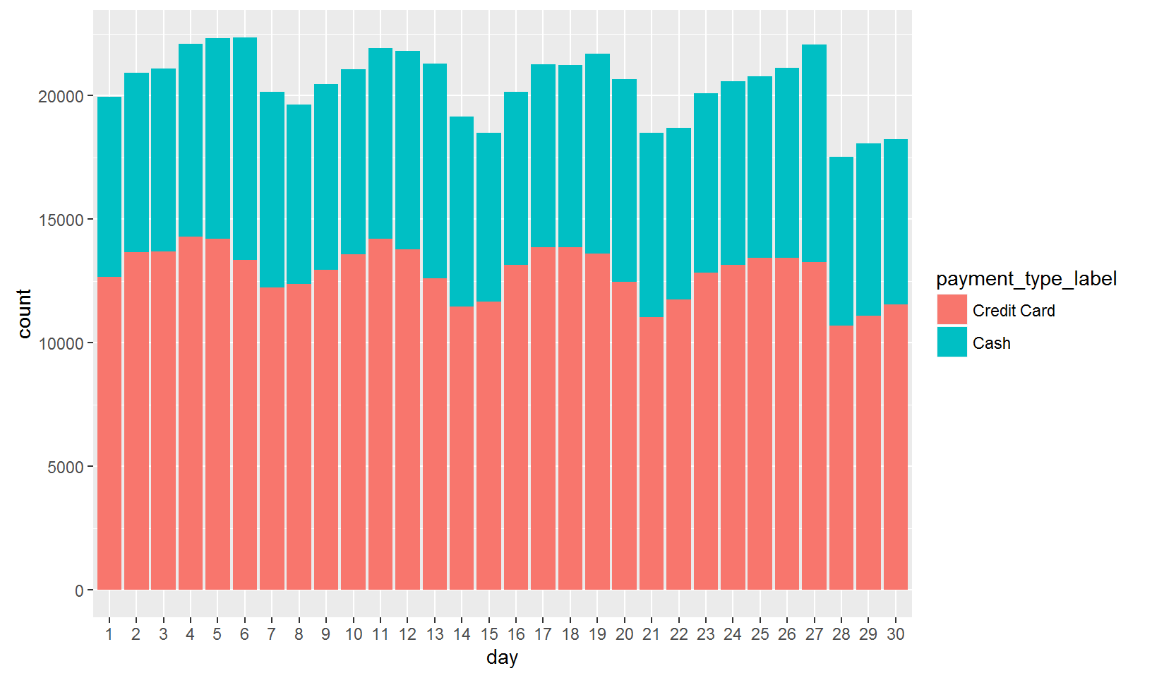
There are clearly more credit card rides than cash rides. If you “dodge” the bars you can plot them next to each other instead:
taxi.new %>%
  filter(payment_type_label %in% c('Credit Card','Cash')) %>%
  ggplot(aes(x=day,fill=payment_type_label)) + geom_bar(position='dodge')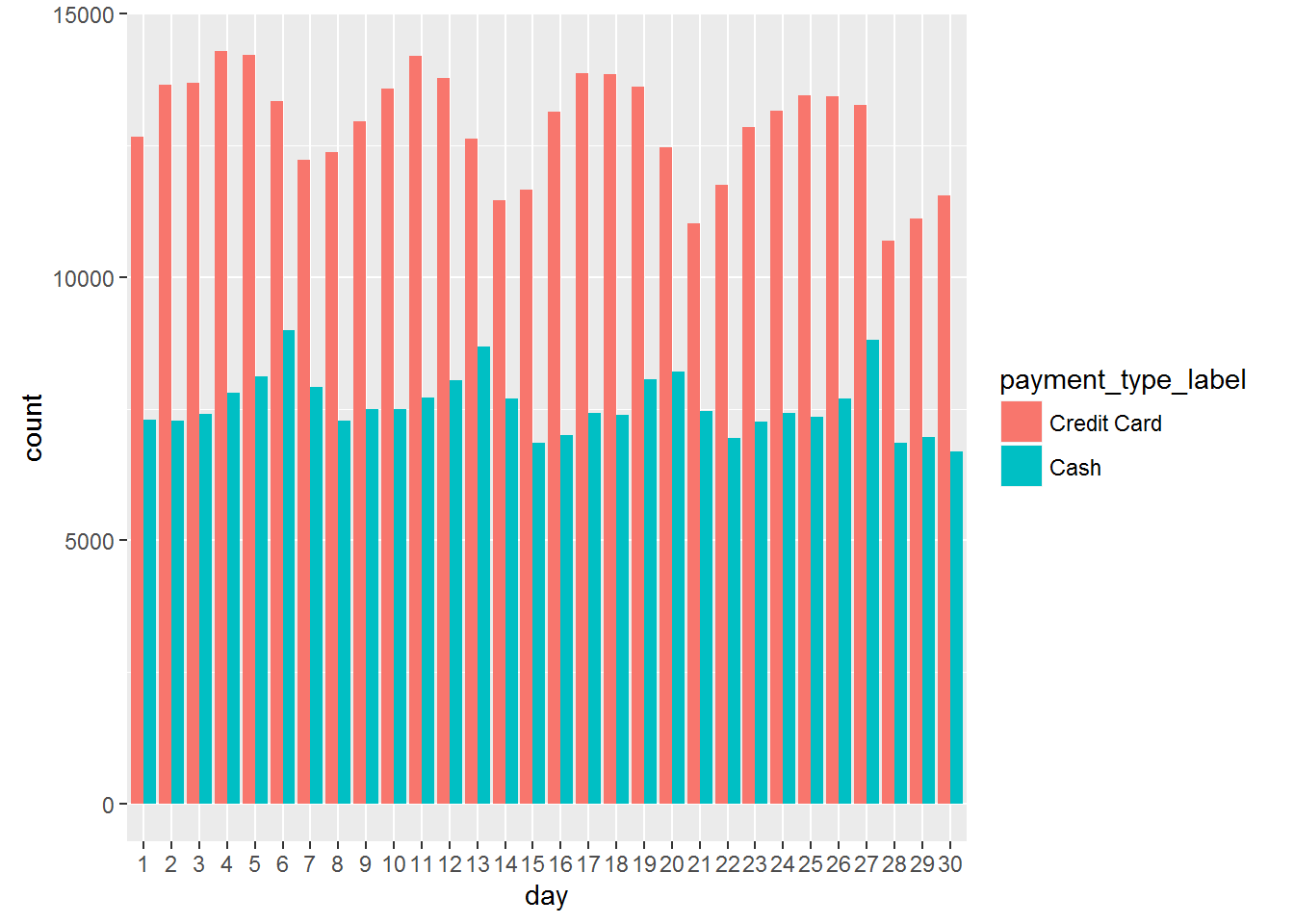
Next, let’s look at ride activity by time of day:
taxi.new %>%
ggplot(aes(x=hour.trip.start)) + geom_bar() 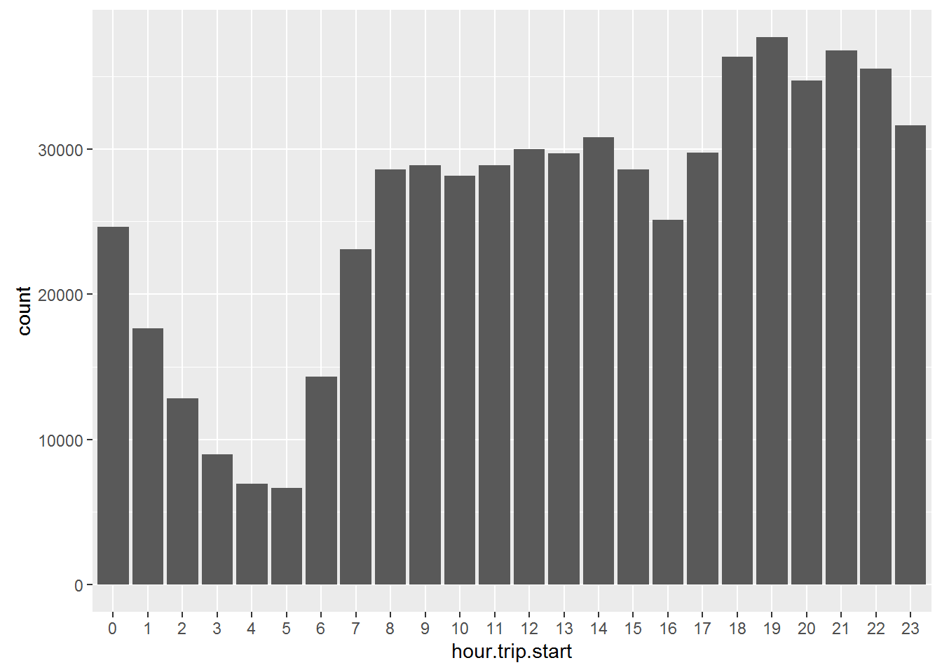 Between 8am and 3pm there is a stable and roughly constant number of rides. Trip demand then increases between 6pm and 10pm. Above we saw that, overall, there were substantially more credit card rides than cash rides. Is this true throughout the day?
taxi.new %>%
  filter(payment_type_label %in% c('Credit Card','Cash')) %>%
ggplot(aes(x=hour.trip.start,fill=payment_type_label)) + geom_bar(position='dodge') 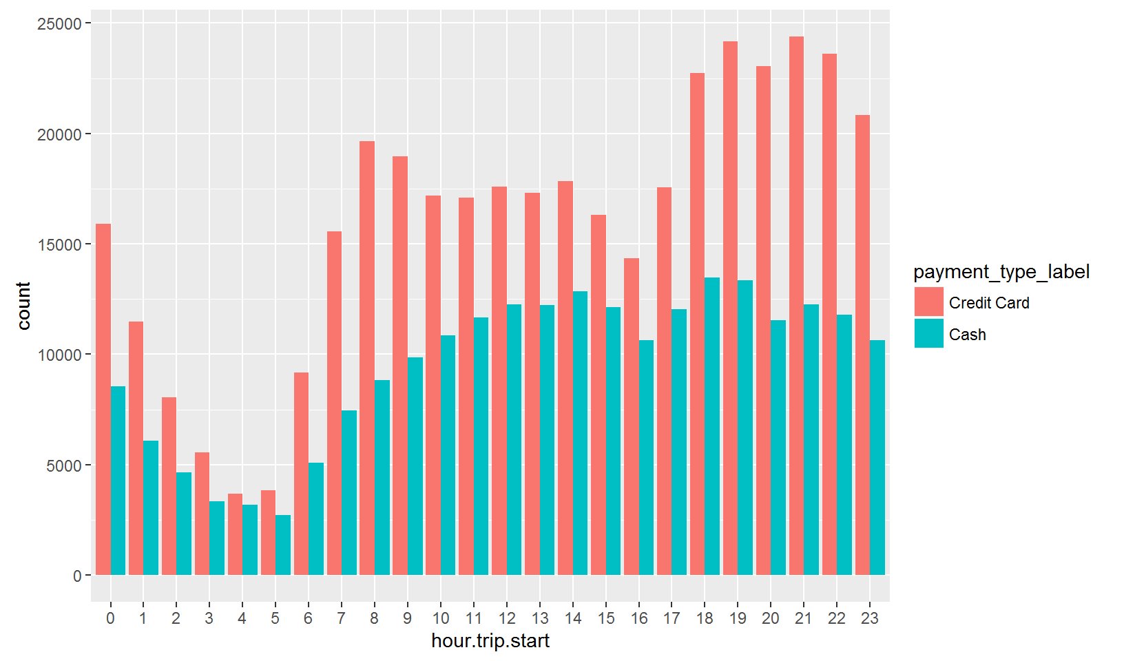
We see a large variation in the ratio of payment types throughout the day. For example, in the evening there are about twice as many credit card trips compared to cash trips. However, in the early morning it is close to 50-50.
Let’s break out trips by day of week:
taxi.new  %>%
ggplot(aes(x=weekday)) + geom_bar() 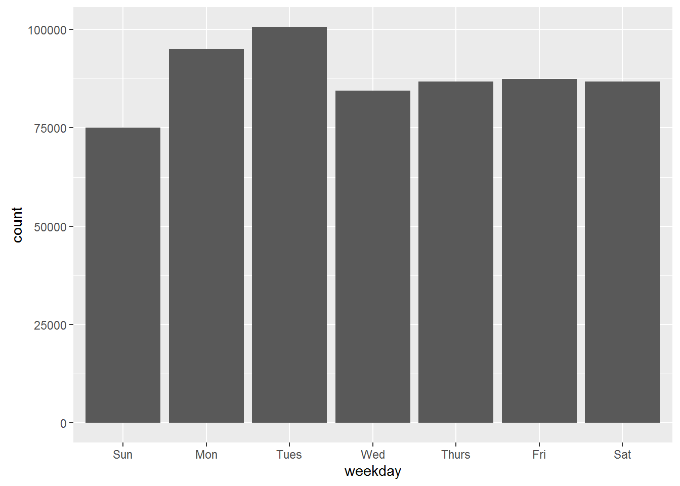
Most trips are on Tuesdays? That sounds weird. Here it is important to remember two things: What the structure of the data is and how R plots the data. Remember that the data are all trips (well, here a 5% sample of all trips) for each day of June 2015. To determine the height of a bar, R will count the number of rows for each value of weekday. If your objective is to compare the number of trips for each day of week, this calculation will only make sense if there are the same number of each weekday in a month. Let’s check:
taxi.new %>%
  group_by(day) %>%
  summarize(weekday=weekday[1]) %>%
  count(weekday)
## # A tibble: 7 × 2
## weekday n
## <fctr> <int>
## 1 Sun 4
## 2 Mon 5
## 3 Tues 5
## 4 Wed 4
## 5 Thurs 4
## 6 Fri 4
## 7 Sat 4So there were 5 Mondays and Tuesdays but only 4 of every other weekday in June 2015. That’s why Mondays and Tuesdays appear to have the most number of rides. To correct this, we can manually caluclate the number of rides for each day of the month, while recording what weekday it is. Then we can simply average across weekdays and plot the result. Here is one way of doing this:
taxi.new %>%
  group_by(day) %>%
  summarize(n = n(),
            wday = weekday[1]) %>%
  group_by(wday) %>%
  summarize(n.trip.mean=mean(n)) %>%
  ggplot(aes(x=wday,y=n.trip.mean)) + geom_bar(stat='identity')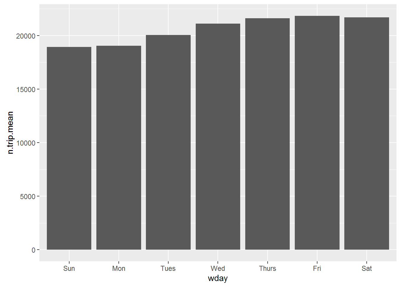
Since you have already calculated the height of each bar, you need to tell R what the variable capturing bar-height is (below “n.trip.mean”) and that no more counting is necessary (stat=‘identity’).
If you don’t like bar charts, you can create point-chart versions of the plots instead. In this case you have to explicitly inform R about what goes on the x and y-axis:
taxi.new %>%
  count(day) %>%
ggplot(aes(x=day,y=n)) + geom_point() 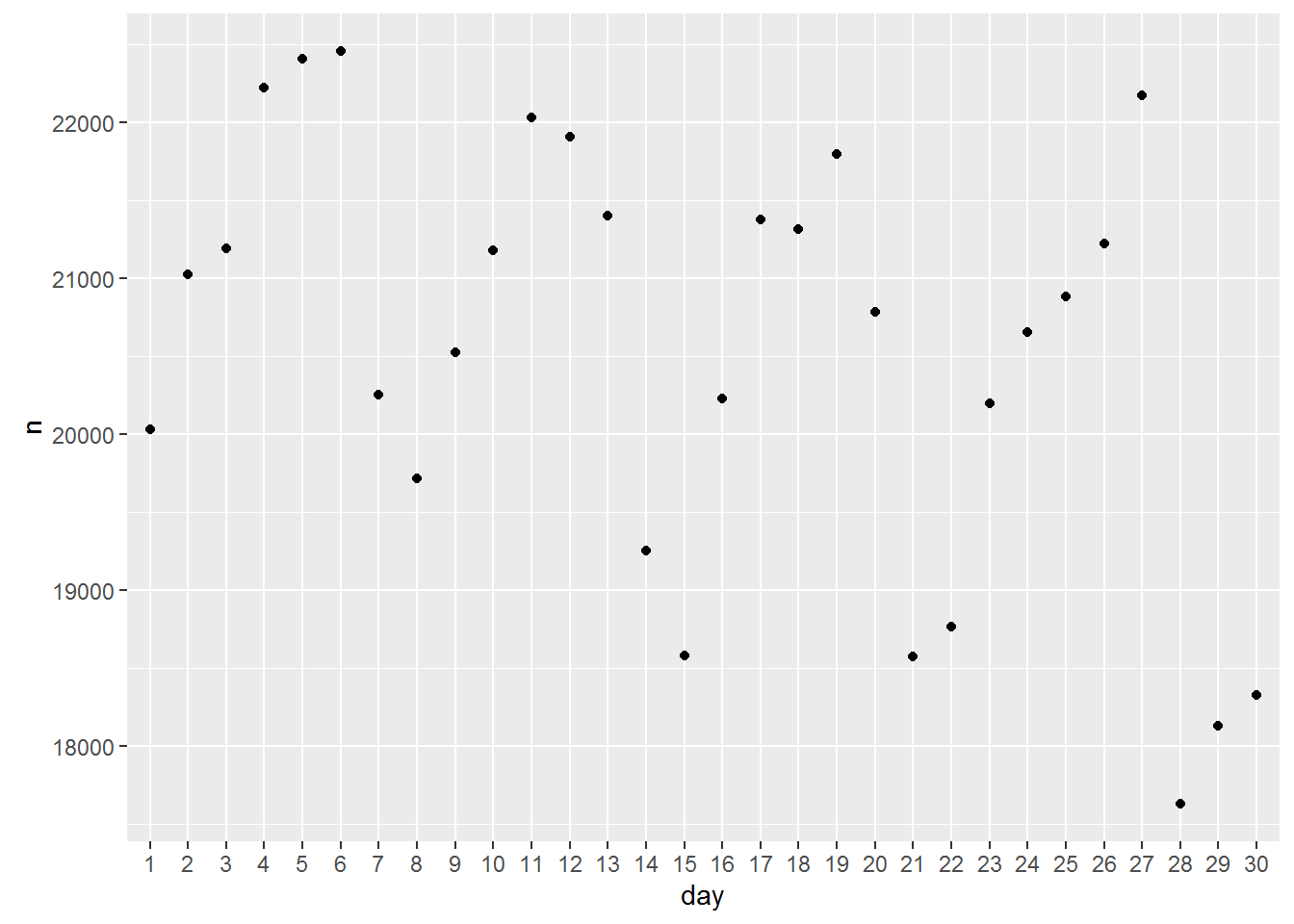
Here it might be good to connect the points by a line to indicate the time-series nature of the data:
taxi.new %>%
  count(day) %>%
  ggplot(aes(x=day,y=n)) + geom_point() + geom_line(aes(group=1),linetype='dotted')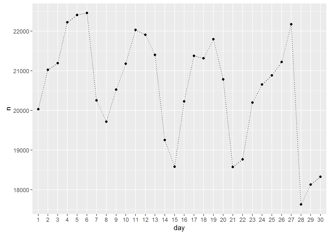
You need to tell R which points to connect. The option group=1 simply means all of them. Here is the time of day version using points and lines:
taxi.new %>%
  count(hour.trip.start) %>%
  ggplot(aes(x=hour.trip.start,y=n)) + geom_point() + geom_line(aes(group=1),linetype='dotted')
Let’s add payment type using a different color for each payment:
taxi.new %>%
  filter(payment_type_label %in% c('Credit Card','Cash')) %>%
  count(payment_type_label, hour.trip.start) %>%
  ggplot(aes(x=hour.trip.start,y=n,color=payment_type_label,group=payment_type_label)) + geom_point() + geom_line(linetype='dotted')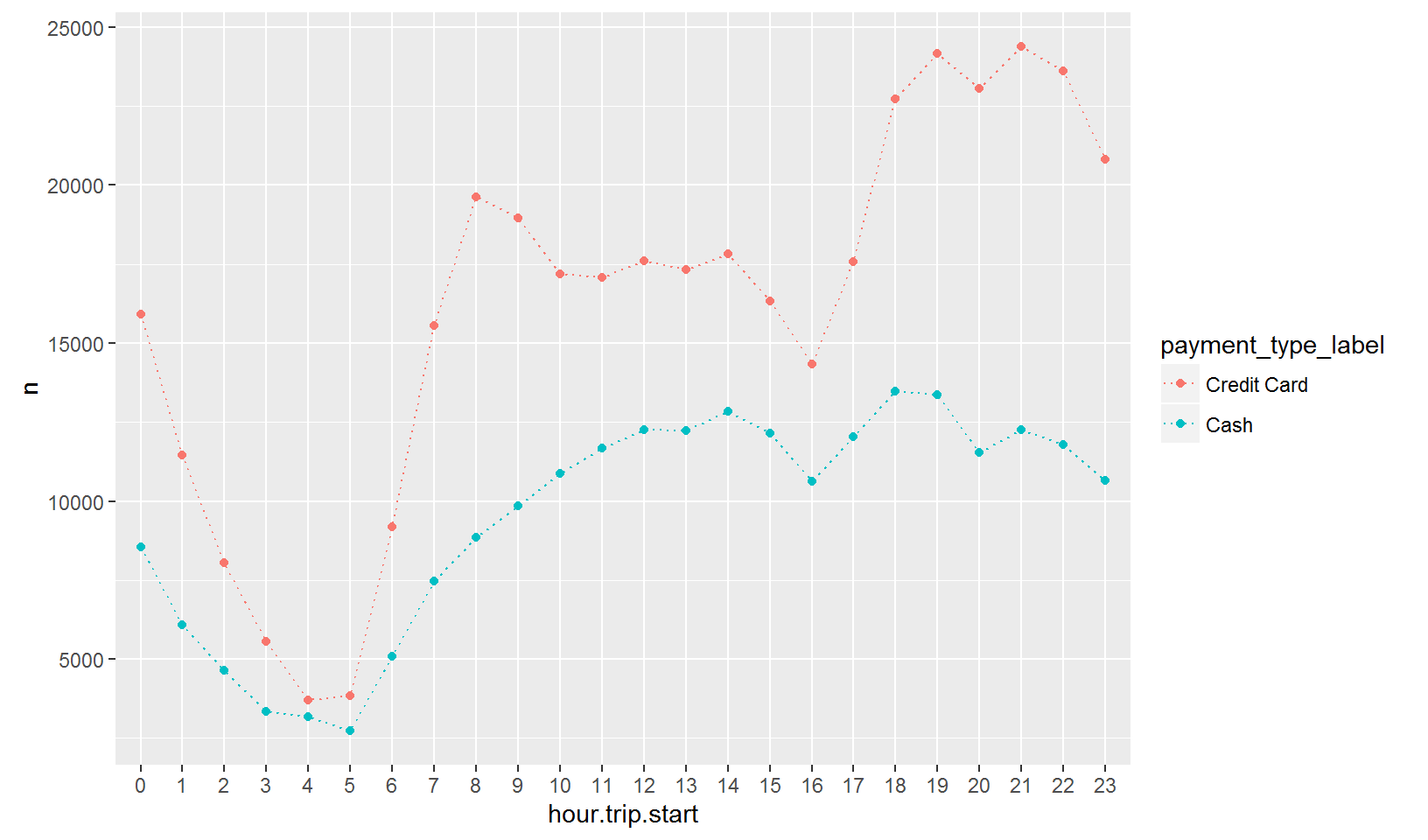
Trip Duration
Let’s now turn to visualizing the duration of trips. What is the overall distribution of trip durations? We can use a histogram:
taxi.new %>%
  ggplot(aes(x=trip.duration)) + geom_histogram()
## `stat_bin()` using `bins = 30`. Pick better value with `binwidth`.
ehh….what?? - that’s a weird histogram. This is the (very standard) problem of outliers. Here are the 5 longest trips in the data:
taxi.new %>%
  arrange(desc(trip.duration)) %>%
  select(tpep_pickup_datetime,tpep_dropoff_datetime,trip.duration) %>%
  slice(1:5)
## # A tibble: 5 × 3
## tpep_pickup_datetime tpep_dropoff_datetime trip.duration
## <dttm> <dttm> <dbl>
## 1 2015-06-27 17:42:24 2015-06-30 10:53:08 3910.733
## 2 2015-06-18 22:37:26 2015-06-19 22:37:02 1439.600
## 3 2015-06-07 18:40:43 2015-06-08 18:40:08 1439.417
## 4 2015-06-27 23:47:54 2015-06-28 23:47:16 1439.367
## 5 2015-06-09 21:45:47 2015-06-10 21:45:09 1439.367Alright - so here we have a taxi ride that lasted 10284/60 = 171 hours! Is this normal? What percentage of rides are above 2 hours?
sum(taxi.new$trip.duration > 120)/nrow(taxi.new)## [1] 0.0009330674Only 0.9% of trips are longer than 2 hours. So let’s cut off the histogram at 2 hours:
taxi.new %>%
  ggplot(aes(x=trip.duration)) + geom_histogram() + xlim(0,120)
## `stat_bin()` using `bins = 30`. Pick better value with `binwidth`.## Warning: Removed 578 rows containing non-finite values (stat_bin).
Much better! Most trips are less than 60 minutes with the vast majority of trips between 0 and 25 minutes. This is also a highly skewed distribution so if we want to characterize the “typical” trip duration we should probably not use the average. In the following we will focus on the median trip duration.
Here is the median duration for each day of the month:
taxi.new %>%
  group_by(day) %>%
  summarize(med.duration=median(trip.duration)) %>%
  ggplot(aes(x=day,y=med.duration)) + geom_point() + geom_line(aes(group=1),linetype='dotted')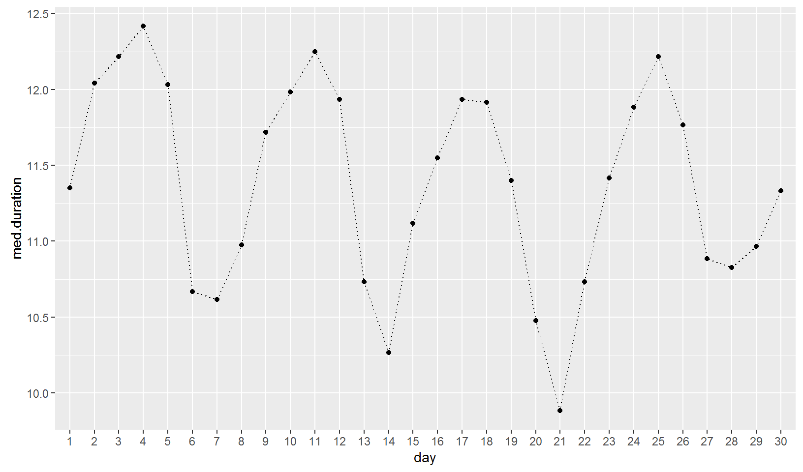
Let’s “pretty-up” this plot a bit by adding some axis titles and weekday information:
taxi.new %>%
  group_by(day) %>%
  summarize(med.duration=median(trip.duration),
            weekday=weekday[1]) %>%
  ggplot(aes(x=day,y=med.duration,group=1)) + geom_point(aes(color=weekday),size=5) +
  geom_line(linetype='dotted')+
  xlab('Day of Month')+ylab('Median Trip Duration (Mins.)')+
  ggtitle("Median Trip Duration by Day of Month")
In terms of duration, the longest trips are on Tuesdays and Wednesdays, while the shortest are on weekends. An alternative approach is to add labels directly on the plot:
taxi.new %>%
  group_by(day) %>%
  summarize(med.duration=median(trip.duration),
            weekday=weekday[1]) %>%
  ggplot(aes(x=day,y=med.duration)) + geom_text(aes(label=weekday)) +
  geom_line(aes(group=1),linetype='dotted')+
  xlab('Day of Month')+ylab('Median Trip Duration (Mins.)')+ggtitle("Median Trip Duration by Day of Month")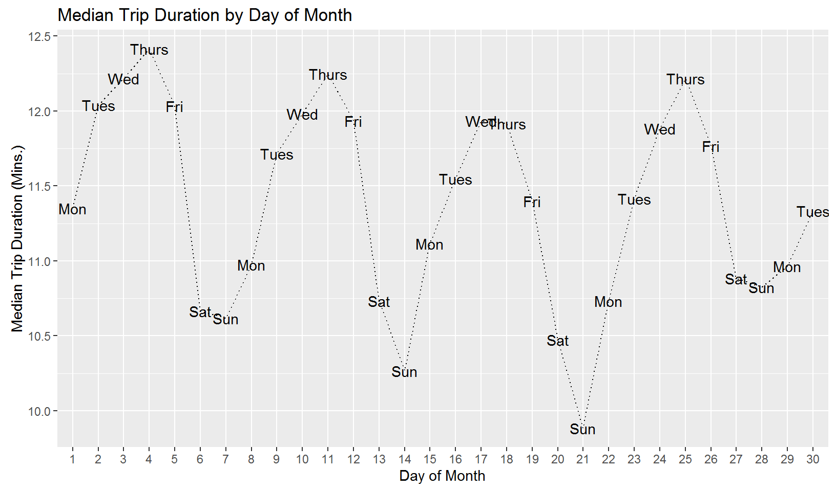
Now let’s look at median trip duration by time of day:
taxi.new %>%
  group_by(hour.trip.start) %>%
  summarize(med.duration=median(trip.duration)) %>%
  ggplot(aes(x=hour.trip.start,y=med.duration)) + geom_point() + geom_line(aes(group=1),linetype='dotted')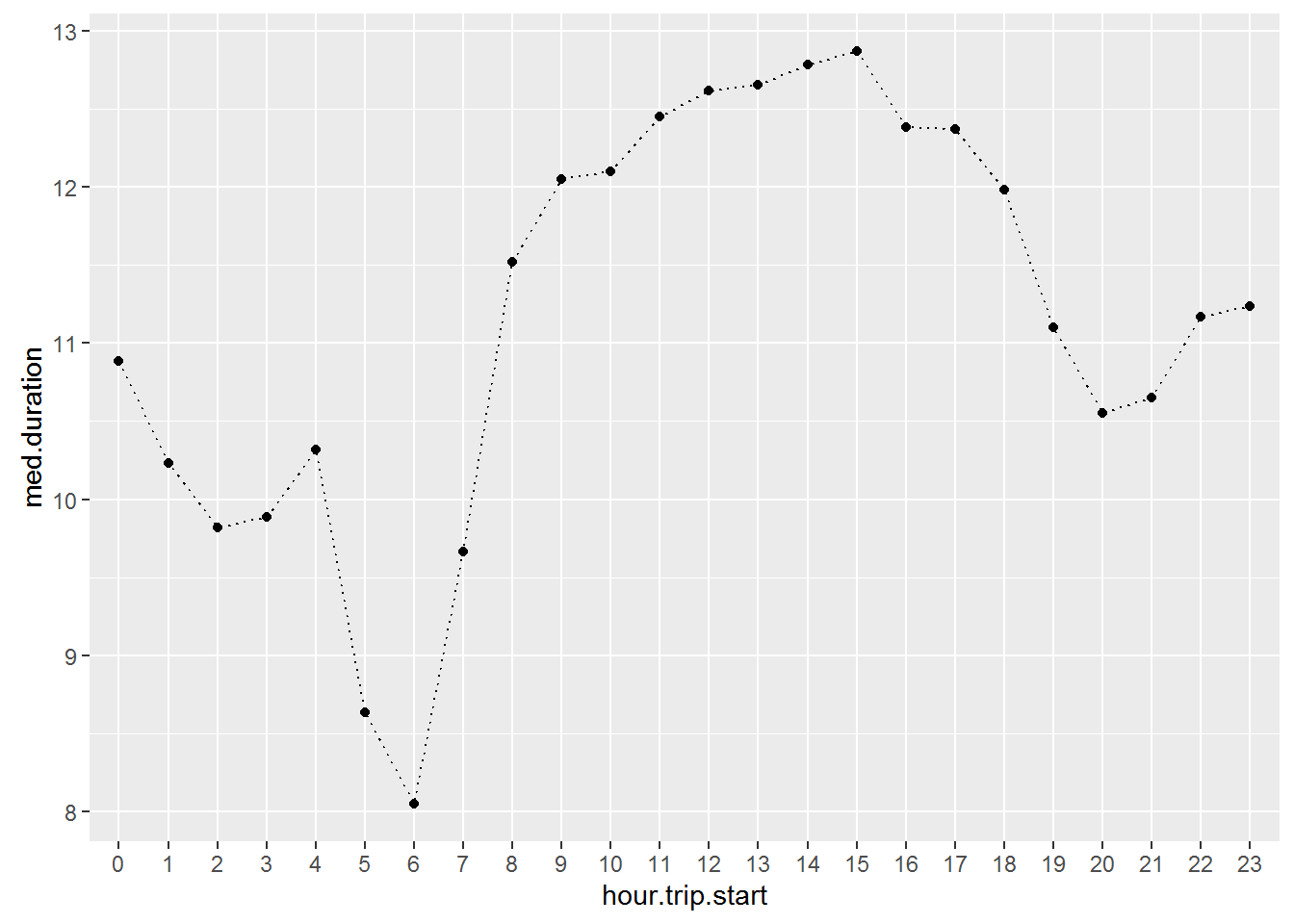
Does this pattern stay stable throughout the week? Let’s break out this relationship for each weekday:
taxi.new %>%
  group_by(weekday,hour.trip.start) %>%
  summarize(med.duration=median(trip.duration)) %>%
  ggplot(aes(x=hour.trip.start,y=med.duration,group=weekday,color=weekday)) +
  geom_point(size=3) +
  geom_line(size=0.5) +
  facet_wrap(~weekday,nrow=1) +
  theme(legend.position="none")+
  scale_x_discrete(breaks=c(0,3,6,9,12,15,18,21))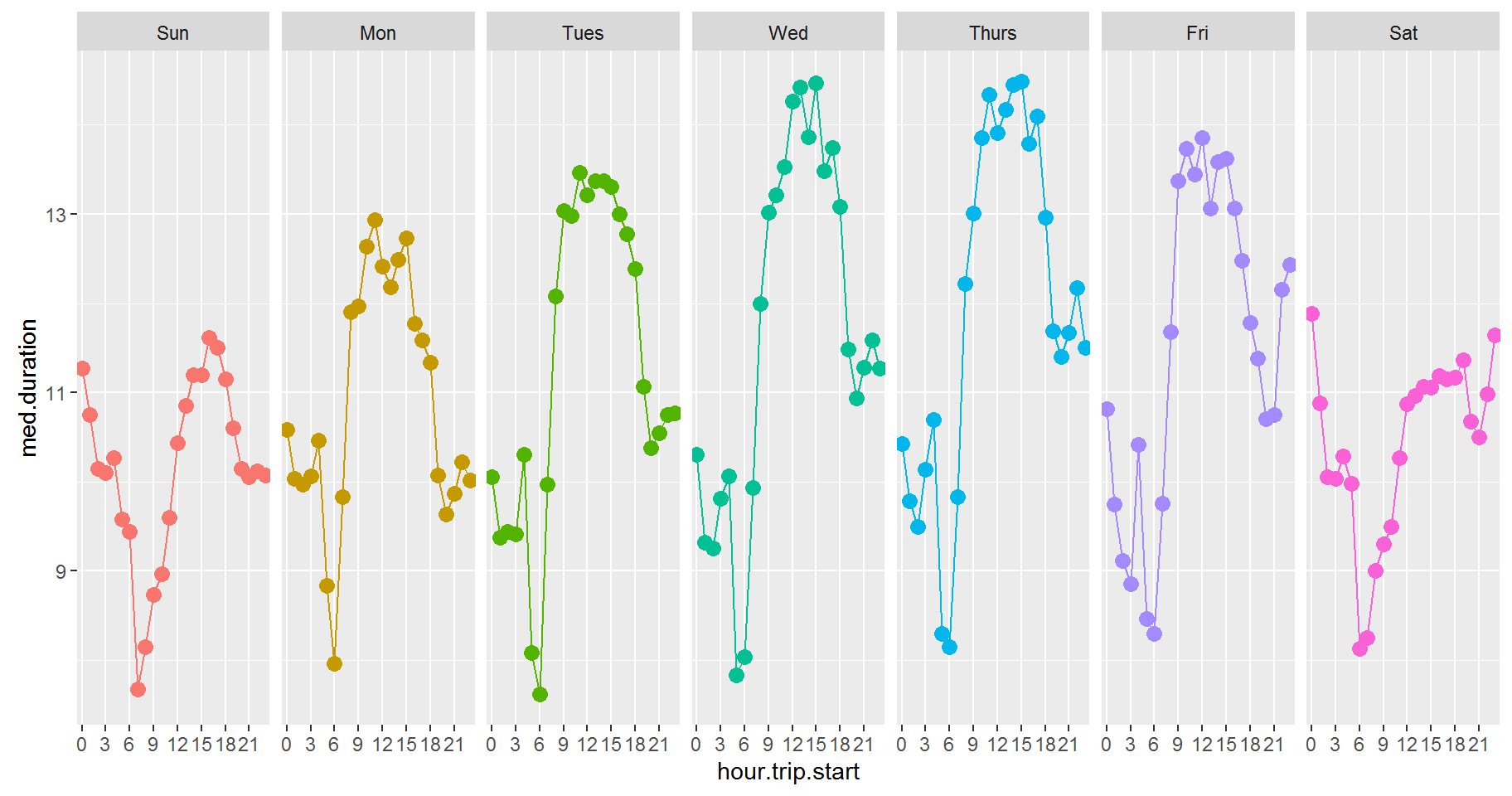
This visualization is an example of a “facet” and this feature alone makes it worthwhile to learn ggplot. A facet repeats the same base plot for every value of the facet variable - here weekday. This makes it laughably easy to make complex and highly informative plots.
You can even create two-dimensional facets. Suppose we wanted to repeat the above plot for each payment type. Easy:
taxi.new %>%
  filter(payment_type_label %in% c('Credit Card','Cash')) %>%
  group_by(weekday,hour.trip.start,payment_type_label) %>%
  summarize(med.duration=median(trip.duration)) %>%
  ggplot(aes(x=hour.trip.start,y=med.duration,group=weekday,color=weekday)) +
  geom_point(size=3) +
  geom_line(size=0.5) +
  facet_grid(weekday~payment_type_label) +
  theme(legend.position="none")+
  scale_x_discrete(breaks=c(0,3,6,9,12,15,18,21))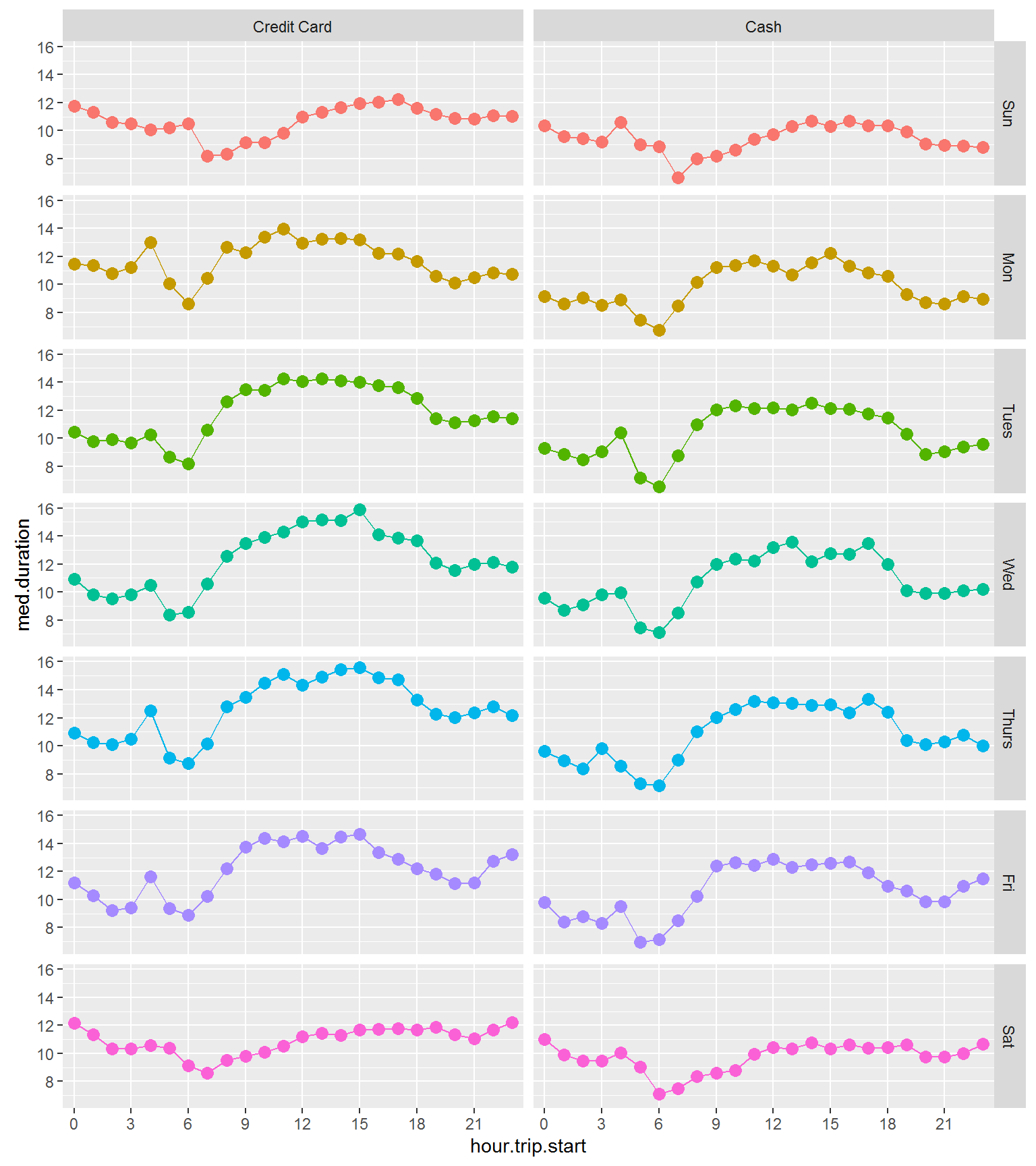
Admittedly this is not a good visualization if the objective is to highlight differences between payment types by weekday and time of day. Here is a better version for that purpose:
taxi.new %>%
  filter(payment_type_label %in% c('Credit Card','Cash')) %>%
  group_by(weekday,hour.trip.start,payment_type_label) %>%
  summarize(med.duration=median(trip.duration)) %>%
  ggplot(aes(x=hour.trip.start,y=med.duration,group=payment_type_label,
             color=payment_type_label,linetype=payment_type_label,shape=payment_type_label)) +
  geom_point(size=2) +
  geom_line(size=0.5) +
  facet_wrap(~weekday,nrow=1) +
  ylab('Median Trip Duration') +
  xlab('Time of Day')+
  scale_x_discrete(breaks=c(0,6,12,18))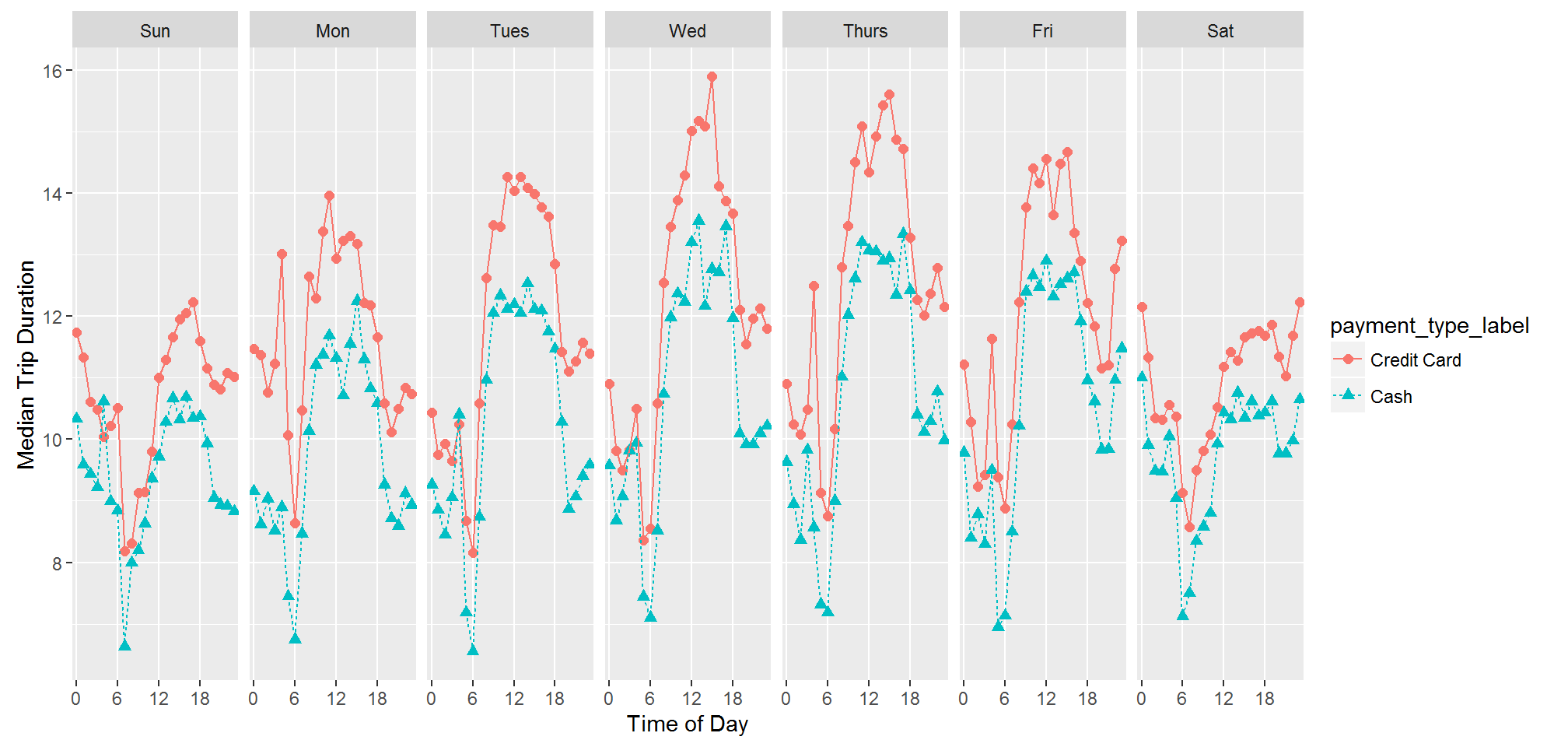
Trips paid with credit card tend to be slightly longer in duration - especially for mid-day and mid-week trips.
Trip Distance
Here is median trip distance for each day of the month:
taxi.new %>%
  group_by(day) %>%
  summarize(med.trip=median(trip_distance),
            weekday=weekday[1]) %>%
  ggplot(aes(x=day,y=med.trip)) + geom_point(aes(color=weekday),size=5) +
  geom_line(aes(group=1),linetype='dotted')+
  xlab('Day of Month')+ylab('Median Trip Distance (Miles)')+ggtitle("Median Trip Distance by Day of Month")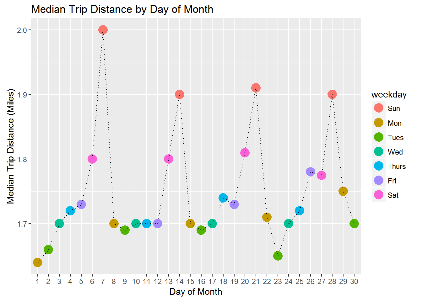
In terms of distance, we see the longest trips on weekends. For time of day we get
taxi.new %>%
  group_by(hour.trip.start) %>%
  summarize(med.trip=median(trip_distance)) %>%
  ggplot(aes(x=hour.trip.start,y=med.trip)) + geom_point(size=3) + geom_line(aes(group=1),linetype='dotted')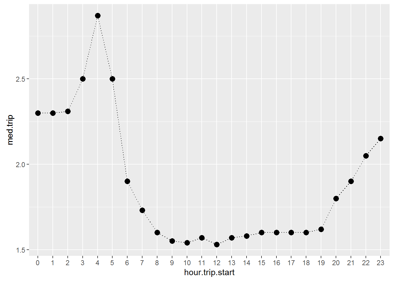
Trips are longer at night and shortest during the day. Here is the version where we cut it by weekday:
taxi.new %>%
  group_by(weekday,hour.trip.start) %>%
  summarize(med.trip=median(trip_distance)) %>%
  ggplot(aes(x=hour.trip.start,y=med.trip,group=weekday,color=weekday)) +
  geom_point(size=3) +
  geom_line(size=0.5) +
  facet_wrap(~weekday,nrow=1) +
  theme(legend.position="none")+
  scale_x_discrete(breaks=c(0,3,6,9,12,15,18,21))
Taxi Exercise 1: Trip Speed
Try to visualize trip speed and distance across time of day and day of week. Do you see any interesting patterns? Do your findings make sense when compared to the findings for trip duration and distance?
Fares
Let’s look are fare mounts for each payment type:
taxi.new %>%
  filter(payment_type_label %in% c('Credit Card','Cash')) %>%
  ggplot(aes(x=fare_amount,fill=payment_type_label)) + geom_histogram() + facet_wrap(~payment_type_label) + xlim(0,75)+
  theme(legend.position="none")
## `stat_bin()` using `bins = 30`. Pick better value with `binwidth`.## Warning: Removed 914 rows containing non-finite values (stat_bin).
These distributions are not too different - credit card trips appear to have slightly larger fares.
Average fares are smallest on Saturdays and largest on Thursdays. This is consistent with the finding above that trips were shorter on Saturdays and longer on Thursdays.
taxi.new %>%
  filter(fare_amount < 100) %>%
  group_by(day) %>%
  summarize(med.fare=mean(fare_amount),
            weekday=weekday[1]) %>%
  ggplot(aes(x=day,y=med.fare)) + geom_point(aes(color=weekday),size=5) +
  geom_line(aes(group=1),linetype='dotted')+
  xlab('Day of Month')+ylab('Mean Fare ($)')+ggtitle("Mean Fare Amount by Day of Month")
Let’s investigate the relationship between fare amount, hour of day, weekday and payment type:
taxi.new %>%
  filter(fare_amount < 100,payment_type_label %in% c('Credit Card','Cash')) %>%
  group_by(weekday,hour.trip.start,payment_type_label) %>%
  summarize(mean.fare=mean(fare_amount)) %>%
  ggplot(aes(x=hour.trip.start,y=mean.fare,color=payment_type_label,group=payment_type_label)) +
  geom_point(size=2) + geom_line() +
  facet_wrap(~weekday,nrow=1)+
  scale_x_discrete(breaks=c(0,6,12,18))+
  ylab('Mean Fare ($)') + xlab('Hour of Trip Start')+ggtitle('Mean Fares by Time of Day and Weekday')
Mean fares tend to be $2-$3 higher for credit card trips.
Taxi Exercise 2: Tips
Visualize relationships between tips and payment type and tips and weekday and time of day. The dollar amount of tip is tip_amount.
Taxi Exercise 3: Passenger Count
Can you find any interesting patterns for passenger count?
Case Study: New York Citibike
In this section we will visualize parts of the citibike data introduced in the Group Summaries section. We start by reading in the data and adding a few transformations:
citibike <- readRDS('data/201508.rds') %>%
  mutate(day = factor(mday(as.Date(start.time, "%m/%d/%Y"))),
         start.hour=factor(start.hour))
How many trips are there for each hour of the day? Let’s check:
ggplot(data=citibike,aes(x=start.hour)) + geom_bar() + xlab('Time of Day') + ylab('Number of Trips')+
  theme(axis.text.x  = element_text(size=8,angle=90))
Hmmm…looks like there are large rush hour effects - both morning and afternoon. But it this true for both user segments?
ggplot(data=citibike,aes(x=start.hour)) + geom_bar() + xlab('Time of Day') + ylab('Number of Trips')+
  theme(axis.text.x  = element_text(size=8,angle=90)) + facet_wrap(~usertype)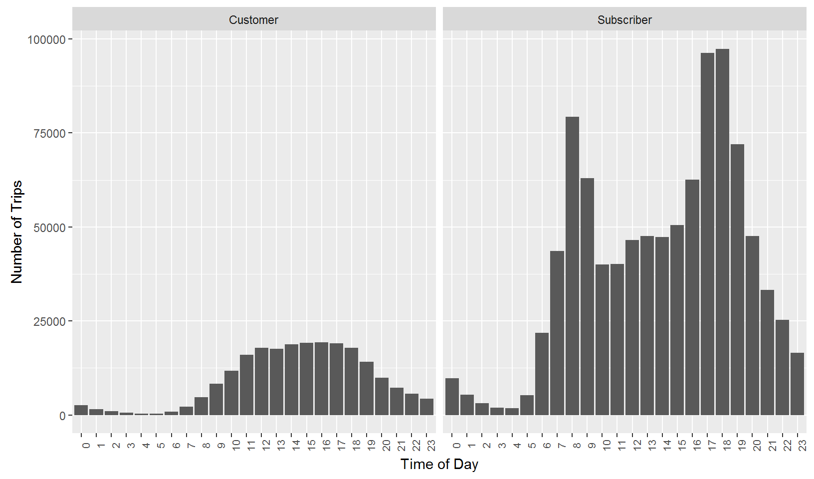
No - rush hour spikes seems to be limited to the “Subscriber” segment.
How about trips by weekday?
ggplot(data=citibike,aes(x=weekday)) + geom_bar() + xlab('Day of Week') +
ylab('Number of Trips') + ggtitle('Number of Bike Trips by Day of Week') 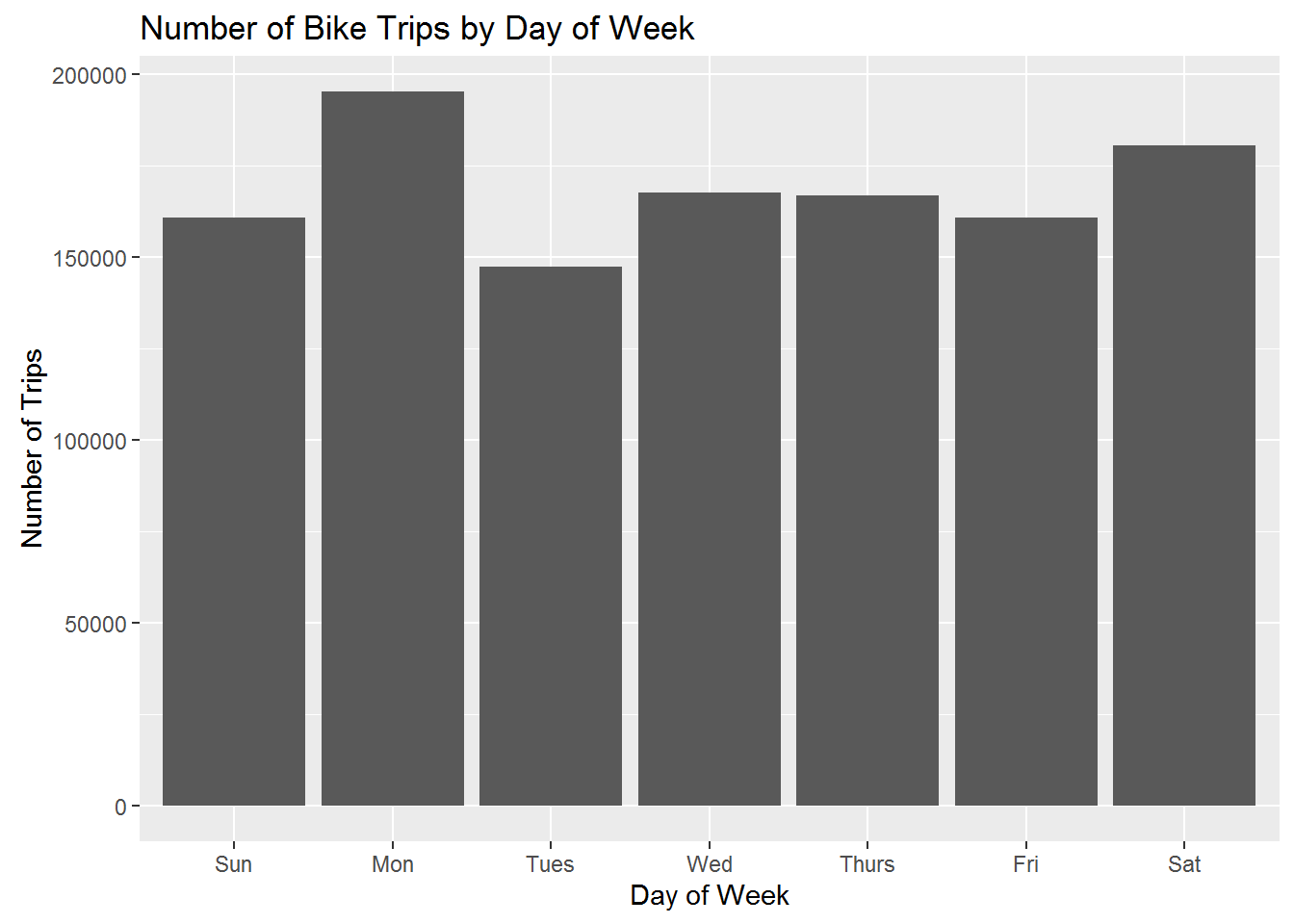
This suffers from the same problem that we encountered for the taxi data - some weekdays occur 5 times in a month while others only occur 4 times. We can correct this the same say as for the taxi data:
citibike %>%
  group_by(day) %>%
  summarize(n=n(),
            weekday = weekday[1]) %>%
  group_by(weekday) %>%
  summarize(n.m=mean(n)) %>%
  ggplot(aes(x=weekday,y=n.m)) + geom_bar(stat='identity') + xlab('Day of Week') +
ylab('Number of Trips') + ggtitle('Number of Bike Trips by Day of Week') 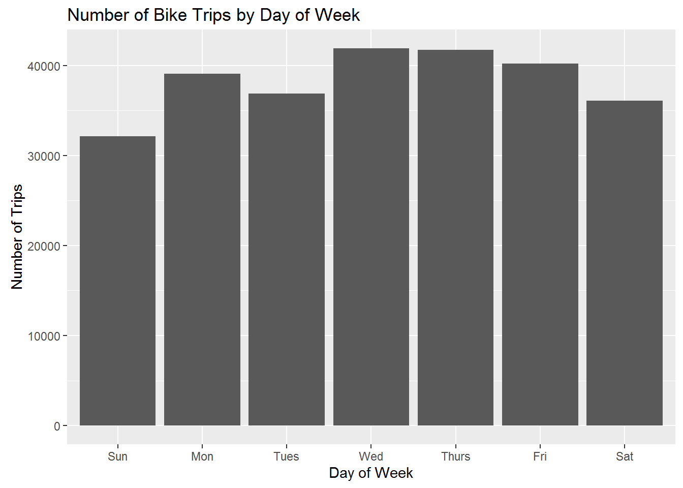
The fewest number of trips occurs on weekends. Is this pattern the same for both segments?
citibike %>%
  group_by(day,usertype) %>%
  summarize(n=n(),
            weekday = weekday[1]) %>%
  group_by(weekday,usertype) %>%
  summarize(n.m=mean(n)) %>%
  ggplot(aes(x=weekday,y=n.m)) + geom_bar(stat='identity') + xlab('Day of Week') +
ylab('Number of Trips') + facet_wrap(~usertype) + ggtitle('Number of Bike Trips by Day of Week') 
That’s interesting! For “Customers” we see spikes on weekends, while the opposite is true for “Subcribers”. This is consistent with the interpretation of customers as tourists and subscribers as locals.
Let’s put it all together - trips by weekday by segment by time of day:
citibike %>%
  group_by(day,usertype,start.hour) %>%
  summarize(n=n(),
            weekday = weekday[1]) %>%
  group_by(weekday,usertype,start.hour) %>%
  summarize(n.m=mean(n)) %>%
  ggplot(aes(x=start.hour,y=n.m,fill=weekday)) + geom_bar(stat='identity') + xlab('Time of Day') +
  ylab('Number of Trips') + facet_grid(weekday~usertype) +
  ggtitle('Number of Bike Trips by Time of Day and Weekday')  +
  theme(axis.text.x  = element_text(size=8,angle=90),
        legend.position="NULL")
Even more interesting: On weekends, “Subscribers” as as “Customers” - no rush hour spikes.
Now let’s turn to analyzing trip durations rather than the number of trips. What does the distribution of trip durations look like? Remember from above that trip duration is recorded in seconds. This is hard to think about. Let’s start by defining a new variable, which is trip duration in minutes. Also, based on analyzing this data in the Group Summaries section, we ignore the few outlier trips with of extreme length:
citibike <- citibike %>%
  mutate(tripduration.m = tripduration/60)

citibike %>%
  filter(tripduration.m < 100) %>%
  ggplot(aes(x=tripduration.m)) + geom_histogram()+xlab('Trip Duration (min.))') + ylab('Number of Trips')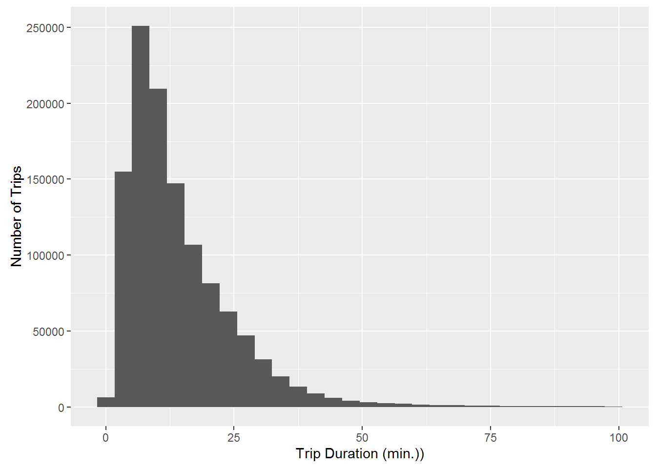
This is a skewed distribution with a long right tail. Most trips are less than 30 minutes. Do the two segments have similar duration distributions?
citibike %>%
  filter(tripduration.m < 100) %>%
  ggplot(aes(x=tripduration.m)) + geom_histogram()+xlab('Trip Duration (min.)') + ylab('Number of Trips') +
  facet_wrap(~usertype)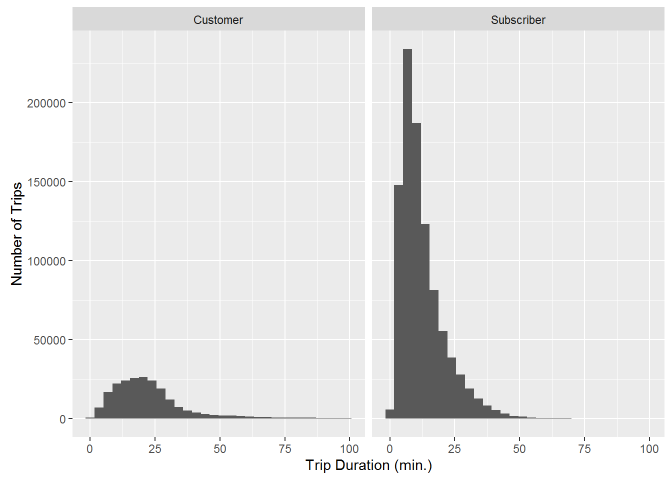
These distributions are different - the “Customer” distribution is much less skewed with more weight on longer trips. This is more evident if we plot the density versions of the histograms (a “density” is just a smoothed version of a histogram):
citibike %>%
  filter(tripduration.m < 100) %>%
ggplot(aes(x=tripduration.m,fill=usertype)) + geom_density(alpha=0.2)+xlab('Trip Duration (min.)') + ylab('Number of Trips') 
Here we clearly see that customers take longer trips than subscribers.
Finally, let’s look at effect of gender and birth year on trip duration. Do segments defined by gender and age take different trips in terms of duration?
citibike %>%
  filter(!birth.year=='NA', gender %in% c('female','male')) %>%
  mutate(birth.year.f=cut(as.numeric(birth.year),
                          breaks = c(0,1955,1965,1975,1985,1990,2000),
                          labels=c('<1955','1955-1964','1965-1974','1975-1984','1985-1989','>=1990'))) %>%
  group_by(birth.year.f,gender) %>%
  summarize(med.trip.dur = median(tripduration.m)) %>%
  ggplot(aes(x=birth.year.f,y=med.trip.dur,group=gender,color=gender)) +
  geom_point() + geom_line(linetype='dotted') +ylab('Trip Duration (min.)') + xlab('Age Group') +
  ggtitle('Median Trip Duration by Gender and Birth Year')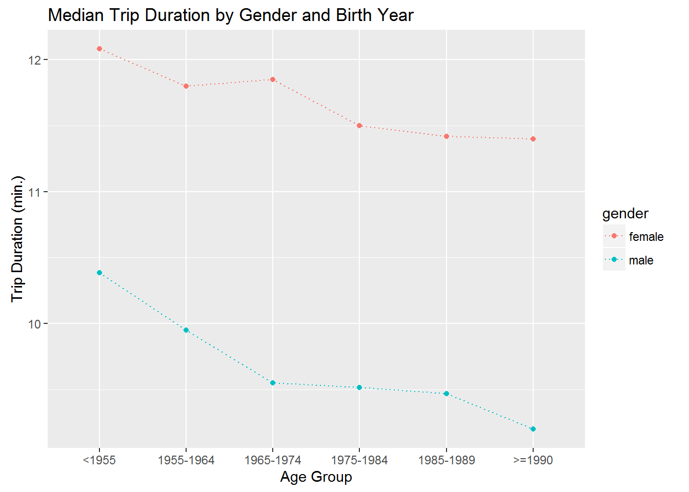
Answer: Yes! Men take shorter (in time) trips than women at any age. Furthermore, younger riders of any gender take shorter trips than older riders.
Copyright © 2016 Karsten T. Hansen. All rights reserved.