Predictive Analytics: Linear Models
Predictive models are used to predict outcomes of interest based on some known information. In order to come up with a good prediction rule, we can use historical data where the outcome is observed. This will allow us to calibrate the predictive model, i.e., to learn how specifically to link the known information to the outcome. For example, we might be interested in predicting the satisfaction of a user based on the user’s experience and interaction with a service: \[ S = f(X_1,X_2,X_3), \] where \(S\) is the satisfaction measure and \(X_1,X_2,X_3\) are three measures of experience. For example, \(S\) could be satisfaction of a visitor to a theme park, \(X_1\) could be an indicator of whether the visit was on a weekend or not, \(X_2\) could be indicator of whether the visitor was visiting with kids or not and we could let \(X_3\) could capture all other factors that might drive satisfaction. Then we could use a predictive model of the form \[ S = \beta_{wk} Weekend + \beta_f Family + X_3, \] where \(Weekend=1\) for weekend visitors (otherwise zero), \(Family=1\) for familily visitors (otherwise zero) and \(\beta_{wk},\beta_f\) define the prediction rule. \(X_3\) captures all other factors impacting satisfaction. We might not have a good idea about they are but we can let \(\beta_0\) denote the mean of them. Then we can write the model as \[ S = \beta_0 + \beta_{wk} Weekend + \beta_f Family + \epsilon, \] where \(\epsilon = X_3-\beta_0\) must have mean zero. This is a predictive model since it can predict mean satisfaction given some known information. For example, predicted satisfaction for non-family weekend visitors is \(\beta_0 + \beta_{wk}\), while predicted mean satisfaction for family weekend visitors is \(\beta_0 + \beta_{wk} + \beta_f\). Of course, these prediction rules are not all that useful if we don’t know what the \(\beta\)’s are. We will use historical data to calibrate the values of the \(\beta\)’s so that they give us good prediction rules.
The predictive model above is simple. However, we can add other factors to it, i.e., add things that might be part of \(X_3\). For example, we might suspect that the total number of visitors in the park would influence the visit experience. We could add that to the model as a continuous measure: \[ S = \beta_0 + \beta_{wk} Weekend + \beta_f Family + \beta_n N + \epsilon, \] where \(N\) is the number of visitors on the day that \(S\) was recorded (for example on a survey). We can now make richer predictions. For example, what is the satisfaction of a family visitor on a non-weekend where the total park attendance is \(N=5,000\)?
Predictive models like these are referred to as “linear”, but that’s a bit of a misnomer. The model above implies that satisfaction is a linear function of attendance \(N\). However, we can change that by specifying an alternative model. Suppose we divide attendance into three categories, small, medium and large. Then we can use a model of the form: \[ S = \beta_0 + \beta_{wk} Weekend + \beta_f Family + \beta_{med} D_{Nmed} + \beta_{large} D_{Nlarge} + \epsilon, \] where \(D_{Nmed}\) is an indicator for medium sized attendance days (equal to 1 on such days and zero otherwise) and \(D_{Nlarge}\) the same for large attendance days. Now the relationship between attendance size and satisfaction is no longer restricted to be linear. If desired you can easily add more categories of attendance to get finer resolution.
Exercise
Using the last model above, what would the predicted mean satisfaction be for family visitors on small weekend days? How about on large weekend days?
In the following we will consider two case studies. All data and code are in the project in this zip file.
Case Study: Pricing a Tractor
 Let’s use predictive analytics to develop a “blue book” for tractors: Given a set of tractor characteristics, what would we expect the market’s valuation to be?
The dataset auction_tractor.rds contains information on 12,815 auction sales of a specific model of tractor. These auctions occurred in many states across the US in the years 1989-2012. We will develop a model to predict auction prices for tractors in the 12 month period from May 2011 to April 2012 using the historical data from 1989 to April 2011. We can use the 12 months of “hold-out” data data to evaluate the success of the model in predicting future prices.
Let’s start by loading the data and finding out what information is in it:
## get libraries
library(tidyverse)
library(forcats)

## read data, calculate age of each tractor and create factors
auction.tractor <- readRDS('data/auction_tractor.rds') %>%
  mutate(MachineAge = saleyear - YearMade,
         saleyear=factor(saleyear),
         salemonth=factor(salemonth,levels=month.abb),
         saleyearmonth = paste(saleyear,salemonth))

names(auction.tractor)
## [1] "SalesID" "SalePrice"
## [3] "MachineID" "ModelID"
## [5] "datasource" "auctioneerID"
## [7] "YearMade" "MachineHoursCurrentMeter"
## [9] "UsageBand" "saledate"
## [11] "fiModelDesc" "fiBaseModel"
## [13] "fiSecondaryDesc" "fiModelSeries"
## [15] "fiModelDescriptor" "ProductSize"
## [17] "fiProductClassDesc" "state"
## [19] "ProductGroup" "ProductGroupDesc"
## [21] "Drive_System" "Enclosure"
## [23] "Forks" "Pad_Type"
## [25] "Ride_Control" "Stick"
## [27] "Transmission" "Turbocharged"
## [29] "Blade_Extension" "Blade_Width"
## [31] "Enclosure_Type" "Engine_Horsepower"
## [33] "Hydraulics" "Pushblock"
## [35] "Ripper" "Scarifier"
## [37] "Tip_Control" "Tire_Size"
## [39] "Coupler" "Coupler_System"
## [41] "Grouser_Tracks" "Hydraulics_Flow"
## [43] "Track_Type" "Undercarriage_Pad_Width"
## [45] "Stick_Length" "Thumb"
## [47] "Pattern_Changer" "Grouser_Type"
## [49] "Backhoe_Mounting" "Blade_Type"
## [51] "Travel_Controls" "Differential_Type"
## [53] "Steering_Controls" "saleyear"
## [55] "salemonth" "MachineAge"
## [57] "saleyearmonth"The key variable is “SalePrice” - the price determined at auction for a given tractor. There is information about the time and location of the auction and a list of tractor characteristics.
Summarizing the data
Before you start fitting predictive models, it is usually a good idea to summarize the data to get a basic understanding of what is going on. Let’s start by filtering out the historical data and plotting the observed distribution of prices:
holdout.yearmonth <- c(paste('2011',month.abb[5:12]),paste('2012',month.abb[1:4]))

## historic data
auction.tractor.fit <- auction.tractor %>%
  filter(!saleyearmonth %in% holdout.yearmonth)

## prediction data
auction.tractor.holdout <- auction.tractor %>%
  filter(saleyearmonth %in% holdout.yearmonth)


## distribution of prices
auction.tractor.fit %>%
  ggplot(aes(x=SalePrice/1000)) + geom_histogram(binwidth=10)  + xlab("Sale Price (in $1,000)")
There is a quite a bit of variation in the observed prices with most prices being in the $25K to $75K range. Did prices change over the time period? Let’s check:
## average auction price by year of sale
auction.tractor.fit %>%
  group_by(saleyear) %>%
  summarize('Average Sale Price ($)' = mean(SalePrice),
            'Number of Sales' =n()) %>%
  gather(measure,value,-saleyear) %>%
  ggplot(aes(x=saleyear,y=value,group=measure,color=measure)) +
  geom_point(size=3) +
  geom_line(linetype='dotted') +
  facet_wrap(~measure,scales='free')+
  xlab('Year of Sale')+ylab(' ')+
  theme(legend.position="none",
        axis.text.x = element_text(angle = 45, hjust = 1))
The average price increased by about $20K over the time period. Like cars, tractors depreciate with age. Let’s see how this is reflected in the price at auction:
auction.tractor.fit %>%
  filter(MachineAge >= 0) %>%
  mutate(MachineAgeCat = cut(MachineAge,
                    breaks=c(0,2,4,6,10,15,100),
                    include.lowest=T,
                    labels = c('<= 2','3-4','5-6','7-10','11-15','>15'))) %>%
  group_by(saleyear,MachineAgeCat) %>%
  summarize(mp = mean(SalePrice)/1000,
            'Number of Sales' =n()) %>%
  ggplot(aes(x=MachineAgeCat,y=mp,group=saleyear,color=factor(saleyear))) +
  geom_point(size=2) +
  geom_line() +
  xlab('Machine Age in Years')+ylab('Average Sale Price (in $1000)')+
  facet_wrap(~saleyear,scales='free')+
  theme(legend.position="none",
        axis.text.x = element_text(angle = 45, hjust = 1,size=8))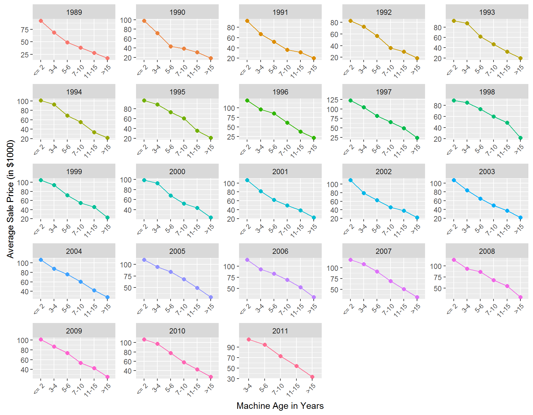
The tractor model in the data has been sold as different sub-models (or “trim”) over time. Let’s see how prices vary across sub-models:
auction.tractor.fit %>%
  group_by(saleyear,fiSecondaryDesc) %>%
  summarize(mp = mean(SalePrice)/1000,
            ns =n()) %>%
  ggplot(aes(x=saleyear,y=mp,group=fiSecondaryDesc,color=fiSecondaryDesc)) +
  geom_point(size=2) +
  geom_line() +
  xlab('Year of Sale')+ylab('Average Sale Price (in $1,000)')+
  facet_wrap(~fiSecondaryDesc,scales='free')+
  theme(legend.position="none",
        axis.text.x = element_text(angle = 45, hjust = 1,size=7))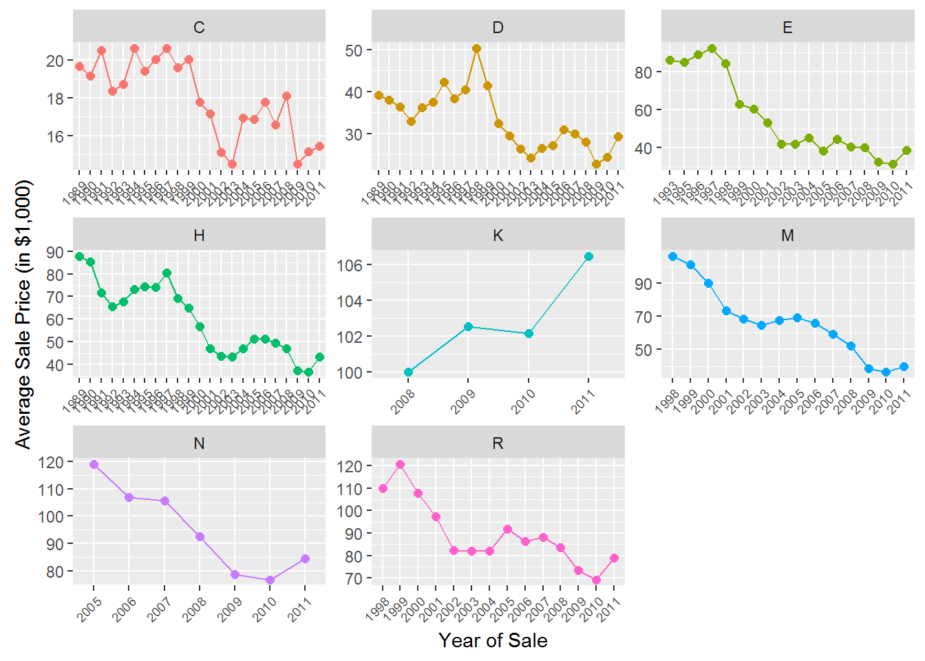
Finally, let’s see how prices vary across states:
auction.tractor.fit %>%
  group_by(state) %>%
  summarize(mean.price = mean(SalePrice)/1000) %>%
  ggplot(aes(x=fct_reorder(state,mean.price),y=mean.price)) +
  geom_bar(stat='identity') +
  ylab('Average Sale Price (in $1,000)')+
  theme(axis.text.x = element_text(angle = 90, hjust = 1))+
  xlab('State')
What to take away from these summaries? Well, clearly we can conclude that any predictive model that we might consider should at a minimum account for year, state, sub-model and machine age effects.
Predictive Models
We start by defining the data used for developing the model. Since we will want to have state effects in the model, let’s elminate states with too few sales and also convert year and month of sale into factors:
incl.states <-  auction.tractor.fit %>%
  count(state) %>%
  filter(n > 10, !state=='Unspecified')

auction.tractor.fit.state <- auction.tractor.fit %>%
  filter(state %in% incl.states$state)
This reduces the sample only by 121 observations. These all come for states with very few auctions.
Let’s start with a model that is clearly too simple: A model that predicts prices using only the year of sale. We already know from the above plots that we can do better, but this is just to get started. You specify a linear model in R using the lm command:
## linear model using only year to predict prices
lm.year <- lm(log(SalePrice)~saleyear,
              data=auction.tractor.fit.state)

## look at model estimates
sum.lm.year <- summary(lm.year)
This is a linear model where we are predicting the (natural) log of sale price using the factor saleyear. When predicting things like prices (or sales), it is usually better to predict the log of price (or sales). The object sum.lm.year contains the calibrated (or estimated) coefficients for your model (along with other information):
##
## Call:
## lm(formula = log(SalePrice) ~ saleyear, data = auction.tractor.fit.state)
##
## Residuals:
##      Min       1Q   Median       3Q      Max
## -1.88801 -0.39954  0.05655  0.46036  1.28129
##
## Coefficients:
##               Estimate Std. Error t value Pr(>|t|)
## (Intercept)  10.379310   0.038490 269.661  < 2e-16 ***
## saleyear1990  0.095267   0.055808   1.707 0.087843 .
## saleyear1991  0.147834   0.052929   2.793 0.005230 **
## saleyear1992 -0.024217   0.050781  -0.477 0.633447
## saleyear1993  0.006535   0.051496   0.127 0.899016
## saleyear1994  0.050021   0.052929   0.945 0.344652
## saleyear1995  0.196387   0.052302   3.755 0.000174 ***
## saleyear1996  0.188945   0.053119   3.557 0.000377 ***
## saleyear1997  0.301433   0.051968   5.800 6.79e-09 ***
## saleyear1998  0.339995   0.047840   7.107 1.26e-12 ***
## saleyear1999  0.398981   0.049705   8.027 1.09e-15 ***
## saleyear2000  0.332623   0.044198   7.526 5.63e-14 ***
## saleyear2001  0.228936   0.044406   5.156 2.57e-07 ***
## saleyear2002  0.248626   0.046290   5.371 7.98e-08 ***
## saleyear2003  0.155599   0.046978   3.312 0.000929 ***
## saleyear2004  0.319510   0.044647   7.156 8.78e-13 ***
## saleyear2005  0.411895   0.045603   9.032  < 2e-16 ***
## saleyear2006  0.503946   0.045293  11.126  < 2e-16 ***
## saleyear2007  0.495893   0.044078  11.250  < 2e-16 ***
## saleyear2008  0.482767   0.043121  11.196  < 2e-16 ***
## saleyear2009  0.439535   0.042459  10.352  < 2e-16 ***
## saleyear2010  0.382052   0.043521   8.779  < 2e-16 ***
## saleyear2011  0.540418   0.048972  11.035  < 2e-16 ***
## ---
## Signif. codes:  0 '***' 0.001 '**' 0.01 '*' 0.05 '.' 0.1 ' ' 1
##
## Residual standard error: 0.5925 on 11582 degrees of freedom
## Multiple R-squared:  0.06313,    Adjusted R-squared:  0.06135
## F-statistic: 35.47 on 22 and 11582 DF,  p-value: < 2.2e-16
Notice that while we have data from 1989 to 2011, there is no effect for 1989 - the model dropped this automatically. Think of the intercept as the base level for the dropped year - the average log price in 1989. The predicted average log price in 1990 is then 0.095 higher. Why? Like in the satisfaction example above, you should think of each effect as being multiplied by a one or a zero depending on if the year correspond to the effect in question (here 1990). This corresponds to an increase in price of about 10%. Similarly, the predicted average log price in 1991 would be 10.379+0.148.
In order to plot the estimated year effects it is convenient to put them in a R data frame. We can also attach measures of uncertainty of the estimates (confidence intervals) at the same time:
## put results in a data.frame using thew broom package
library(broom)
results.df <- tidy(lm.year,conf.int = T)
We can now plot elements of this data frame to illustrate effects. We can use a simple function to extract which set of effects to plot. Here there is only saleyear to consider:
## ------------------------------------------------------
## Function to extract coefficients for plots
## ------------------------------------------------------
extract.coef <- function(res.df,var){
  res.df %>%
    filter(grepl(var,term)) %>%
    separate(term,into=c('var','level'),sep=nchar(var))
}
##-------------------------------------------------------


## plot estimated trend
extract.coef(results.df,"saleyear") %>%
  ggplot(aes(x=level,y=estimate,group=1)) +
  geom_point() +
  geom_line(linetype='dotted')+
  geom_hline(aes(yintercept=0))+
  theme(axis.text.x = element_text(angle = 90, hjust = 1))
This plot closely resembles the plot above of average prices per year. This is not strange since our “model” basically just calculates the average log price per year.
If you want to add confidence intervals to the plot, you can use the geom_pointrange option:
extract.coef(results.df,"saleyear") %>%
  ggplot(aes(x=level,y=estimate,ymin=conf.low,ymax=conf.high,group=1)) +
  geom_pointrange() +
  geom_line(linetype='dotted')+
  geom_hline(aes(yintercept=0))+
  theme(axis.text.x = element_text(angle = 90, hjust = 1))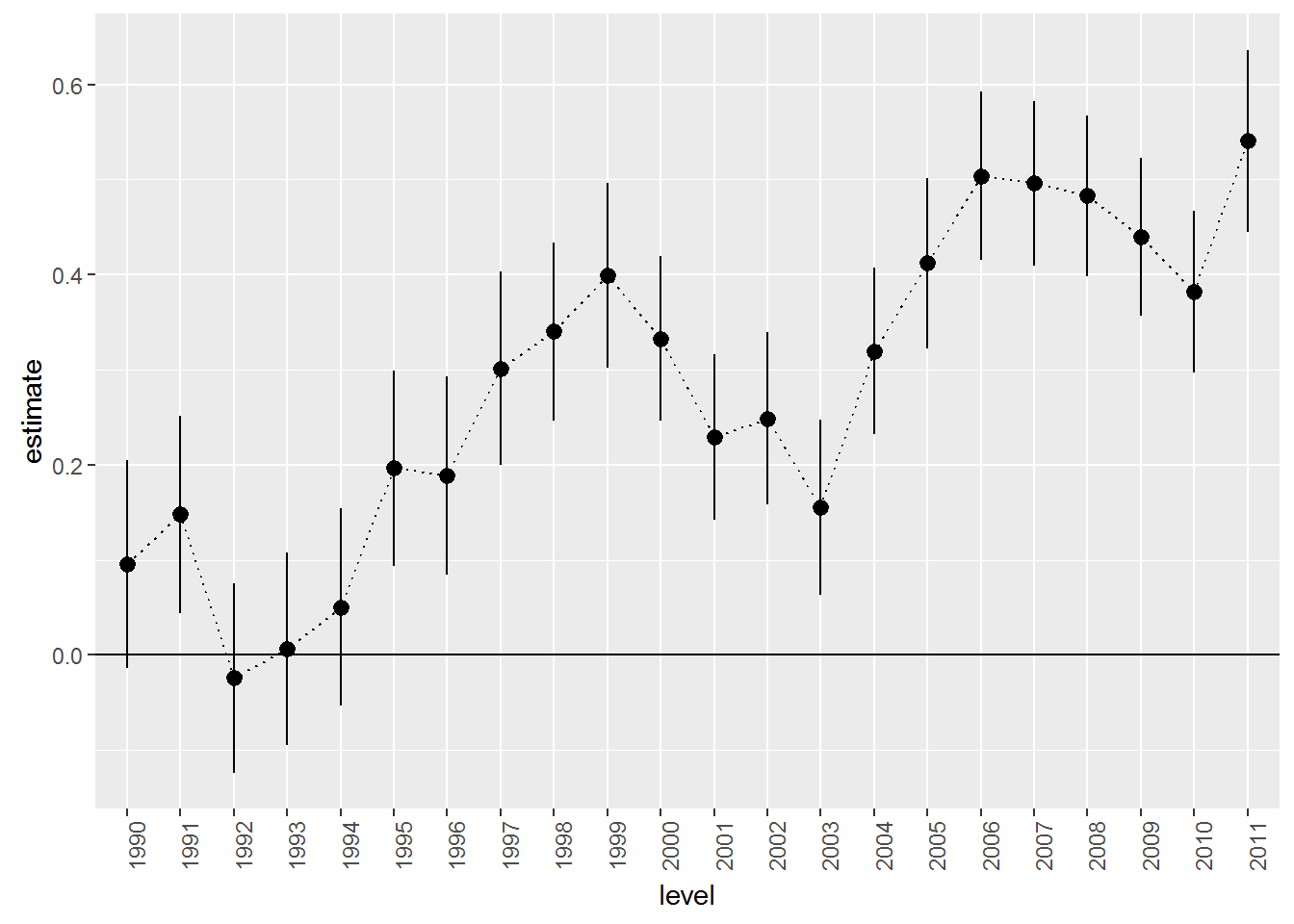
This model would be just fine if the main driver of variation in sale prices was a time trend. This is clearly false. One indication is to look at the with-in sample fit. For example, in the output above it says “Multiple R-squared: 0.064”. This means that the annual time trend only explains 6.4% of the overall variation in log prices. That is not a good predictive model. We can also evaluate the out-of-sample fit. Let’s grab the holdout data and then assume that the effect in 2011 carries over to 2012. So we are assuming that prices in 2012 are what they were in 2011:
## holdout data
auction.tractor.holdout <- auction.tractor.holdout %>%
  filter(state %in% incl.states$state)

## treat 2012 as 2011
auction.tractor.holdout$saleyear='2011'
Now we can have R calculate predictions for the prediction period using the model and then compare to what the prices actually were:
pred.df <- data.frame(log.sales=log(auction.tractor.holdout$SalePrice),
                      log.sales.pred=predict(lm.year,newdata=auction.tractor.holdout))

pred.df %>%
  ggplot(aes(x=log.sales,y=log.sales.pred)) + geom_point(size=2)  + xlab('Actual Log Prices') + ylab('Predicted Log Prices')
Yikes….not a good set of predictions: Actual log prices vary from 9 to over 11.5 and we are predicting them to be all the same. We need to improve this.
Let’s consider a model that takes into account that auctions occur throughout the year and across many states. We do this by including month and state effects:
lm.base <- lm(log(SalePrice)~state+saleyear+salemonth,
              data=auction.tractor.fit.state)

results.df <- tidy(lm.base,conf.int = T)
We wont show the estimated coefficients here (since there are too many of them), but this model explains 12% of the overall variation in log prices in the estimation sample. That’s better than before but we have also included more effects. How about in terms of predictions? Let’s check:
pred.df <- data.frame(log.sales=log(auction.tractor.holdout$SalePrice),
                      log.sales.pred=predict(lm.base,newdata=auction.tractor.holdout))

pred.df %>%
  ggplot(aes(x=log.sales,y=log.sales.pred)) + geom_point(size=2)  + geom_line(aes(x=log.sales,y=log.sales))+
  xlab('Actual Log Prices') + ylab('Predicted Log Prices') + xlim(9,12)+ylim(9,12)
Here we have added a 45 degree line to the plot. Our predictions are slightly better than before but still not great. Let’s add information about the sub-model of each tractor:
lm.trim <- lm(log(SalePrice)~state+saleyear+salemonth + fiSecondaryDesc,
              data=auction.tractor.fit.state)

results.trim.df <- tidy(lm.trim,conf.int = T)
With this model we are explaining 79.4% of the overall variation in log prices. Let’s plot the predictions with information about each model type:
pred.df <- data.frame(log.sales=log(auction.tractor.holdout$SalePrice),
                      log.sales.pred=predict(lm.trim,newdata=auction.tractor.holdout),
                      trim = auction.tractor.holdout$fiSecondaryDesc)

pred.df %>%
  ggplot(aes(x=log.sales,y=log.sales.pred)) + geom_text(aes(color=trim,label=trim),size=2) +
  geom_line(aes(x=log.sales,y=log.sales)) +
  xlab('Actual Log Prices') + ylab('Predicted Log Prices') + xlim(9,12)+ylim(9,12) +
  theme(legend.position="none")
Ok - we are getting close to something useful. But we saw from the plots above that the age of the tractor was important in explaining prices so let’s add that to the model as a factor:
auction.tractor.fit.state <- auction.tractor.fit.state %>%
  filter(MachineAge >= 0) %>%
  mutate(MachineAgeCat = cut(MachineAge,
                             breaks=c(0,2,4,6,10,15,100),
                             include.lowest=T,
                             labels = c('<= 2','3-4','5-6','7-10','11-15','>15')))

lm.trim.age <- lm(log(SalePrice)~state+saleyear+salemonth + fiSecondaryDesc+MachineAgeCat,
                  data=auction.tractor.fit.state)

results.trim.age.df <- tidy(lm.trim.age,conf.int = T)
Now we are explaining 85.8% of the overall variation in log prices. Let’s take a closer look at the estimated age effects:
extract.coef(results.trim.age.df,"MachineAgeCat") %>%
  mutate(level = factor(level,levels=levels(auction.tractor.fit.state$MachineAgeCat))) %>%
  ggplot(aes(x=level,y=estimate,ymin=conf.low,ymax=conf.high,group=1)) +
  geom_pointrange() + geom_line(linetype='dotted')+
  geom_hline(aes(yintercept=0))+
  theme(axis.text.x = element_text(angle = 90, hjust = 1))+
  xlab('Machine Age')
We can think of this as an age-depreciation curve. Compared to two year old (or less) tractors, 3 to 4 year old tractors are on average word 0.181 less on the log-price scale. This corresponds to exp(0.181)-1 = 19.8% percent. 11 to 15 year old tractors are worth exp(0.757)-1=113% less than two year old or younger tractors.
We can also look at where tractors are cheapest by looking at the state effects:
extract.coef(results.trim.age.df,"state") %>%
  ggplot(aes(x=reorder(level,estimate),y=estimate,ymin=conf.low,ymax=conf.high,group=1)) +
  geom_pointrange() +
  geom_hline(aes(yintercept=0))+
  theme(axis.text.x = element_text(angle = 90, hjust = 1))+
  xlab('State')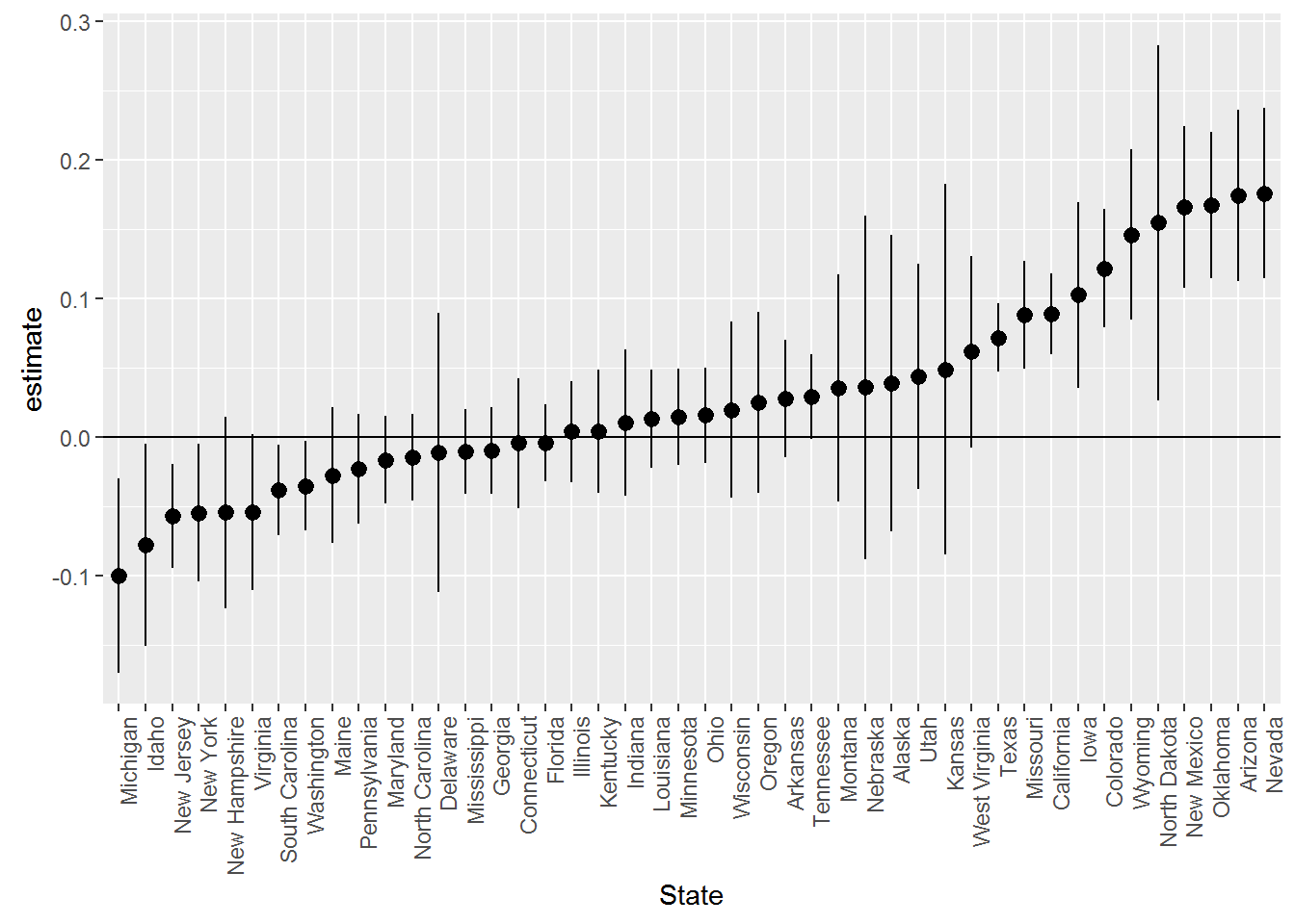
Tractors are cheapest in Michigan, Idahor and New Jersey and most expensive Oklahoma, Arizona and Nevada. Notice that we could not make these kinds of statements based on the raw data above since then we are confounding location with the type of tractor being sold at that location.
Finally, here are the predictions for the predictive model with age included:
auction.tractor.holdout <- auction.tractor.holdout %>%
  filter(MachineAge >= 0) %>%
  mutate(MachineAgeCat = cut(MachineAge,
                             breaks=c(0,2,4,6,10,15,100),
                             include.lowest=T,
                             labels = c('<= 2','3-4','5-6','7-10','11-15','>15')))


pred.df <- data.frame(log.sales=log(auction.tractor.holdout$SalePrice),
                      log.sales.pred=predict(lm.trim.age,newdata=auction.tractor.holdout),
                      trim = auction.tractor.holdout$fiSecondaryDesc)

pred.df %>%
  ggplot(aes(x=log.sales,y=log.sales.pred)) + geom_text(aes(color=trim,label=trim),size=2) +
  geom_line(aes(x=log.sales,y=log.sales)) +
  xlab('Actual Log Prices') + ylab('Predicted Log Prices') + xlim(9,12)+ylim(9,12) +
  theme(legend.position="none")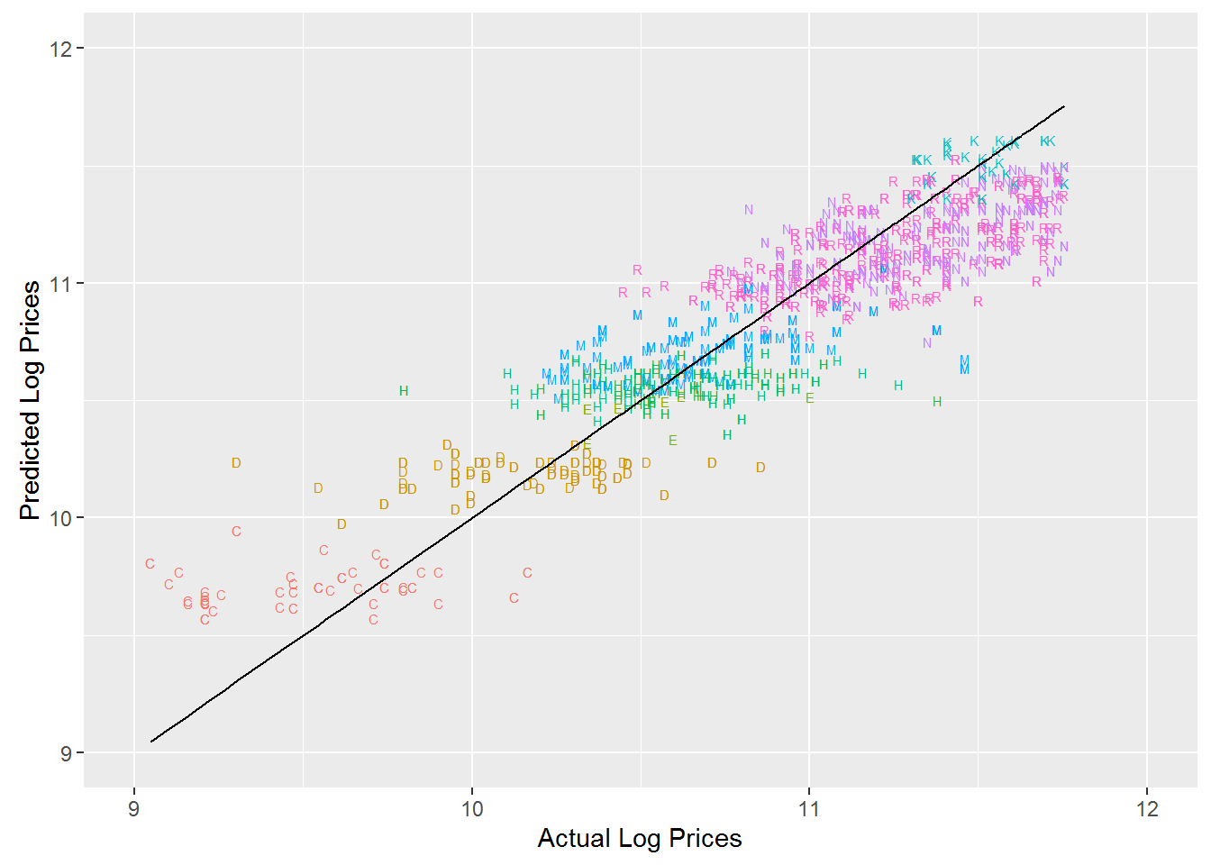
It is often useful to calculate summary measures of the predictions of the different models. Here we calculate two metrics: Mean Absolute Prediction Error and Root Mean Square Prediction Error. The smaller these are, the better is the predictive ability of the model. Both of these metrics are on the same scale as the outcome variable, log price.
pred.df <- data.frame(log.sales=log(auction.tractor.holdout$SalePrice),
                      Year = predict(lm.year,newdata=auction.tractor.holdout),
                      Base = predict(lm.base,newdata=auction.tractor.holdout),
                      Trim = predict(lm.trim,newdata=auction.tractor.holdout),
                      Time_Age = predict(lm.trim.age,newdata=auction.tractor.holdout))


pred.df %>%
  gather(model,pred,-log.sales) %>%
  group_by(model) %>%
  summarize(MAE = mean(abs(log.sales-pred)),
            RMSE = sqrt(mean((log.sales-pred)**2))) %>%
  gather(metric,value,-model) %>%
  ggplot(aes(x=model,y=value,fill=model)) + geom_bar(stat='identity') + facet_wrap(~metric)+theme(legend.position="none")
For both metrics we see that the model with both trim and age seems to do the best. It also had the best in-sample performance. Using this model we have an average absolute prediction error of about .2 on the log scale. Depending on the type of use of this predictive model this may and may not be an acceptable error.
Exercise
We still haven’t used any of the specific tractor characteristics as additional predictive information. Try to add Enclosure (the type of “cabin” of the tractor), Travel_Controls (part of controlling the machine) and Ripper (the attachment that goes in the ground top cultivate the soil). You need to throw out data since there is limited information for some of the levels of these variables. You can verify this as follows:
table(auction.tractor.fit.state$Enclosure)##
## EROPS EROPS AC EROPS w AC OROPS
## 1008 1 2955 7639table(auction.tractor.fit.state$Travel_Controls)##
## Differential Steer Finger Tip Lever
## 2669 936 70
## None or Unspecified Pedal
## 7919 3table(auction.tractor.fit.state$Ripper)##
## Multi Shank None or Unspecified Single Shank
## 1049 9740 808
## Yes
## 1You should drop the data for those levels with only very few auctions:
auction.tractor.fit.state.char <- auction.tractor.fit.state %>%
  filter(!Ripper=='Yes',!Travel_Controls=='Pedal',!Enclosure=='EROPS AC')
We lose only 5 observations by doing this. Now use this data to see whether you can improve the models above - both within and out of sample.
Case Study: Weather Patterns and Bike Commuting
 Let’s see how weather impacts bike demand in New York City’s citibike system. The data file bike_demand.rds contains trip data for three months, June-August 2015, aggregated to the hourly level. Each row in the data is a month-day-hour record with the total number of trips occurring in that month-day-hour window. The data file also contains day-hour weather information for the smae three month period. These have been scraped of the web from the web-site www.wunderground.com (if you are interested in the details of how to do this in R, you can find the code in this file).
The weather data was merged with the bike trip data at the month-day-hour level. We can now investigate how sensitive bike demand is to weather. Here we will analyze the aggregate demand data. In an exercise you can try to see whether the results on the aggregate data is replicated on the two individual user segments present in the data. It is also possible to carry out the analysis by segmenting demand spatially, e.g., demand at individual bike stations.
We start by loading the data and then setting up a model that has weekday and hour effects along with rain, temperature and humidity effects:
bike.demand <- readRDS('data/bike_demand.rds')

lm.bike <- lm(log(n)~weekday+hour+RainCat+TempCat+HumidCat,data=bike.demand)

bike.results <- tidy(lm.bike,conf.int=T)
First, let’s look at effects of rain on bike demand:
extract.coef(bike.results,"RainCat") %>%
  ggplot(aes(x=level,y=estimate,ymin=conf.low,ymax=conf.high,group=1)) +
  geom_pointrange() + geom_line(linetype='dotted')+
  geom_hline(aes(yintercept=0))+
  theme(axis.text.x = element_text(angle = 45, hjust = 1))+
  xlab('Amount of Rain (Inches)')+
  ggtitle('Rain Effects on Bike Demand')
The left level is 0.00, i.e., no precipitation. These are large effects. A small amount of rain, less than 0.05 inches, reduces demand by .58 on the log scale. This is equivalent to a exp(-0.58)-1=44% drop in number of trips! The effects are even more dramatic for large amounts of rain. Note that the effect is slightly smaller for the largest rain level compared to the medium sized levels. Why might that be?
Here are the effects of temperature:
extract.coef(bike.results,"TempCat") %>%
  ggplot(aes(x=level,y=estimate,ymin=conf.low,ymax=conf.high,group=1)) +
  geom_pointrange() + geom_line(linetype='dotted')+
  geom_hline(aes(yintercept=0))+
  theme(axis.text.x = element_text(angle = 90, hjust = 1))+
  xlab('Temperature (F)')+
  ggtitle('Temperature Effects on Bike Demand')
This is an inverse U-shape: Compared to the coolest days, trip demand increases with warmer temperatures and then levels off. For the hottest days we see a slight decline in trip demand (although this is not very precisely estimated).
Here are the effects of humidity:
extract.coef(bike.results,"HumidCat") %>%
  ggplot(aes(x=level,y=estimate,ymin=conf.low,ymax=conf.high,group=1)) +
  geom_pointrange() + geom_line(linetype='dotted')+
  geom_hline(aes(yintercept=0))+
  theme(axis.text.x = element_text(angle = 90, hjust = 1))+
  xlab('Percent Humidity')+
  ggtitle('Humidity Effects on Bike Demand')
Increasing humidity reduces demand for bikes. Very high humidity strongly reduces demand.
Exercise
The data file bike_demand_usertype.rds is structured the same way as the file above, except there are twice as many rows - one month-day-hour record for each user type (“Customer” and “Subscriber”). Redo the analysis above for each segment - do you find the same effects?
Copyright © 2016 Karsten T. Hansen. All rights reserved.