Predicting Binary Events
 In this section we will develop methods for predicting binary events. These are events that either occur or don’t occur. For example, will a certain customer place a new order in the next month? Clearly, this will either happen or not happen. In order to do this we need to modify our approach from the one we used when discussing linear predictive models. These were models of the mean of a continuous variable, e.g., log price. What we need to do now is to model the mean of a binary variable, e.g., a probability. If the predicted probability of the event occurring is high we will predict that it is likely that the event will occur. Since we are modelling probabilities we need to make sure that the predicted probabalities are constrained to be between zero and one. The most popular model for doing this is the Logit Model.
All data and code for the material below can be found in this R project zip file.
Logit Models
Suppose we want to understand what drives some users to click on an online banner ad. In this case we can let \(Y\) denote the binary event with \[ Y_i= \begin{cases} 1 & \text{if user i clicks on the ad,} \\ 0 & \text{otherwise.} \end{cases} \] Suppose the online advertiser randomly changes the image shown on the add from the standard image \(X=0\) to a new test image \(X=1\). We want to predict by how the test image changes the click-rate. Suppose we have data \((Y_i,X_i)\) from a large set of users. Some users were exposed to the standard image while others were exposed to the new image. A logit model will model the click rate as \[ {\rm Pr}(Y_i=1|X_i) = \frac{\exp\lbrace \beta_0 + \beta_X X_i \rbrace }{1.0 + \exp\lbrace \beta_0 + \beta_X X_i \rbrace}, \] where \(\beta_0\) and \(\beta_X\) are unknown parameters to be determined by the historical data. Let’s make some quick observations. First, this model constrains the predicted probabilities to be between zero and one. Second, we can use this model to see what the change in click-rate will be when we change the image. This is easy - just plug in: \[ {\rm Pr}(\text{click}|\text{standard image}) = {\rm Pr}(Y_i=1|X_i=0) = \frac{\exp\lbrace \beta_0 \rbrace }{1.0 + \exp\lbrace \beta_0 \rbrace}. \] Using the historical data (and the power of R!) we can determine \(\beta_0\) - we will see how to do this below. Similarly, \[ {\rm Pr}(\text{click}|\text{new image}) = {\rm Pr}(Y_i=1|X_i=1) = \frac{\exp\lbrace \beta_0 + \beta_X \rbrace }{1.0 + \exp\lbrace \beta_0 + \beta_X \rbrace}. \] Therefore we get \[ \Delta(\text{click rate}) \equiv \frac{\exp\lbrace \beta_0 + \beta_X \rbrace }{1.0 + \exp\lbrace \beta_0 + \beta_X \rbrace} - \frac{\exp\lbrace \beta_0 \rbrace }{1.0 + \exp\lbrace \beta_0 \rbrace}. \]
Case Study: Titanic
 You are about to board the Titanic - would you rather be Jack or Rose? Well, of course we know what happened in the movie - but was this representative of the actual survival rates of rich young women vs. poor young men? And what about old men or women? Let’s build a logit model to predict survival probabilities for different traveller segments on the Titanic.
First, we need the actual passenger data for Titanic with information on demographics and survival outcomes. It turns out that this exists - although it is incomplete: We only have survival information on 1309 of the more than 2000 passengers and complete demographics only for 1046 passengers. However, let’s see what we can do with what we have. First, load the data and see what variables we have:
## load libraries
library(tidyverse)

## get data
titanic <- readRDS('data/titanic.rds')

## what's in the data?
head(titanic)
## pclass survived name sex age sibsp
## 1 1st Yes Allen, Miss. Elisabeth Walton female 29.0000 0
## 2 1st Yes Allison, Master. Hudson Trevor male 0.9167 1
## 3 1st No Allison, Miss. Helen Loraine female 2.0000 1
## 4 1st No Allison, Mr. Hudson Joshua Crei male 30.0000 1
## 5 1st No Allison, Mrs. Hudson J C (Bessi female 25.0000 1
## 6 1st Yes Anderson, Mr. Harry male 48.0000 0
## parch ticket fare cabin embarked boat body
## 1 0 24160 211.3375 B5 Southampton 2 NA
## 2 2 113781 151.5500 C22 C26 Southampton 11 NA
## 3 2 113781 151.5500 C22 C26 Southampton NA
## 4 2 113781 151.5500 C22 C26 Southampton 135
## 5 2 113781 151.5500 C22 C26 Southampton NA
## 6 0 19952 26.5500 E12 Southampton 3 NA
## home.dest
## 1 St Louis, MO
## 2 Montreal, PQ / Chesterville, ON
## 3 Montreal, PQ / Chesterville, ON
## 4 Montreal, PQ / Chesterville, ON
## 5 Montreal, PQ / Chesterville, ON
## 6 New York, NYOk - looks like we have class of travel, survival outcome, name, gender, age. There is also information on number of siblings/spouses aboard (sibsp) and number of parents/childen aboard (parch). You can also see ticket number and price, cabin number, where the traveller embarked and home destination. For survivors you can see which lifeboard they were on and for non-survivors you can see whether the body was recovered.
To see what might matter, let’s quickly make some bar charts focusing on class of travel, age and gender:
## by class of travel
titanic %>%
  ggplot(aes(x=pclass,fill=survived)) + geom_bar(position='dodge') + xlab('Class of Travel')
## by gender
titanic %>%
ggplot(aes(x=sex,fill=survived)) + geom_bar(position='dodge') 
## by age
titanic %>%
  filter(!age=='NA') %>%
  mutate(age.f=cut(age,breaks=c(0,20,30,40,50,60,100))) %>%
  ggplot(aes(x=age.f,fill=survived)) + geom_bar(position='dodge') + xlab('Age Group')
Hmm…it’s pretty clear that passengers travelling on 3rd class didn’t fare well compared to 1st and 2nd class passengers, and 2nd class passengers were worse off compared to 1st class. We also see a huge gender effect - many more female passengers survived. It is a bit harder to judge the age effect. However, it seems like the survival rate is much lower for 20-30 year olds than any of the other categories.
Based on these summaries, it seems reasonable to try out a logit model with class of travel, gender and age as predictor variables. The syntax for setting up a logit model is more or less the same as the one we used for linear predictive models:
## remove observations with missing age, define age groups and survival outcome
titanic.est <- titanic %>%
  filter(!age=='NA') %>%
  mutate(age.f=cut(age,breaks=c(0,20,30,40,50,100)),
         lsurv = survived=='Yes')


## define logit model: class of travel, gender, age group ----------------------
logit.titanic.A <- glm(lsurv~pclass+sex+age.f,
                       data=titanic.est,
                       family=binomial(link="logit"))
This sets up a logit model for predicting the event that survived is equal to Yes. You can see the individual effects by looking at the results:
summary(logit.titanic.A)##
## Call:
## glm(formula = lsurv ~ pclass + sex + age.f, family = binomial(link = "logit"),
## data = titanic.est)
##
## Deviance Residuals:
## Min 1Q Median 3Q Max
## -2.4441 -0.7114 -0.4554 0.7079 2.3703
##
## Coefficients:
## Estimate Std. Error z value Pr(>|z|)
## (Intercept) 2.9351 0.2750 10.673 < 2e-16 ***
## pclass2nd -1.1845 0.2250 -5.264 1.41e-07 ***
## pclass3rd -2.1536 0.2227 -9.672 < 2e-16 ***
## sexmale -2.4950 0.1651 -15.110 < 2e-16 ***
## age.f(20,30] -0.5006 0.2122 -2.359 0.018333 *
## age.f(30,40] -0.4946 0.2469 -2.003 0.045192 *
## age.f(40,50] -1.0336 0.2891 -3.575 0.000351 ***
## age.f(50,100] -1.3490 0.3402 -3.965 7.34e-05 ***
## ---
## Signif. codes: 0 '***' 0.001 '**' 0.01 '*' 0.05 '.' 0.1 ' ' 1
##
## (Dispersion parameter for binomial family taken to be 1)
##
## Null deviance: 1414.6 on 1045 degrees of freedom
## Residual deviance: 992.7 on 1038 degrees of freedom
## AIC: 1008.7
##
## Number of Fisher Scoring iterations: 4In a moment we will use R to automatically generate preditions for different traveller segments, but before we do that it might be instructive to see how to do this manually. Suppose we wanted the predicted survival probability for 25 year old males, travelling on 3rd class. We can piece together the \(\beta\) effects for this segment by simply picking out the relevant ones from the table above - remembering to always include the intercept: \[ 2.935 - 2.154 - 2.495 - 0.501 \approx -2.22 \] Then - applying the logit formula - we get a predicted survival rate of \[ {\rm Pr}(\text{survival}| \text{25 year, 3rd class, male} ) = exp(-2.22)/(1.0 + exp(-2.22)) \approx 9.8\% \] Those are bad odds - only 1 in 10 survived. Let’s calculate this for all segments. To do this we create a new data frame where each row is a segment for which we want a predicted survival rate:
## create prediction array
pred.df <- expand.grid(pclass=levels(titanic.est$pclass),
                       sex=levels(titanic.est$sex),
                       age.f=levels(titanic.est$age.f))

## make predictions
pred.df$Prob <- predict(logit.titanic.A,
                        newdata = pred.df,
                        type = "response")
The data frame pred.df contains all possible combinations of our three predictor variables. Sometimes - when you have many predictor variables - you might not be interested in all combinations and you would only use a subset of all possibilities. Here we will use all of them (30 in total). The second command use the logit model to predict the probability (“response”) for each of the rows in pred.df.
Let’s check that our manual calculation above was correct:
pred.df %>%
  filter(sex=='male', pclass=='3rd')
## pclass sex age.f Prob
## 1 3rd male (0,20] 0.15272063
## 2 3rd male (20,30] 0.09849798
## 3 3rd male (30,40] 0.09903535
## 4 3rd male (40,50] 0.06025639
## 5 3rd male (50,100] 0.04468277These are the predicted survival rates for males travelling on 3rd class. We can see what we got it right above.
At this point it might be fun to visualize the predictions for all segments:
## plot predictions
pred.df %>%
  ggplot(aes(x=age.f,y=Prob,group=sex,color=sex)) + geom_line(linetype='dotted') +
  geom_point() +
  ylab('Survival Probability') + xlab('Age Group') +
  facet_wrap(~pclass) +
  theme(axis.text.x = element_text(angle = 45, hjust = 1),
        plot.title=element_text(size=14))+
  ggtitle('Predicted Survival Probability by Class of Travel, Gender and Age')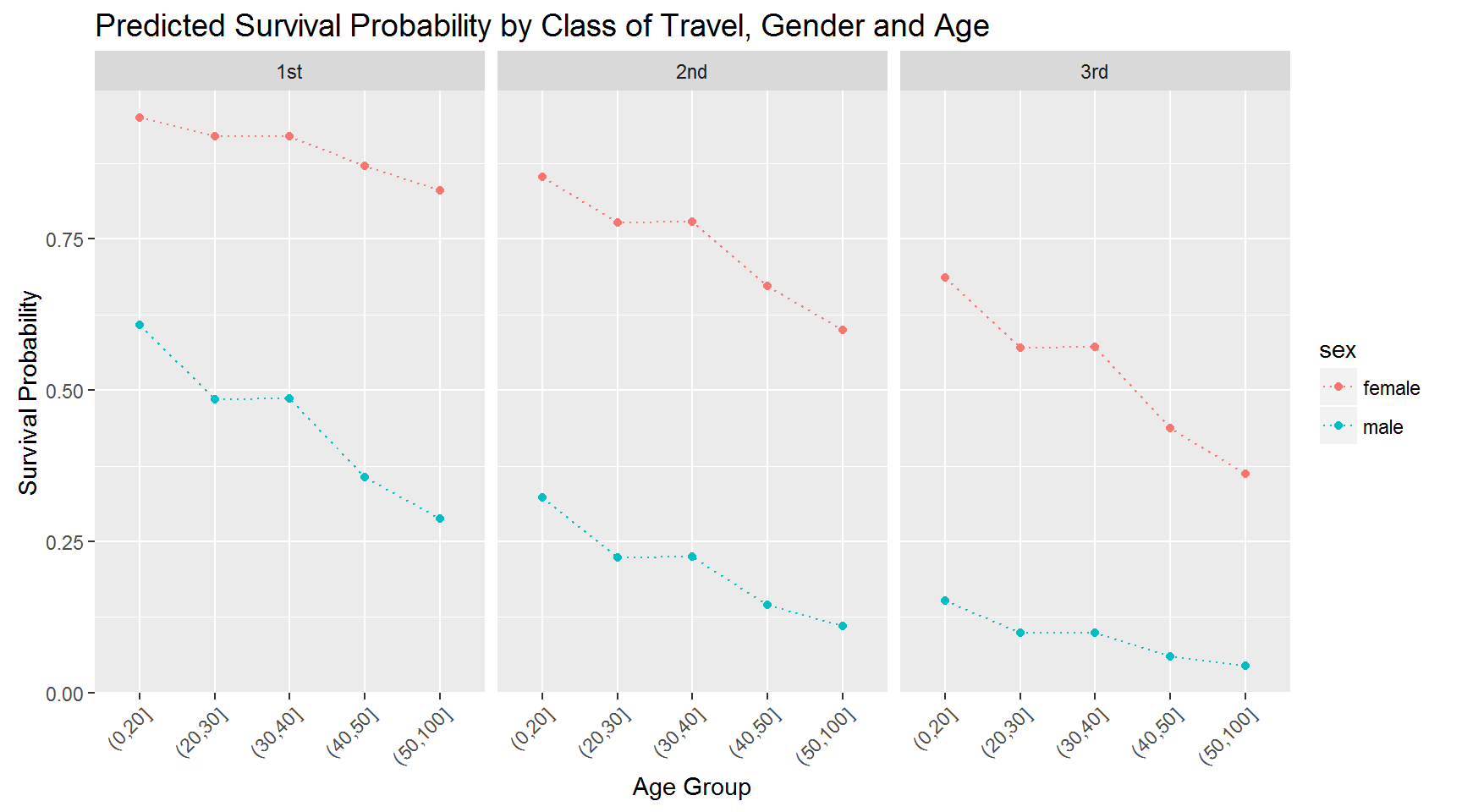
What would you conclude about demographics and survival rates based on this?
Is the model above reasonable? Maybe - but one objection we could raise is the way we have modelled the impact of gender and class of travel. Notice that by design, the effect of gender is the same for every class of travel. This is a consequence of the additivity assumption implicit in the model above. Specifically, the difference in the sum of \(\beta\)’s for males and females on 1st class is identical to the difference in the sum of \(\beta\)’s for males and females on 3rd class. We can change this by adding an interaction in the model:
logit.titanic.B <- glm((survived=='Yes')~pclass*sex+age.f,
                       data=titanic.est,
                       family=binomial(link="logit"))

summary(logit.titanic.B)
##
## Call:
## glm(formula = (survived == "Yes") ~ pclass * sex + age.f, family = binomial(link = "logit"),
## data = titanic.est)
##
## Deviance Residuals:
## Min 1Q Median 3Q Max
## -2.8806 -0.7007 -0.5617 0.4711 2.3745
##
## Coefficients:
## Estimate Std. Error z value Pr(>|z|)
## (Intercept) 4.13307 0.50783 8.139 4.00e-16 ***
## pclass2nd -1.44070 0.56977 -2.529 0.011454 *
## pclass3rd -3.88608 0.51031 -7.615 2.63e-14 ***
## sexmale -3.87041 0.49358 -7.841 4.45e-15 ***
## age.f(20,30] -0.54983 0.20878 -2.634 0.008449 **
## age.f(30,40] -0.55087 0.24794 -2.222 0.026296 *
## age.f(40,50] -1.09615 0.30633 -3.578 0.000346 ***
## age.f(50,100] -1.54195 0.38334 -4.022 5.76e-05 ***
## pclass2nd:sexmale -0.03774 0.63170 -0.060 0.952354
## pclass3rd:sexmale 2.44968 0.54041 4.533 5.82e-06 ***
## ---
## Signif. codes: 0 '***' 0.001 '**' 0.01 '*' 0.05 '.' 0.1 ' ' 1
##
## (Dispersion parameter for binomial family taken to be 1)
##
## Null deviance: 1414.62 on 1045 degrees of freedom
## Residual deviance: 943.93 on 1036 degrees of freedom
## AIC: 963.93
##
## Number of Fisher Scoring iterations: 5The gender effect now depends on class of travel: In 1st class, the gender effect for males and females is -3.87. For 3rd class it is -3.87+2.45 = -1.42. What does this mean? It means that the relative difference in survival rates for males and females is much bigger in 1st class than 3rd class. We can better by visualizing the implied survival rates:
pred.df$Prob <- predict(logit.titanic.B,
                        newdata = pred.df,
                        type = "response")

pred.df %>%
  ggplot(aes(x=age.f,y=Prob,group=sex,color=sex)) + geom_line(linetype='dotted') +
  geom_point() +
  ylab('Survival Probability') + xlab('Age Group') +
  facet_wrap(~pclass) +
  theme(axis.text.x = element_text(angle = 45, hjust = 1),
        plot.title=element_text(size=14))+
  ggtitle('Predicted Survival Probability by Class of Travel, Gender and Age')
Compare this to the previous plot.
One thing we haven’t done is to see how well our model actually predicts the data. Rather than go into this, we will do this in the context of another case study.
Case Study: Avoiding Buying a Lemon
 This is an application where we will develop a risk-scoring model for cars using the logit model. The data set car.rds contains 59,754 rows where each row represents a car bought at an auction. There is information on each car’s characteristics and whether or not the car subsequently turned out to be a “lemon”, i.e., a low-quality car with serious defects (the variabel IsBadBuy). This was measured by a post-purchase inspection. We will use this data to develop a scoring model for prospective auction car purchases so we can avoid the lemons before buying them.
Let’s get the data and then set up two logits: One which just includes the make of each car as a predictor and another which also include a list of car characteristics. The first logit represents a “limited information” scenario where we only have data on the make of the car.
## load libraries
library(tidyverse)
library(scales)

## load data
car <- readRDS('data/car.rds')


## set up logit model A
logit.car.A <- glm(IsBadBuy~Make,
                   data=car,
                   family=binomial(link="logit"))

## set up logit model B
logit.car.B <- glm(IsBadBuy~Size+Make+VNST+IsOnlineSale+VehicleAge+Transmission+WheelType+Auction,
                   data=car,
                   family=binomial(link="logit"))
Now let’s use these models to predict the risk of a car being a lemon. The data set car_test.rds contains a holdout sample of 10,000 cars. Let’s use our model to predict the risk for each of these cars.
## load test data
car.test <- readRDS('data/car_test.rds')

## get predictions
car.test <- car.test %>%
  mutate(Prob.IsBadBuy.A=predict(logit.car.A,newdata = car.test,type = "response"),
         Prob.IsBadBuy.B=predict(logit.car.B,newdata = car.test,type = "response"))
Let’s make a histogram of predicted risk for each model:
## compare prediction distributions
car.test %>%
  select(Prob.IsBadBuy.A,Prob.IsBadBuy.B) %>%
  gather(model,prediction) %>%
  ggplot(aes(x=prediction,fill=model)) + geom_histogram(alpha=0.5,position = "identity")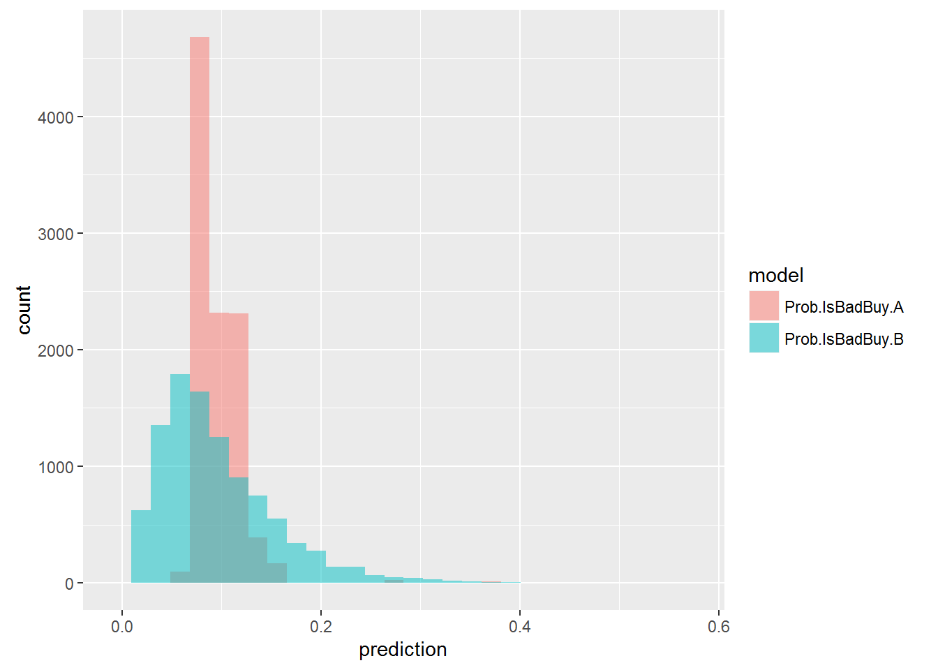
Notice the difference in spread of these two distributions: For model A there is a very limited range of predicted risk, tightly clustered around the average risk (just arond 10%). Model B is much more discerning, clearly ruling out some cars to be lemons, while predicting others cars to have highly elevated risk (2 to 3 times as large as the average).
How can we use the models to make decisions? To see one possible use, we can perform what is called a “decile analysis”: We first rank the risk of all 10,000 cars as predicted by the model. The we divide these into ten groups (deciles) from worst to best. Then we compute the observed risk in the hold-out sample for each group (i.e., the fraction of lemons). If the model is any good we should expect the ratio of observed risk to vary across groups in a consistent way. Let’s check by developing a “gains” or “lift chart”:
n.bad = sum(car.test$IsBadBuy==1)
n.test = nrow(car.test)
overall.bad = n.bad/n.test

lift.A <- car.test %>%
  mutate(dec.A = factor(ntile(Prob.IsBadBuy.A,10))) %>%
  group_by(dec.A) %>%
  summarize(n = n(),
            count.bad = sum(IsBadBuy==1)) %>%
  mutate(ratio.total=count.bad/n.bad) %>%
  arrange(desc(ratio.total)) %>%
  mutate(cumul.car = cumsum(n/n.test),
         cumul.lift = cumsum(ratio.total))

lift.B <- car.test %>%
  mutate(dec.B = factor(ntile(Prob.IsBadBuy.B,10))) %>%
  group_by(dec.B) %>%
  summarize(n = n(),
            count.bad = sum(IsBadBuy==1)) %>%
  mutate(ratio.total=count.bad/n.bad) %>%
  arrange(desc(ratio.total)) %>%
  mutate(cumul.car = cumsum(n/n.test),
         cumul.lift = cumsum(ratio.total))
What we have done here - for each of the two logit models - is first to divide all the 10,000 predicted risks into deciles (using the ntile command). We then group the data by risk decile and count the number (and ratio) of lemons in each decile. Finally we compute the cummulative ratio of cars in each decile and lemons in each decile. The result is (for model B):
## # A tibble: 10 × 6
##     dec.B     n count.bad ratio.total cumul.car cumul.lift
##    <fctr> <int>     <int>       <dbl>     <dbl>      <dbl>
## 1      10  1000       239  0.24117053       0.1  0.2411705
## 2       9  1000       154  0.15539859       0.2  0.3965691
## 3       8  1000       146  0.14732593       0.3  0.5438951
## 4       7  1000        88  0.08879919       0.4  0.6326942
## 5       5  1000        85  0.08577195       0.5  0.7184662
## 6       6  1000        78  0.07870838       0.6  0.7971746
## 7       4  1000        59  0.05953582       0.7  0.8567104
## 8       3  1000        56  0.05650858       0.8  0.9132190
## 9       2  1000        44  0.04439960       0.9  0.9576186
## 10      1  1000        42  0.04238143       1.0  1.0000000
So 10% of all cars was in the first decile (that’s what decile means!), but 24% of all lemons was also in the first decile. Similarly, 20% of all cars were in the first two deciles, but 39.7% of all lemons was in this group. This is usually displayed like this:
lift.B %>%
  ggplot(aes(x=cumul.car,y=cumul.lift,group=1)) + geom_line() + geom_point() +
  geom_text(aes(label=paste0(format(100*cumul.lift,digits = 2),"%")),hjust=1, vjust=-0.5,size=4)+
  geom_line(aes(y=cumul.car),color='red') +
  scale_y_continuous(labels=percent,limits=c(0,1))+
  scale_x_continuous(labels=percent,limits=c(0,1),breaks=seq(0,1,.1))+
  ggtitle('Lift Chart - Model B')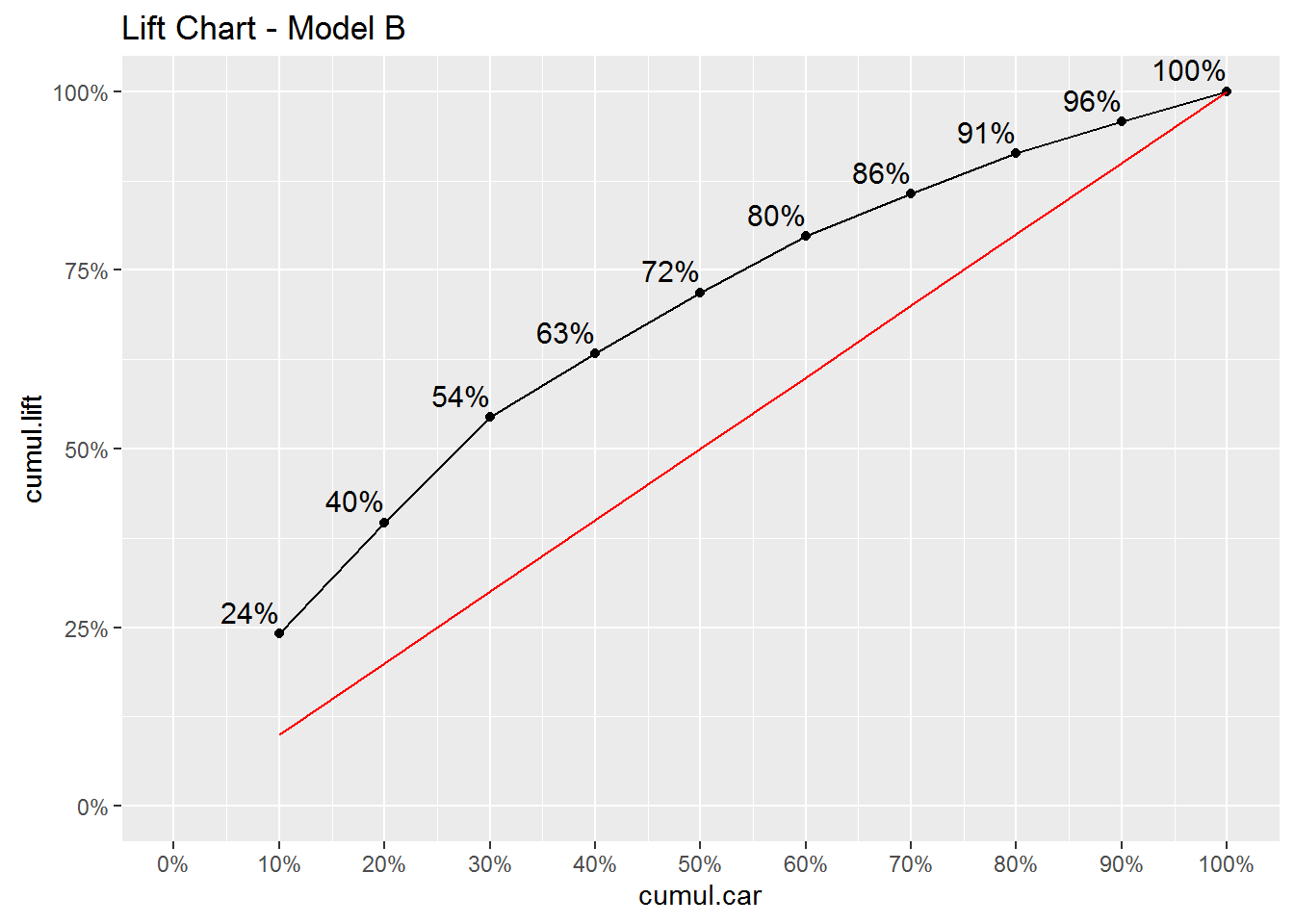
How to read this lift chart? The red line is a 45 degree line. This line represents a situation where we have no useful information what so ever in predicting whether or not a car is a bad buy. In this case the 10% most risky purchases would just be a 10% random sample of the 10,000 cars in the holdout sample and therefore would represent 10% of all lemons. The black line represents the “lift” created by the model: The chart shows that the group of 10% most risky car purchases as predicted by the model, is responsible for 24% of all lemons. The group consisting of the worst 20% is responsible for 40% of all lemons. This is not perfect - you will often make a wrong purchase - but it is clearly better than not using a model.
You can see how this information can be used for decision making: Let’s say you see a car coming up for auction. In fact, let’s say it is the car in the hold-out sample with id (the variable RefId) equal to 11939:
car.test %>% filter(RefId==11939) %>% glimpse()## Observations: 1
## Variables: 36
## $ RefId <int> 11939
## $ IsBadBuy <fctr> 0
## $ PurchDate <chr> "10/28/2009"
## $ Auction <chr> "OTHER"
## $ VehYear <int> 2008
## $ VehicleAge <fctr> 1
## $ Make <chr> "CHEVROLET"
## $ Model <chr> "IMPALA V6 3.5L V6 SF"
## $ Trim <chr> "LT"
## $ SubModel <chr> "4D SEDAN LT 3.5L FFV"
## $ Color <chr> "BLUE"
## $ Transmission <chr> "AUTO"
## $ WheelTypeID <chr> "1"
## $ WheelType <chr> "Alloy"
## $ VehOdo <int> 87013
## $ Nationality <chr> "AMERICAN"
## $ Size <chr> "LARGE"
## $ TopThreeAmericanName <chr> "GM"
## $ MMRAcquisitionAuctionAveragePrice <chr> "9067"
## $ MMRAcquisitionAuctionCleanPrice <chr> "10415"
## $ MMRAcquisitionRetailAveragePrice <chr> "10292"
## $ MMRAcquisitonRetailCleanPrice <chr> "11748"
## $ MMRCurrentAuctionAveragePrice <chr> "10201"
## $ MMRCurrentAuctionCleanPrice <chr> "11786"
## $ MMRCurrentRetailAveragePrice <chr> "13807"
## $ MMRCurrentRetailCleanPrice <chr> "15689"
## $ PRIMEUNIT <chr> "NULL"
## $ AUCGUART <chr> "NULL"
## $ BYRNO <int> 3453
## $ VNZIP1 <int> 84104
## $ VNST <chr> "UT"
## $ VehBCost <int> 7275
## $ IsOnlineSale <fctr> No
## $ WarrantyCost <int> 2152
## $ Prob.IsBadBuy.A <dbl> 0.07476305
## $ Prob.IsBadBuy.B <dbl> 0.008928425This is a 2008 Chevy Impala. Using logit model B we are predict the lemon risk for this purchase to be less than 1%. This car belongs to the top decile where the average lemon ratio was that contains only 4% of observed lemons. So this car is among the least risky purchases in the group of least risky purchases. On the other hand, if instead we are looking at the car with id equal to 48333, we get a very different picture:
car.test %>% filter(RefId==48333) %>% glimpse()## Observations: 1
## Variables: 36
## $ RefId <int> 48333
## $ IsBadBuy <fctr> 0
## $ PurchDate <chr> "12/7/2010"
## $ Auction <chr> "OTHER"
## $ VehYear <int> 2001
## $ VehicleAge <fctr> 9
## $ Make <chr> "LEXUS"
## $ Model <chr> "RX300 2WD"
## $ Trim <chr> NA
## $ SubModel <chr> "4D SPORT UTILITY"
## $ Color <chr> "SILVER"
## $ Transmission <chr> "AUTO"
## $ WheelTypeID <chr> "1"
## $ WheelType <chr> "Alloy"
## $ VehOdo <int> 82610
## $ Nationality <chr> "OTHER ASIAN"
## $ Size <chr> "MEDIUM SUV"
## $ TopThreeAmericanName <chr> "OTHER"
## $ MMRAcquisitionAuctionAveragePrice <chr> "6855"
## $ MMRAcquisitionAuctionCleanPrice <chr> "7782"
## $ MMRAcquisitionRetailAveragePrice <chr> "8905"
## $ MMRAcquisitonRetailCleanPrice <chr> "10705"
## $ MMRCurrentAuctionAveragePrice <chr> "7255"
## $ MMRCurrentAuctionCleanPrice <chr> "8212"
## $ MMRCurrentRetailAveragePrice <chr> "10569"
## $ MMRCurrentRetailCleanPrice <chr> "12561"
## $ PRIMEUNIT <chr> "NO"
## $ AUCGUART <chr> "GREEN"
## $ BYRNO <int> 22808
## $ VNZIP1 <int> 70401
## $ VNST <chr> "LA"
## $ VehBCost <int> 9325
## $ IsOnlineSale <fctr> No
## $ WarrantyCost <int> 1413
## $ Prob.IsBadBuy.A <dbl> 0.3809524
## $ Prob.IsBadBuy.B <dbl> 0.5757399This is a 2001 Lexus SUV. This car has a predicted lemon risk of 58%! We might still want to make a bid for this car but obviously only if we could get it at an extremely low price.
Finally, for completeness here is the lift chart for model A. This model is clearly less useful than model B:
lift.A %>%
  ggplot(aes(x=cumul.car,y=cumul.lift,group=1)) + geom_line() + geom_point() +
  geom_text(aes(label=paste0(format(100*cumul.lift,digits = 2),"%")),hjust=1, vjust=-0.5,size=4)+
  geom_line(aes(y=cumul.car),color='red') +
  scale_y_continuous(labels=percent,limits=c(0,1))+
  scale_x_continuous(labels=percent,limits=c(0,1),breaks=seq(0,1,.1))+
  ggtitle('Lift Chart - Model A')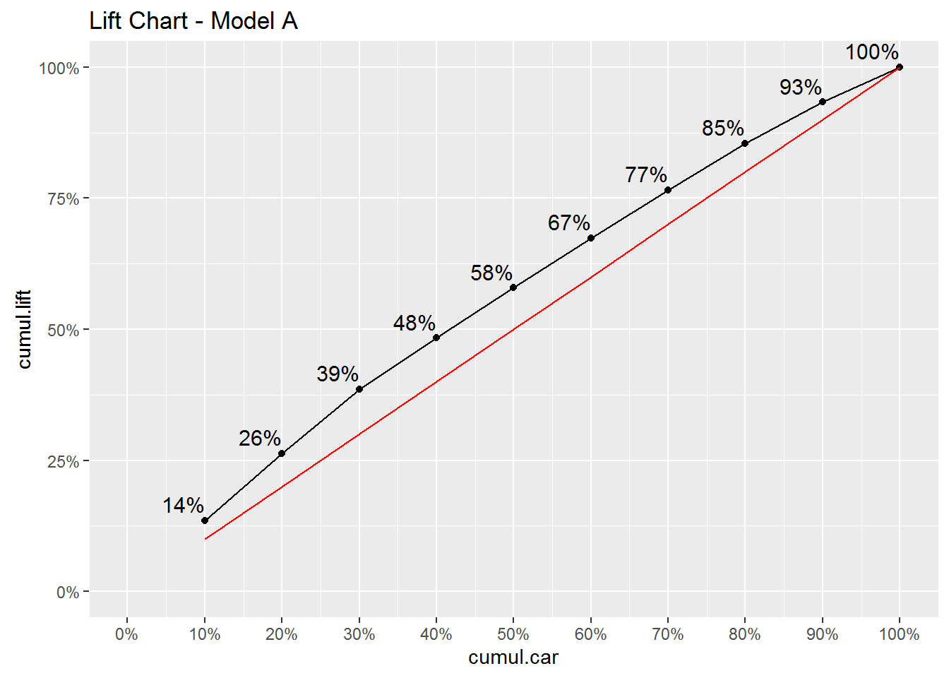
A common tool for evaluating the overall predictive ability of a logit model is to compute the confusion matrix implied by the model. The basic concept is quite simple: Suppose you were to use your model as a classification tool, i.e., for each car in the test data you should classify it as either “bad buy” or “not bad buy”. The confusion matrix is simply a tabulation of how many of these classifications your model gets right. In order to do this you need to specify a threshold above which any predicted probability is linked to “bad buy” and below to “not bad buy”. The standard threshold is 0.5:
## confusion matrix for predictions for model B
lemon.threshold <- 0.5
car.test %>%
  mutate(Pred.IsBadBuy = as.numeric(Prob.IsBadBuy.B > lemon.threshold)) %>%
  count(IsBadBuy,Pred.IsBadBuy)
## Source: local data frame [3 x 3]
## Groups: IsBadBuy [?]
##
## IsBadBuy Pred.IsBadBuy n
## <fctr> <dbl> <int>
## 1 0 0 9006
## 2 0 1 3
## 3 1 0 991Of the 10,000 cars in the test data, 9,009 were not bad buys. Our model correctly predicted that 9,006 of these were indeed not bad buys. 3 of the good cars were misclassified as bad buys. That’s very good! You might be pretty excited about your logit model at this point. Don’t be…take a look at the classification rates for bad buys - it’s horrible: There were 991 bad buys in the test data. The model classified these as bad a grand total of zero times! That’s obviously pathetic. These results are driven by the fact that the current model has very few predicted bad buy probabilities bigger than 0.5.
Case Study: Donors Choose
Let’s return to the DonorsChoose data we looked at here. The objective is to try to predict which projects gets funded. In the following we focus on projects in California:
projects <- read_rds('data/projects_201516.rds')

ca.projects <- projects %>%
  filter(school_state=="CA",!funding_status %in% c('live','reallocated')) %>%
  mutate(cost.group = factor(ntile(total_price_excluding_optional_support,15)))

ca.test <- ca.projects %>%
  sample_n(10000)

ca.train <- ca.projects %>%
  filter(!`_projectid` %in% ca.test$`_projectid`)
We only consider projects with funding status equal to either “completed” or “expired” and we reserve 5,000 projects for the test data.
logit.ca <- glm(funding_status=='completed'~primary_focus_subject+grade_level+poverty_level+school_charter+resource_type+ eligible_double_your_impact_match+cost.group+eligible_almost_home_match,
                   data=ca.train,
                   family=binomial(link="logit"))

ca.test <- ca.test %>%
  mutate(Prob.Comp=predict(logit.ca,newdata = ca.test,type = "response"),
         Pred.Comp=if_else(Prob.Comp > 0.5,'Pred.Completed','Pred.Expired'))

conf.mat <- table(ca.test$funding_status,ca.test$Pred.Comp)
conf.mat
##
## Pred.Completed Pred.Expired
## completed 3570 142
## expired 1066 222In the test data there were a total of 3712 completed projects. The model correcty classified 3570 of them as completed and misclassified 142. So the model can classify completed projects quite well. There were 1288 expired projects in the data. Of these, the model correcly classified 222 as expired. The overall accuracy of the model is defined as the ratio of correctly classified cases:
acc <- (conf.mat[1,1]+conf.mat[2,2])/sum(conf.mat)
cat('Model Accuracy=', acc)
## Model Accuracy= 0.7584The overall model accuracy is 75.8 percent.
Copyright © 2016 Karsten T. Hansen. All rights reserved.