Group Summaries
 Imagine that you are three years old and someone asks you to take a pile of Lego bricks and count the number of bricks of each color. How would you do this?
If you are a smart three year old you would intuitively use the following algorithm: First divide all bricks into separate piles of identical color, i.e., a pile of red bricks, another of green bricks and so on, and then count the number bricks in each pile. Easy.
Now imagine that you are a 25 year old analyst and your manager asks you to take the company customer database and compute average transaction size per customer for the most recent quarter. This is essentially the Lego problem and you should solve it the same way: First divide transactions into “customer piles” and then compute the average of each pile. This idea of taking a collection of objects and first sorting them and then performing some operation is also the foundation of many modern large scale computing frameworks such as MapReduce.
Group Summaries in R with dplyr
Whenever you are faced with an objective like the ones above, you should think: dplyr. This is an R package contained in the tidyverse for performing group operations. Once you understand how to use dplyr, it will change your life as a data scientist and - quite possibly - permanently make you are a happier person. Seriously.
The basic structure of a dplyr statement is
- Take some data
- Define the group assignments for the data
- Perform some operation on each group
Let us try this out on some real data. As always, you can download an Rstudio project with code and data here.
Case Study: Open Payments
Pharmaceutical and other health care companies often have financial “relationships” with medical doctors and hospitals. This involves payments and gifts from the company to the doctor. By federal law these transfers have to be publicly disclosed in a database. This means that anyone can download the data and inspect it. You can find the all the details and documentation if you click on the image to the right. The full data is very large so we will use a subset of it that only includes physicians licensed in the state of California. Let’s read in this data and rename some of the key variables (this is only to simplify the code below and is not necesarry):
library(tidyverse)
library(forcats)
op <- read_rds('data/ca_13_15.rds') %>%
  rename(Drug = Name_of_Associated_Covered_Drug_or_Biological1,
         Manufacturer = Submitting_Applicable_Manufacturer_or_Applicable_GPO_Name,
         Amount = Total_Amount_of_Payment_USDollars,
         Device = Name_of_Associated_Covered_Device_or_Medical_Supply1,
         Payment_Form = Form_of_Payment_or_Transfer_of_Value,
         Payment_Nature = Nature_of_Payment_or_Transfer_of_Value)
This file contains a total of 2,840,610 payments (=number of rows) for 102,204 physicians. We will use dplyr to compute various summaries of this data. The data is organized in a form where each row is a payment and the columns contain information about the nature of this payment. In other words, a row is a certain payment from a certain manufacturer to a certain physician, e.g., payment for a dinner where a sales rep informed a physician about a new drug. This means that the same manufacturer will show up in many rows. If a physician has received multiple payments, then the physian’s name will show up in multiple rows. This makes it easy to perform various summaries over rows.
A very common task for data like this is answering questions about who the “big players” in the market are. Let’s start with a simple query: Who are the top 10 manufacturers in terms of total payments over this three year time period? To answer this question using the Lego-logic from above we should
- Sort rows according to manufacturer to get groups containing all payments for each manufacturer
- Sum the rows for each group to get total payments for each manufacturer
- Sort the result of operation 2.
- Pick the top 10 of the sorted result in 3.
Each of these four operations have an associated “verb” in dplyr. These are group_by, summarize, arrange and slice. Once you have mastered the use of these types of operations (along with a few others), you will be able to summarize any aspect of a database.
top10.manuf <- op %>%
  group_by(Manufacturer) %>%
  summarize(total = sum(Amount)) %>%
  arrange(desc(total)) %>%
  slice(1:10)
Note the use of the “%>%”-syntax. This is referred to as chaining or piping in that each of the statements are chained together. This makes for code that is very readable - almost like reading a cook book recipe (“take the op data frame, then group it by manufacturer, then summarize each group of manufacturers in terms of total sum of payments, then sort the result and then pick the top 10”). Let’s see the top 10 companies:
top10.manuf## # A tibble: 10 x 2
## Manufacturer total
## <chr> <dbl>
## 1 Topera, Inc. 57412199
## 2 Allergan Inc. 28492131
## 3 DePuy Synthes Sales Inc. 23845012
## 4 Medtronic Vascular, Inc. 22596335
## 5 Arthrex, Inc. 20144576
## 6 Cook Incorporated 18931232
## 7 Janssen Pharmaceuticals, Inc 16159029
## 8 AstraZeneca Pharmaceuticals LP 15287157
## 9 Stryker Corporation 14566270
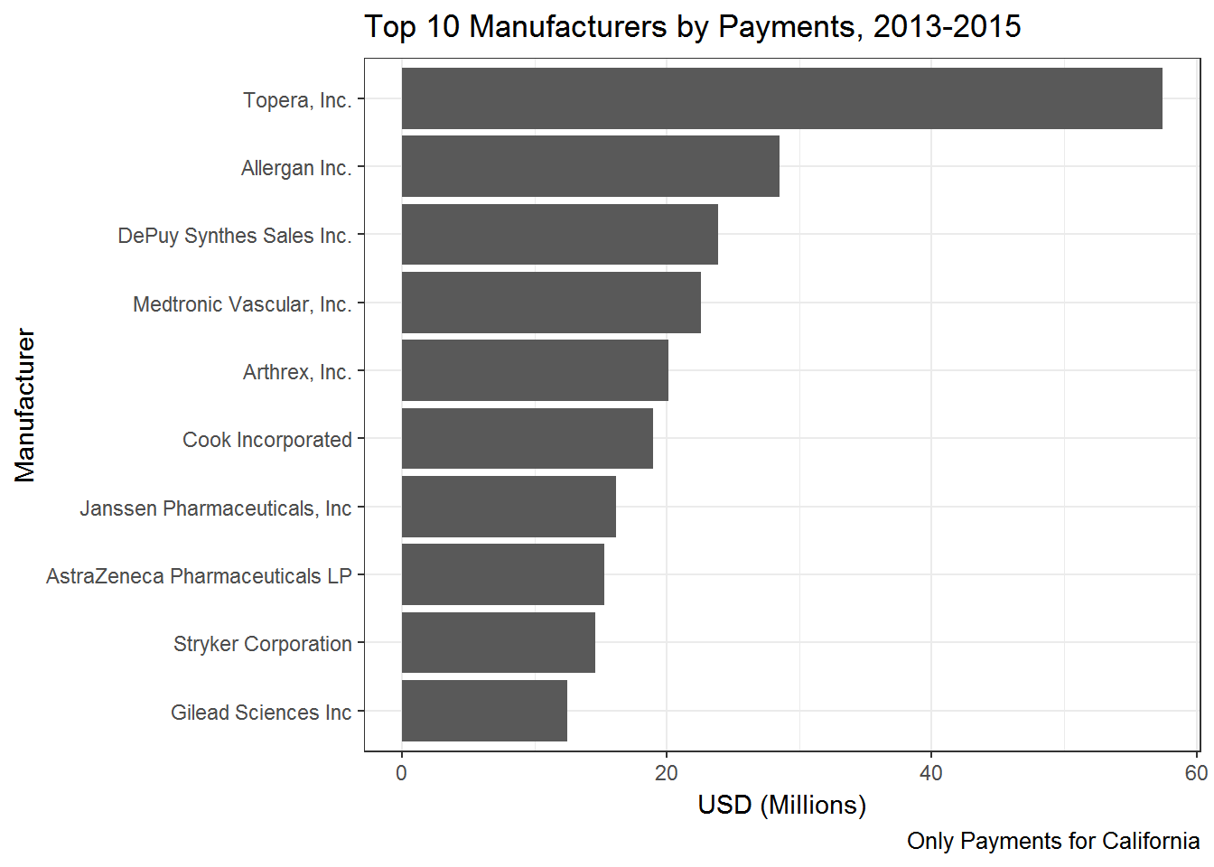
## 10 Gilead Sciences Inc 12487752Ok - so Topera spend around 57 million dollars on these kinds of payments in this three year time period - in California alone! (almost all of this amount was payments made to the founder of the company - in this case a physician).
If you were doing this summary with an objective of communicating the results to someone else, e.g., in the form of a presentation, web page or paper, you would usually visualize the results:
top10.manuf %>%
  ggplot(aes(x=fct_reorder(Manufacturer,total),y=total/1000000)) + geom_bar(stat='identity') +
  coord_flip() +
  labs(y="USD (Millions)",
       x="Manufacturer",
       title='Top 10 Manufacturers by Payments, 2013-2015',
       caption="Only Payments for California")+
  theme_bw()
Topera is clearly an outlier with more than twice the amount in payments compared to the second highest.
Next, let’s try to break down payments in terms of what drug or device the payment is meant to promote. We can simply repeat the code above except replace Manufacturer with Drug and then visualize the results. There is one twist: Not all payments are for a drug - some are for medical devices. So we start the chain by dropping any rows (i.e., payments) that are for non-drugs:
top10.drug <- op %>%
  drop_na(Drug) %>%
  group_by(Drug) %>%
  summarize(total = sum(Amount)) %>%
  arrange(desc(total)) %>%
  slice(1:10)

top10.drug %>%
  ggplot(aes(x=fct_reorder(Drug,total),y=total/1000000)) + geom_bar(stat='identity') +
  coord_flip() +
  labs(y="USD (Millions)",
       x="Manufacturer",
       title='Top 10 Drugs by Payments, 2013-2015',
       caption="Only Payments for California")+
  theme_bw()
Hello California! The top two promoted drugs are for botox treatments. The third drug, Humira, treats various inflammatory diseases and arthritis, while Invokana is a drug used in the treatment of Type 2 diabetes.
What are payments made for? We can look into this by summarize the nature of the payment:
library(stringr)    # library for easy string manipulation

payment.nature <- op %>%
  group_by(Payment_Nature) %>%
  summarize(total = sum(Amount)) %>%
  arrange(desc(total))

payment.nature %>%
  ggplot(aes(x=fct_reorder(Payment_Nature,total),y=total/1000000)) + geom_bar(stat='identity') +
  coord_flip() +
  labs(y="USD (Millions)",
       x="Nature of Payment",
       title='Payments by Nature of Payment, 2013-2015',
       caption="Only Payments for California")+
  theme_bw() +
  scale_x_discrete(labels = function(x) str_wrap(x, width = 50)) +
  theme(axis.text.y=element_text(size=7))
The biggest payments in total are made for speaking fees/service as faculty and for royalties/licences.
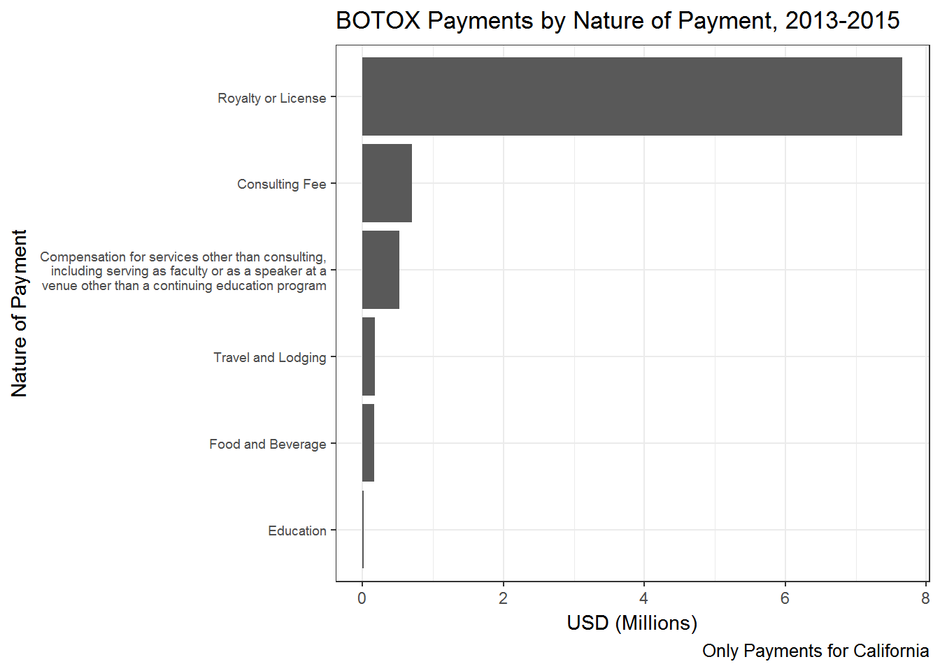
All the summaries made above can easily be made for only select types of payments (i.e., rows). Recall that the filter verb picks out select rows from a data frame. For example, we can ask: What is the nature of payments for Botox? All we have to do is insert a filter statement in the chain above that filters out all the payments for Botox:
payment.nature.botox <- op %>%
  filter(Drug=='BOTOX') %>%
  group_by(Payment_Nature) %>%
  summarize(total = sum(Amount)) %>%
  arrange(desc(total))

payment.nature.botox %>%
  ggplot(aes(x=fct_reorder(Payment_Nature,total),y=total/1000000)) + geom_bar(stat='identity') +
  coord_flip() +
  labs(y="USD (Millions)",
       x="Nature of Payment",
       title='BOTOX Payments by Nature of Payment, 2013-2015',
       caption="Only Payments for California")+
  theme_bw() +
  scale_x_discrete(labels = function(x) str_wrap(x, width = 50)) +
  theme(axis.text.y=element_text(size=7))
Ok - the manufacturer of Botox is mainly relying on Royalties and licenses as nature of payment.
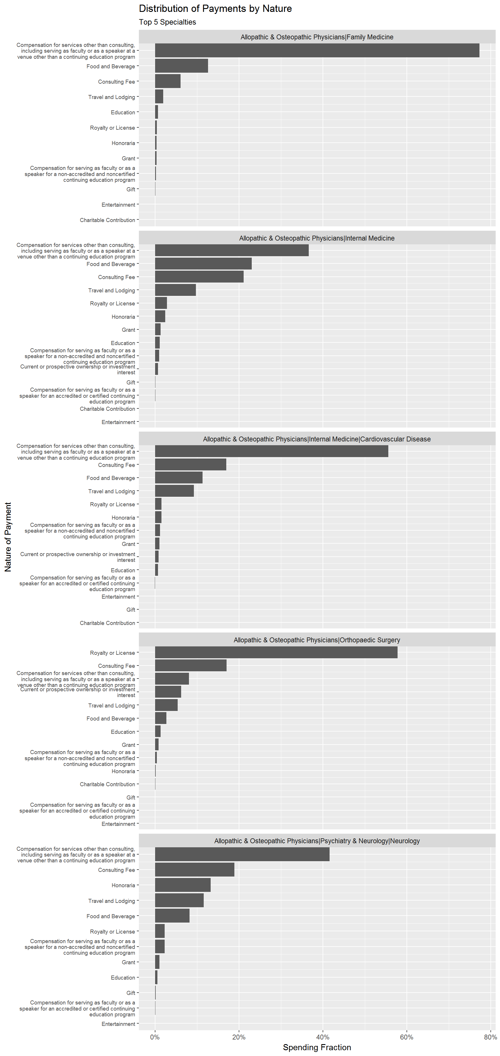
Finally, let’s see the distribution of nature of payment for the top 5 specialties. To do this, we first calculate the total payments for each specialty. We then calculate total payment for each nature of payment and specialty, and then merge in the first result in order to calculate relative payments for each nature of payment. We pick the top 5 specialties and visualize the results:
library(scales) # to plot percentages

AmountField <- op %>%
  group_by(Physician_Specialty) %>%
  summarize(total.field = sum(Amount)) %>%
  arrange(desc(total.field))


AmountNatureField <- op %>%
  group_by(Physician_Specialty,Payment_Nature) %>%
  summarize(total = sum(Amount)) %>%
  left_join(AmountField) %>%
  mutate(fraction=total/total.field) %>%
  filter(Physician_Specialty %in% AmountField$Physician_Specialty[1:5]) %>%
  ungroup() %>%
  arrange(Physician_Specialty,fraction) %>%
  mutate(order = row_number())

AmountNatureField %>%
  ggplot(aes(x=order,y=fraction)) + geom_bar(stat='identity') + coord_flip() +
  facet_wrap(~Physician_Specialty,scales='free_y',ncol=1)+
  scale_x_continuous(
    breaks = AmountNatureField$order,
    labels = str_wrap(AmountNatureField$Payment_Nature, width = 50),
    expand = c(0,0)
  )  +
  scale_y_continuous(labels=percent)+
  theme(axis.text.y=element_text(size=7))+
  labs(title='Distribution of Payments by Nature',
       subtitle='Top 5 Specialties',
       y='Spending Fraction',
       x='Nature of Payment')
For “Family Medicine” physicians we see that over 70% of all payments are made for “Services other than consulting”. For “Orthopedic Surgeons” the biggest payment type is “Royalty or License”.
Finally, let’s do quick trend analysis: How has payments changed over the three year period for the top 5 specialties?
trend.stats <- op %>%
  group_by(Program_Year,Physician_Specialty) %>%
  summarize(n.payment = n(),
            mean.payment = mean(Amount))

trend.stats %>%
  filter(Physician_Specialty %in% AmountField$Physician_Specialty[1:15]) %>%
  mutate(Physician_Specialty = str_wrap(Physician_Specialty, width = 30)) %>%
  ggplot(aes(x=factor(Program_Year),y=n.payment,group=Physician_Specialty)) + geom_point() +
  geom_line(alpha=0.5) + facet_wrap(~Physician_Specialty,scales='free') +
  labs(title='Number of Payments',
       subtitle='2013-2015',
       x='Program Year',
       y='Number of Payments')
This was a quick look at doing group summaries in R using the Open Payments database. Many other types of interesting analyses can be done on the same data.
Exercise Bike1
- Count the number of trips originating from each bike station
- What are the 5 busiest bike stations?
Now let’s look at trip durations. The average trip duration (in minutes) across all trips is
mean(citibike$tripduration)/60## [1] 16.95798Ok - just about 17 minutes. How long can trips be? The 10 longest trips were
citibike %>%
  arrange(desc(tripduration)) %>%
  slice(1:10) %>%
  select(tripduration) %>%
  mutate(hours=tripduration/3600)
## # A tibble: 10 x 2
## tripduration hours
## <int> <dbl>
## 1 2842280 789.5222
## 2 2712082 753.3561
## 3 2555456 709.8489
## 4 2453796 681.6100
## 5 2133856 592.7378
## 6 2041702 567.1394
## 7 1795721 498.8114
## 8 1774865 493.0181
## 9 1745724 484.9233
## 10 1622701 450.7503Those are some long bike trips! It is not clear exactly what sort of trips these are, but clearly they are outliers and does not represent typical behavior. Let’s see how many trips are longer than 12 hours:
sum(citibike$tripduration > 12*3600) ## [1] 610sum(citibike$tripduration > 12*3600)/nrow(citibike) ## [1] 0.0005173683There are only 610 trips longer than 12 hours - representing only 0.05% of the total number of trips. If we abstract from these outliers, the average trip is
citibike %>%
  filter(tripduration < 12*3600) %>%
  summarize(mean.trip = mean(tripduration)/60)
## # A tibble: 1 x 1
## mean.trip
## <dbl>
## 1 15.6424So the average trip is 15.6 minutes. You can get some other quick summary statistics for the data by using summary:
citibike %>%
  filter(tripduration < 12*3600) %>%
  mutate(minutes=tripduration/60) %>%
  select(minutes) %>%
  summary()
## minutes
## Min. : 1.000
## 1st Qu.: 6.917
## Median : 11.333
## Mean : 15.642
## 3rd Qu.: 19.067
## Max. :719.683The shortest trip is 1 minute while half of all trips are less than 11 minutes. There are still some large outliers in the data (notice how much larger the mean is compare to the median). To see where the outlier trips are, you can simply compute various percentiles of the data, e.g.,
quantile(citibike$tripduration/60, probs = c(0.5,0.9,0.95,0.975,0.99,0.995,1.0))## 50% 90% 95% 97.5% 99% 99.5%
## 11.33333 28.46667 36.03333 47.41667 80.90000 126.51667
## 100%
## 47371.33333Ok - so 95% of all trips are less than 36 minutes, while 99% of all trips are less than 81 minutes. Only 0.5% of trips are longer than 126.5 minutes. This is all telling us the same story - there is a long right tail of outliers. Another way of saying this is that if we plot a histogram of trip durations, almost the data is gone by the time we reach 2 hours. Let’s check:
citibike %>%
  filter(tripduration < 2*3600) %>%
  ggplot(aes(x=tripduration/60)) + geom_histogram(binwidth=0.5)
(Note: you can change the binwidth to change the smoothness of the histogram). The vast majority of trips are less than 30 minutes with very trips lasting more than 2 hours.
Next, let’s look at user behavior throughout the day. For example, we can calculate number of trips and trip duration by hour of day:
hour.activity <- citibike %>%
  filter(tripduration < 12*3600) %>%
  group_by(start.hour) %>%
  summarise(n.trips=n(),
            mean.trip.time=mean(tripduration/60))
Exercise Bike2
- Calculate number of trips and trip duration by day of week and user type
- For what hour of the day do subscribers take the longest/shortest trips?
Exercise Bike3
- Calculate average trip time by day of week for each gender.
- Do men and women exhibit similar behavior?
Copyright © 2017 Karsten T. Hansen. All rights reserved.
