Querying a SQL Database From R
There are times where you are faced with data of such a magnitude that reading the entire dataset into R - which requires that it fits in your computer’s memory - becomes problematic. One radical solution to this is: buy more memory! Ok - but what if you don’t want to do that? Is there a way where we can just leave the data in an external file and then pull the relevant sections of it whenever we need it? Yes. The standard here is a SQL database. Technically, “SQL” refers to the language used to make requests to the database but - using the power of R - we actually don’t need to know any SQL syntax to use a SQL database. There are different formats of SQL databases - in the following we will use a sqlite database as an example. This is becoming a very popular database format - in part because it ports easily to mobile platforms.
You can download all the code and data for this module as an Rstudio project here.
SQL Soccer
The file soccer.zip is a zip file containing a sqlite database on over 25,000 soccer matches for 11 European leagues in the period 2008-2016. This database has been assembled by Hugo Mathien - you can read more about the data here. If you want to try out the following code you need to first unzip the zip file (total size is around 311 MB).
You first need to install the RSQLite library (if you haven’t already). Then you need to tell R where the sqlite data is on your computer:
install.packages("RSQLite") #only do this once
install.packages("dbplyr") #only do this once
library(tidyverse)
library(RSQLite)
library(dbplyr)
# connect to sqlite database
my_db <- src_sqlite("data/database.sqlite",create = F)That’s pretty much it - R now has a direct line to the database and you can start making requests.
A SQL database will typically contain multiple “tables”. You can think of these as R data frames. What are the tables in the soccer database?
my_db## src: sqlite 3.19.3 [E:\Dropbox\Public\fall2017\mgta452\modules\databases\data\database.sqlite]
## tbls: Country, League, Match, Player, Player_Stats, sqlite_sequence, TeamOk - we have tables for country, league, match, player and so on. Let’s look at the country and league tables:
country = tbl(my_db,"Country")
league = tbl(my_db,"League")
as.data.frame(country)## id name
## 1 1 Belgium
## 2 1729 England
## 3 4735 France
## 4 7775 Germany
## 5 10223 Italy
## 6 13240 Netherlands
## 7 15688 Poland
## 8 17608 Portugal
## 9 19660 Scotland
## 10 21484 Spain
## 11 24524 Switzerlandas.data.frame(league)## id country_id name
## 1 1 1 Belgium Jupiler League
## 2 1729 1729 England Premier League
## 3 4735 4735 France Ligue 1
## 4 7775 7775 Germany 1. Bundesliga
## 5 10223 10223 Italy Serie A
## 6 13240 13240 Netherlands Eredivisie
## 7 15688 15688 Poland Ekstraklasa
## 8 17608 17608 Portugal Liga ZON Sagres
## 9 19660 19660 Scotland Premier League
## 10 21484 21484 Spain LIGA BBVA
## 11 24524 24524 Switzerland Super LeagueSo each country has its own league. Let’s do a quick data summary: calculate the average number of goals per league (i.e., country) and plot the averages in a chart:
# calculate average number of goals per country league
goals.match.country = tbl(my_db,"Match") %>%
group_by(country_id) %>%
summarise(avg.goal=mean(home_team_goal+away_team_goal)) %>%
left_join(country,by=c("country_id"="id")) %>%
arrange(desc(avg.goal))
# plot results
library(forcats)
as.data.frame(goals.match.country) %>%
ggplot(aes(x=fct_reorder(name,avg.goal),y=avg.goal)) + geom_point() +
ylab('Average Number of Goals per Match') + xlab('National League') + coord_flip() 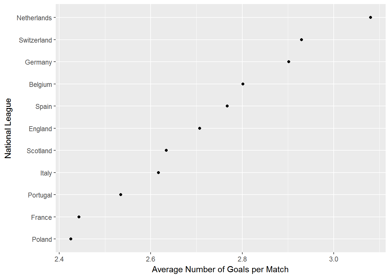
Using BigQuery in R
 Suppose your laptop has 4GB of memory, but you want to work with a 75GB dataset. This seems impossible but there are tools in R that actually can make this situation work. In this tutorial we will look at one such tool: Google’s BigQuery platform.
BigQuery is several things. Primarily it is a tool for making SQL queries to enormous datasets stored in Google’s cloud and it integrates neatly with other Google analytics tools. You can store 10GB of your own data for free - after that you have to pay. However, it is free to sign up and having signed up you can play with many of the publicly available datasets stored on the platform - totally free of charge. That is what we will do here. In the following it is assumed that you have signed up as a user on Google’s Cloud platform. More on this below.
BigQuery works through SQL. That’s great if you know SQL - not so great otherwise. However, don’t despair - there’s an R package for that! The bigrquery package allows you to make queries on data stored on BigQuery while never leaving Rstudio - and - you can do it without ever learning SQL. This truly is a great time to be alive.
The main advantage of the bigrquery package is that you can make your queries using the familiar dplyr syntax. So if you know the ins and outs of the dplyr package you are good to go. If you don’t - learn that first! In the following we will assume that you are familiar with the basics of dplyr. We will also assume that you have an account on Google’s cloud platform. If you don’t have this, just follow the steps at the bottom of bigrquery’s Github page.
In this tutorial we will use one of the public datasets stored on BigQuery: The New York 311 service request data. This is a massive dataset - which gets updated daily - of New Yorkers calling the police on the 311 phone number. This is the non-emergency police phone number. Recall that the emergency number is 911. What’s the difference? If your neighbor is burglarizing your house, you call 911. If your neighbor is having a loud party and you can’t sleep, you call 311.
Where does Pizza Rat live?
 The Pizza Rat rose to Twitter fame in 2015 when someone photographed a rat dragging a slice of pizza down the stairs on the First Avenue L train station in New York. Was this a likely place to see a rat (eating a pizza) or was it a freak occurance? To find out, let’s look at people reporting sightings of rats and other rodents in New York.
At the time of writing this dataset contains over 9GB of data, organized in over 15 million rows and over 50 fields. Each row is a reporting of an incident. Each incident is described by the type of incident, time, location etc.
Let’s start by loading a bunch of libraries that we will need (if you don’t have them in your local R installation, you need to install them first), and then set up a connection to BigQuery. Needless to say you need to be online for this to work:
# Load libraries ---------------------------
library(ggplot2)
library(bigrquery)
library(dplyr)
library(dbplyr)
library(forcats)
library(lubridate)
library(leaflet)
library(leaflet.extras)
library(viridis)
library(maptools)
library(rgdal)
# Establish connection to BigQuery ---------
con <- DBI::dbConnect(dbi_driver(),
project = "bigquery-public-data",
dataset = "new_york",
billing = "your billing number"
)The “project” option specifies that we want to access data stored in the “bigquery-public-data” folder on BigQuery. The “dataset” option specifies that we want to access tables in the “new_york” dataset. Finally, in the “billing” option you should put the number called “Project number” on your Google Cloud account (you can find this under “Settings” and “Project number”). Note: You will not be billed anything as long as you use less than 10,000 queries/day - which is a lot!
Next, we can see what tables are available in the new_york dataset:
DBI::dbListTables(con)## [1] "311_service_requests" "citibike_stations"
## [3] "citibike_trips" "nypd_mv_collisions"
## [5] "tlc_fhv_trips_2015" "tlc_fhv_trips_2016"
## [7] "tlc_green_trips_2013" "tlc_green_trips_2014"
## [9] "tlc_green_trips_2015" "tlc_green_trips_2016"
## [11] "tlc_yellow_trips_2009" "tlc_yellow_trips_2010"
## [13] "tlc_yellow_trips_2011" "tlc_yellow_trips_2012"
## [15] "tlc_yellow_trips_2013" "tlc_yellow_trips_2014"
## [17] "tlc_yellow_trips_2015" "tlc_yellow_trips_2016"
## [19] "tree_census_1995" "tree_census_2005"
## [21] "tree_census_2015" "tree_species"oookay - that’s a lot of data. This includes the famous New York Bike Share data and the New York Taxi data which themselves are massive datasets. Here we will focus on the 311 data so let’s specify that we want a connection to that table:
req311 <- con %>% tbl("311_service_requests") Before we get to Pizza Rat, let’s see what the top 10 service request types were:
# Make query ---------------------------
complaint_count <- req311 %>%
group_by(complaint_type) %>%
summarize(n = n()) %>%
arrange(desc(n)) %>%
as.data.frame()
# Plot query ---------------------------
complaint_count %>%
slice(1:10) %>%
ggplot(aes(x = fct_reorder(complaint_type,n),y = n)) +
geom_bar(stat = 'identity') +
coord_flip() +
labs(title = 'NYC 311 Service Requests',
subtitle = 'Top 10 Request Types',
y = 'Count',
x = 'Type of Request')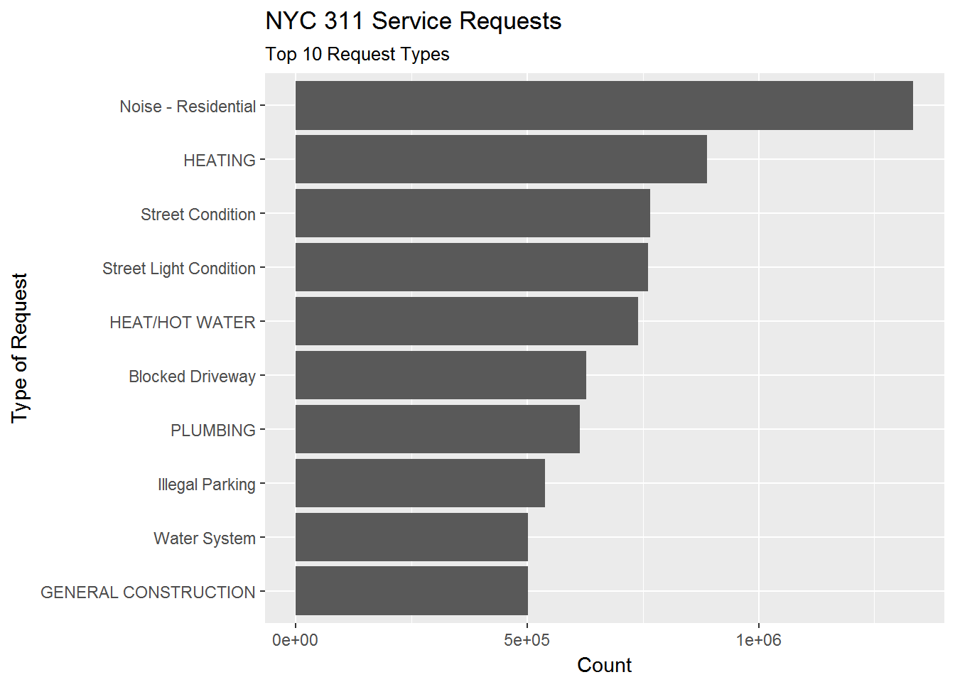
For anyone who has spent any time in New York, the top complaint shouldn’t be a surprise.
Notice the structure of the dplyr chain above. It looks like a regular dplyr chain except for two important things. First, the initial line is not an input-data frame (like it usually is in dplyr) but instead a connection to a cloud database. Second, notice the “as.data.frame()” command in the 5th line. This is important in understanding how bigrquery works and also highlights the huge advantage of it: The first 4 lines takes place in the cloud! We are never importing the raw data locally. We are only importing the result of the query - which happens at the end when we specify the want the result as a data.frame. At that point the result of the query shows up as a data.frame in our local R workspace and we can then visualize it. Magical.
Ok - let’s get back to Pizza Rat. We can do this by specifying that we want complaints of the type “Rodent”. What are the sub-descriptions of “Rodent” complaints?
# Make query ---------------------------
rodent_count <- req311 %>%
filter(complaint_type == 'Rodent') %>%
group_by(descriptor) %>%
summarize(n = n()) %>%
as.data.frame()
# Plot query ---------------------------
rodent_count %>%
ggplot(aes(x = fct_reorder(descriptor,n),y = n)) +
geom_bar(stat = 'identity') +
coord_flip() +
labs(title = 'NYC 311 Service Requests for Rodents',
subtitle = 'Count of Descriptors of Requests',
y = 'Count',
x = 'Description of Request')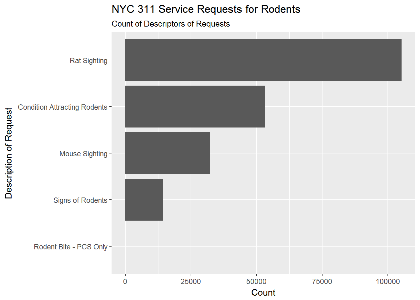
The main description of “Rodent” complaints are “Rat Sighting” (thankfully, “Rodent Bite” is quite small). To see how complaints have changed in the time period of the data, we can plot total Rodent complaints by month and year:
# Make query ---------------------------
rodent_count <- req311 %>%
filter(complaint_type == 'Rodent') %>%
mutate(year = year(created_date),
month = month(created_date)) %>%
group_by(year,month) %>%
summarize(n = n()) %>%
as.data.frame()
# Plot query ---------------------------
rodent_count %>%
ggplot(aes(x = factor(month),y = n,group = year)) +
geom_line() +
facet_wrap(~year,nrow = 1)+
labs(title = 'NYC 311 Service Requests for Rodents',
subtitle = 'Total Counts by Year/Month',
y = 'Count',
x = 'Month')+
theme(axis.text.x = element_text(angle = 90, hjust = 1))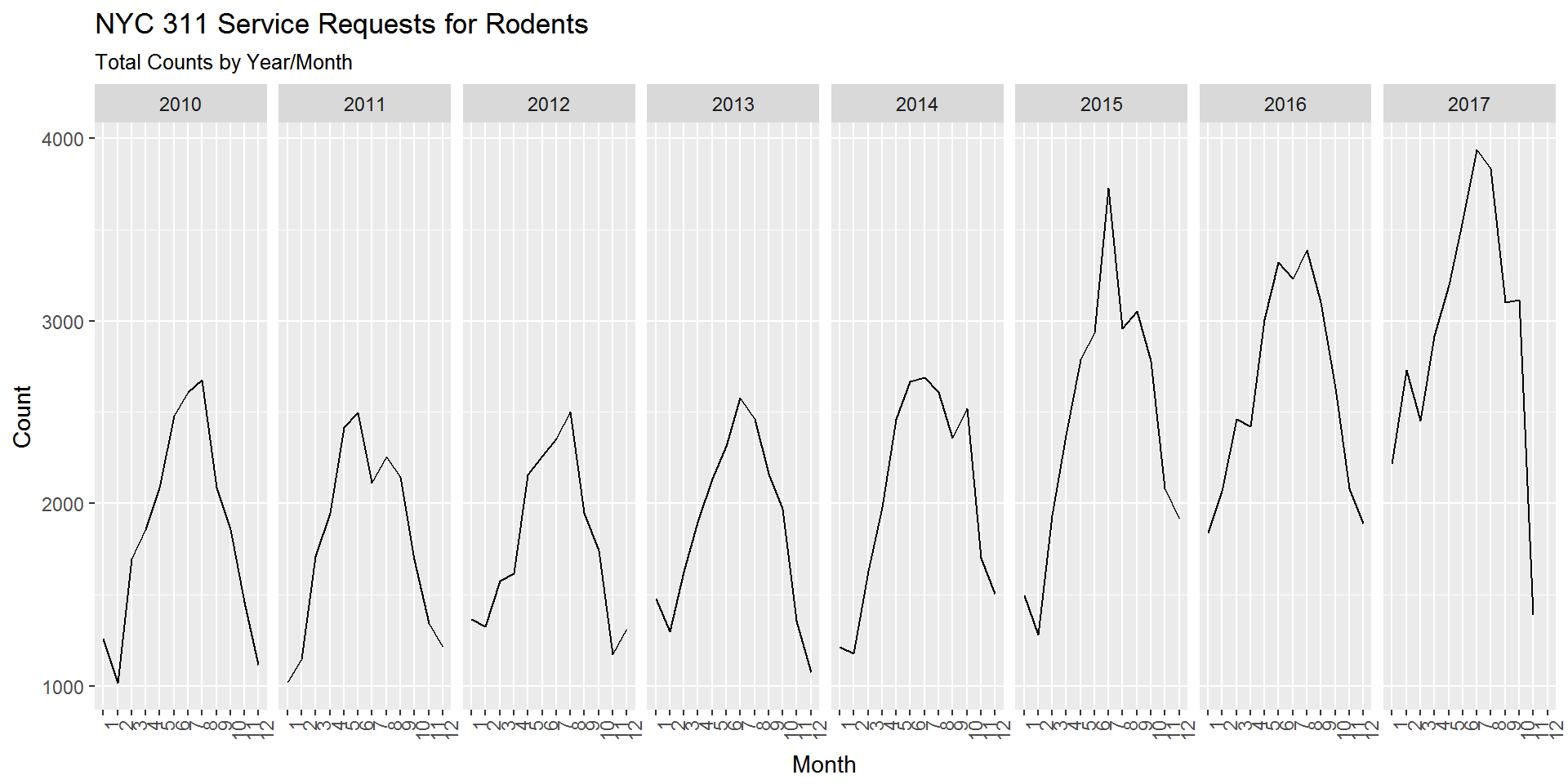
Interesting. There’s a clear seasonality to rodent complaints with reported complaints being much higher during the summer. There also seems to be an upward trend with the last 2 1/2 years being higher. Also what kind of rodent lollapalooza took place in July 2015?
To see where Pizza Rat and his friends are likely to hang out, we can use the fact the complaints are geotagged with longitude and latitude. There are many ways to visualize geospatial data. Let’s do something simple: Plot rat sightings by zip code.
## OGR data source with driver: ESRI Shapefile
## Source: "C:\Users\k4hansen\AppData\Local\Temp\RtmpCoQKx1", layer: "ZIP_CODE_040114"
## with 263 features
## It has 12 fields# get rat sightings by year and zip code
rat_sighting_year_zip <- req311 %>%
filter(descriptor =='Rat Sighting') %>%
mutate(year = year(created_date),
month = month(created_date)) %>%
group_by(year,incident_zip) %>%
summarize(n = n()) %>%
as.data.frame()
# get zip code boundaries for new york as a shape file
temp <- tempfile()
download.file("https://data.cityofnewyork.us/download/i8iw-xf4u/application%2Fzip",
temp, mode="wb")
unzip(temp, exdir=tempdir())
ny.area <- readOGR(tempdir(), 'ZIP_CODE_040114', encoding='UTF-8')
shp <- spTransform(ny.area, CRS("+proj=longlat +datum=WGS84"))We can then construct the choropleth using the Leaflet package. This code gets a little long so it has been suppressed below (if you want to see it just click on the “Show Source” text).
shp2013 <- spTransform(ny.area, CRS("+proj=longlat +datum=WGS84"))
shp2014 <- shp2013
shp2015 <- shp2013
shp2016 <- shp2013
shp2013@data <- left_join(shp2013@data,filter(rat_sighting_year_zip,year==2013),by=c('ZIPCODE'='incident_zip'))
shp2014@data <- left_join(shp2014@data,filter(rat_sighting_year_zip,year==2014),by=c('ZIPCODE'='incident_zip'))
shp2015@data <- left_join(shp2015@data,filter(rat_sighting_year_zip,year==2015),by=c('ZIPCODE'='incident_zip'))
shp2016@data <- left_join(shp2016@data,filter(rat_sighting_year_zip,year==2016),by=c('ZIPCODE'='incident_zip'))
bins <- c(0, 20, 50, 100, 200,300, 400,500,1000)
pal <- colorBin("viridis", domain = shp2013@data$n, bins = bins)
labels2013 <- sprintf(
"<strong>Zip: %s</strong><br/>Count=%g",
shp2013@data$ZIPCODE, shp2013@data$n
) %>% lapply(htmltools::HTML)
labels2014 <- sprintf(
"<strong>Zip: %s</strong><br/>Count=%g",
shp2014@data$ZIPCODE, shp2014@data$n
) %>% lapply(htmltools::HTML)
labels2015 <- sprintf(
"<strong>Zip: %s</strong><br/>Count=%g",
shp2015@data$ZIPCODE, shp2015@data$n
) %>% lapply(htmltools::HTML)
labels2016 <- sprintf(
"<strong>Zip: %s</strong><br/>Count=%g",
shp2016@data$ZIPCODE, shp2016@data$n
) %>% lapply(htmltools::HTML)
leaflet(shp2013) %>%
addTiles() %>%
setView(lat=40.700946, lng=-73.954612,zoom = 11) %>%
addProviderTiles(providers$CartoDB.Positron) %>%
addPolygons(data=shp2013,
weight=1,
fillColor = ~pal(n),
fillOpacity = 0.6,
group="2013",
highlight = highlightOptions(
weight = 3,
dashArray = "",
fillOpacity = 0.9,
bringToFront = TRUE),
label=~labels2013) %>%
addPolygons(data=shp2014,
weight=1,
fillColor = ~pal(n),
fillOpacity = 0.6,
group="2014",
highlight = highlightOptions(
weight = 3,
dashArray = "",
fillOpacity = 0.9,
bringToFront = TRUE),
label=~labels2014) %>%
addPolygons(data=shp2015,
weight=1,
fillColor = ~pal(n),
fillOpacity = 0.6,
group="2015",
highlight = highlightOptions(
weight = 3,
dashArray = "",
fillOpacity = 0.9,
bringToFront = TRUE),
label=~labels2015) %>%
addPolygons(data=shp2016,
weight=1,
fillColor = ~pal(n),
fillOpacity = 0.6,
group="2016",
highlight = highlightOptions(
weight = 3,
dashArray = "",
fillOpacity = 0.9,
bringToFront = TRUE),
label=~labels2016) %>%
addLegend(pal = pal,
values = ~n,
opacity = 0.6,
title = "Rat Sightings",
position = "bottomright") %>%
addLayersControl(
baseGroups = c("2013", "2014","2015","2016"),
options = layersControlOptions(collapsed = FALSE)
)