Results
In the following we visualize the estimated effects for Model 1 and 2. Recall that in Model 2 we add health and employment status effects to the specification.
Age
Age Effects by Race and Gender
We start by showing the age effects on satisfaction for each race and gender combination. First, we define what we mean by an “age effect”. We consider the effect of changing age groups on the probability of being Very Satisified for a given race and gender combination, while fixing all other effects at their mean. For example, we can calculate the effect of belonging to the first age group for white females as \[ \Delta^\mbox{wf}(\mbox{age}_1) = \Phi\left( \mu + \beta^\mbox{female} + \beta_1^\mbox{age} + \beta_1^\mbox{female,age} \right) - \Phi\left(\mu + \beta^\mbox{female} \right) \] This is the change in probability of being Very Satisified (in percentange points) when comparing a white female in the youngest age category to a white female with an “average” age effect (where we are calculating the change for a white female in the average county, average income etc.). This effect will be positive if young white females are more satisied than the average aged white female (holding all other factors fixed at their mean) and negative otherwise.
The estimated effects are shown below.
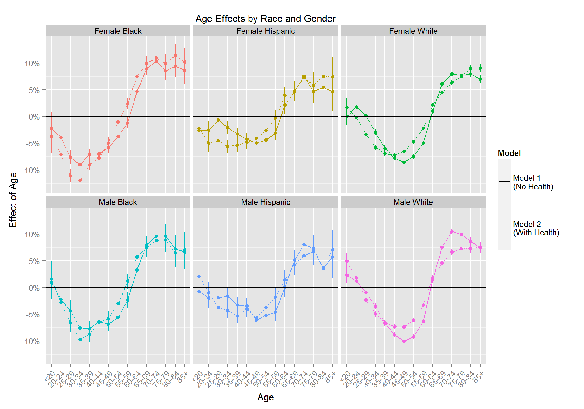
All race and gender combinations exhibit a similar “U”-shaped pattern: Satisfaction declines starting in young adulthood, bottoming out the mid-life years (or even slightly earlier), then steadily increases until individuals reach early 70s after which the satisfaction probability levels out. Black respondents seem to reach their bottom 10 years earlier than Hispanic and White respondents. Furthermore, Hispanic respondents seem to have a smaller “amplitude” from bottom to peak compared to White and Black respondents. Controlling for Health (and Employment and Marital Status) doesn’t change the overall pattern. It does tend the lower satisfaction for young respondents compared to the estimates without Health.
Age Effects by Income
The age effects shown above for race and gender were computed holding income fixed at the average income level. Next we show the effects of aging on satisfaction for low income, middle income and high income respondents.
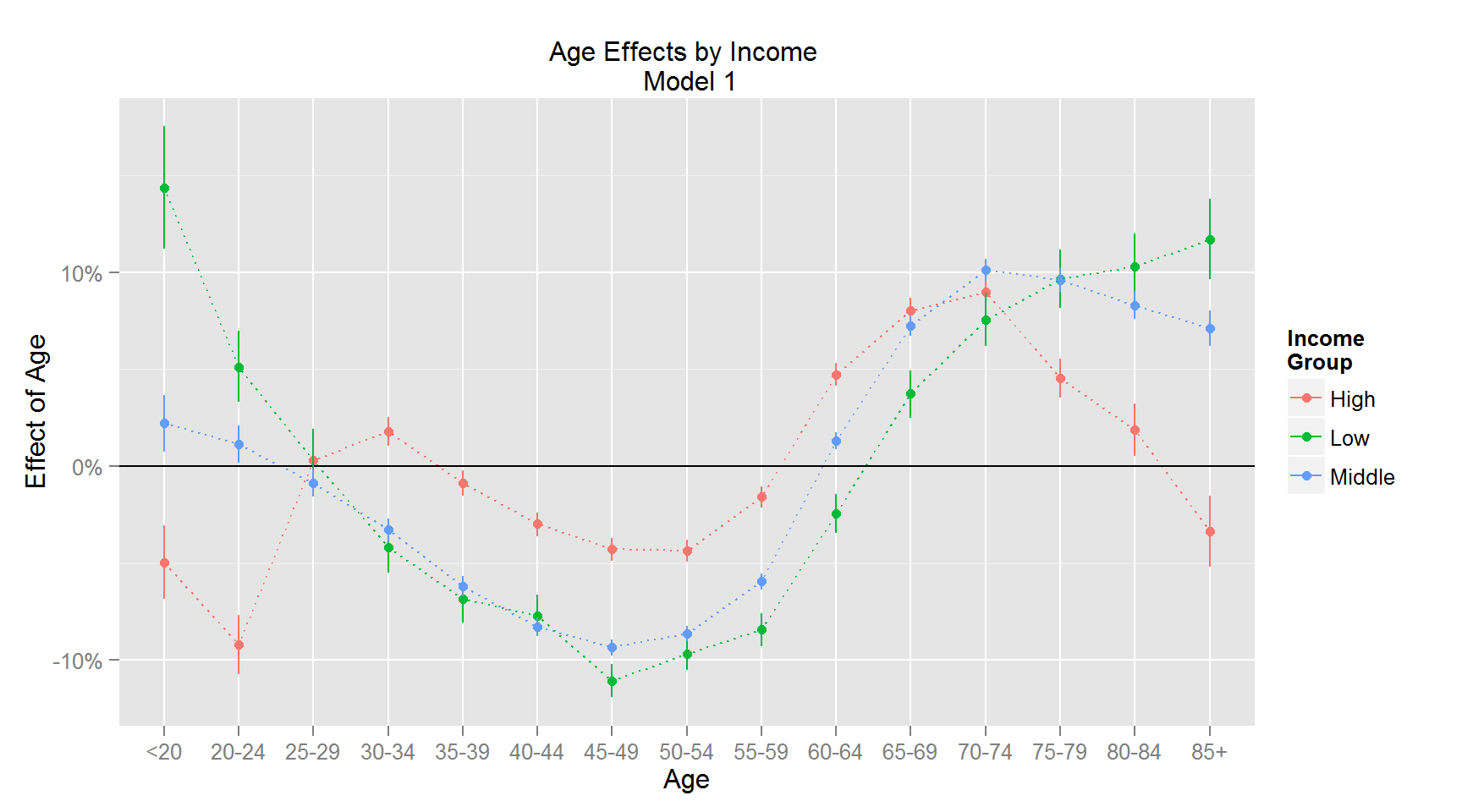
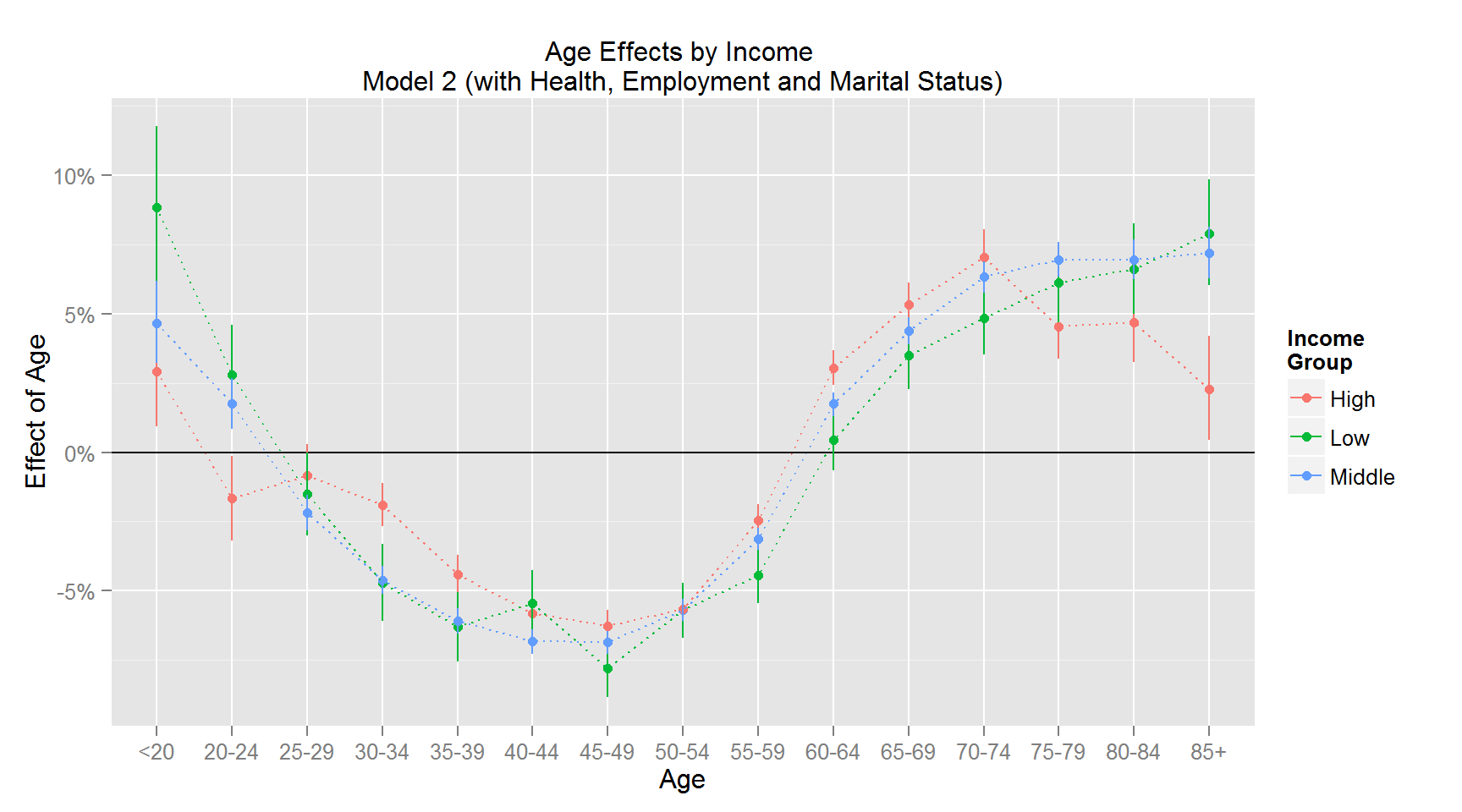
These patterns are striking: While low and middle income respondents largely have similar age effects, high income respondents are different. For the Model 1 results we that the rich enjoy a much smaller mid-life dip than other income groups, but - on the other hand - undergo a severe drop in satisfaction late in life. In other words, rich respondents are less affected by age during their mid-life than other income groups but more affected by age late in life than other income groups. When controlling for health, all income groups appear similar until late in life where the rich still suffer a drop in satisfaction. To further illustrate this we can plot the effects of moving from young age to mid-life, mid-life to old age and old age to very old age for each of the three income groups:
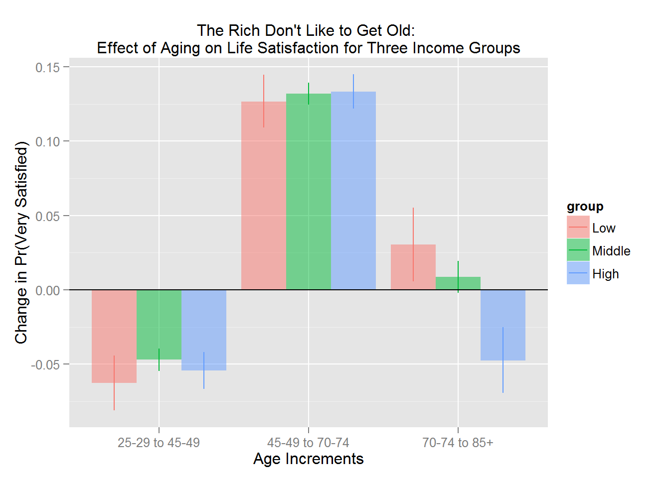
Note: Effects shown for Model 2.
Age increases from young to mid-life and mid-life to old age have similar effects for all income groups, but increases from old age to very old age impacts the high income segment’s satisfaction much more dramatically than middle and low income respondents.
Income
The following figure shows income effects for each race and gender combination:
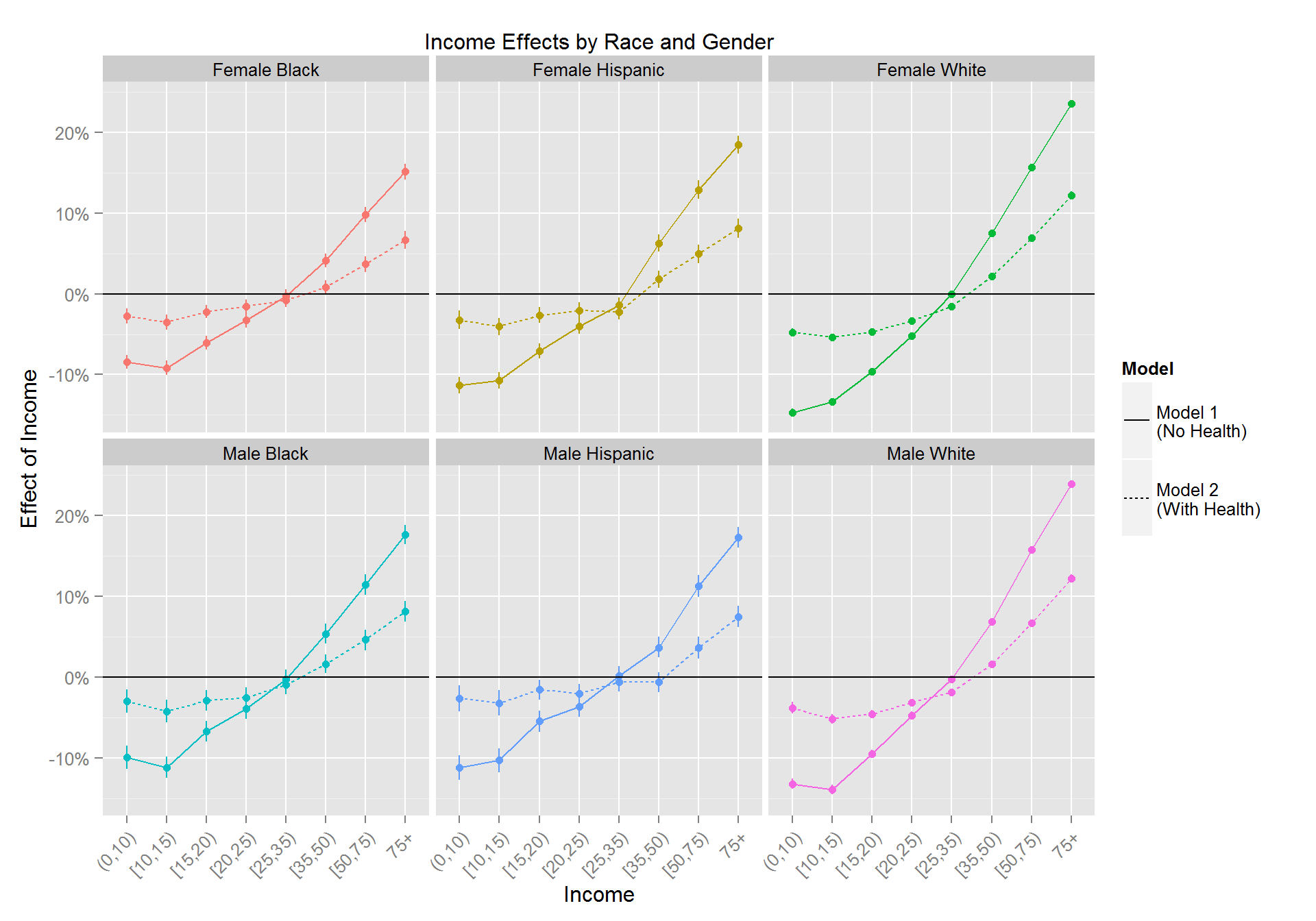
There are three striking facts about these effects:
- The income effects are smaller when health status is included in the model. In other words, part of the large income effects on satisfaction seen in Model 1 are due to health effects.
- The effects of income on satisfaction are large and monotonically increasing for all race and gender groups.
- The income effects are smaller for minority groups than for white respondents.
We illustrate points 1 and 3 in the figure below where we show the overall effect of income (high income minus low income) for each race and gender group:
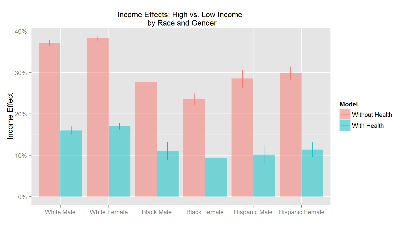
Controlling for health, employment and marital status cuts the high vs. low income effects by almost two-thirds.half. However, even when health is included the income effects are large. For example, the probability of reporting “Very Satisfied” for white high income respondents is 15 percentage points higher than for white low income respondents. The figure clearly also shows the lower sensitivity to income for the minority groups. For example, the effect for black female respondents is half that of white females.
Health
The next results are for variables only included in Model 2. First, health effects:
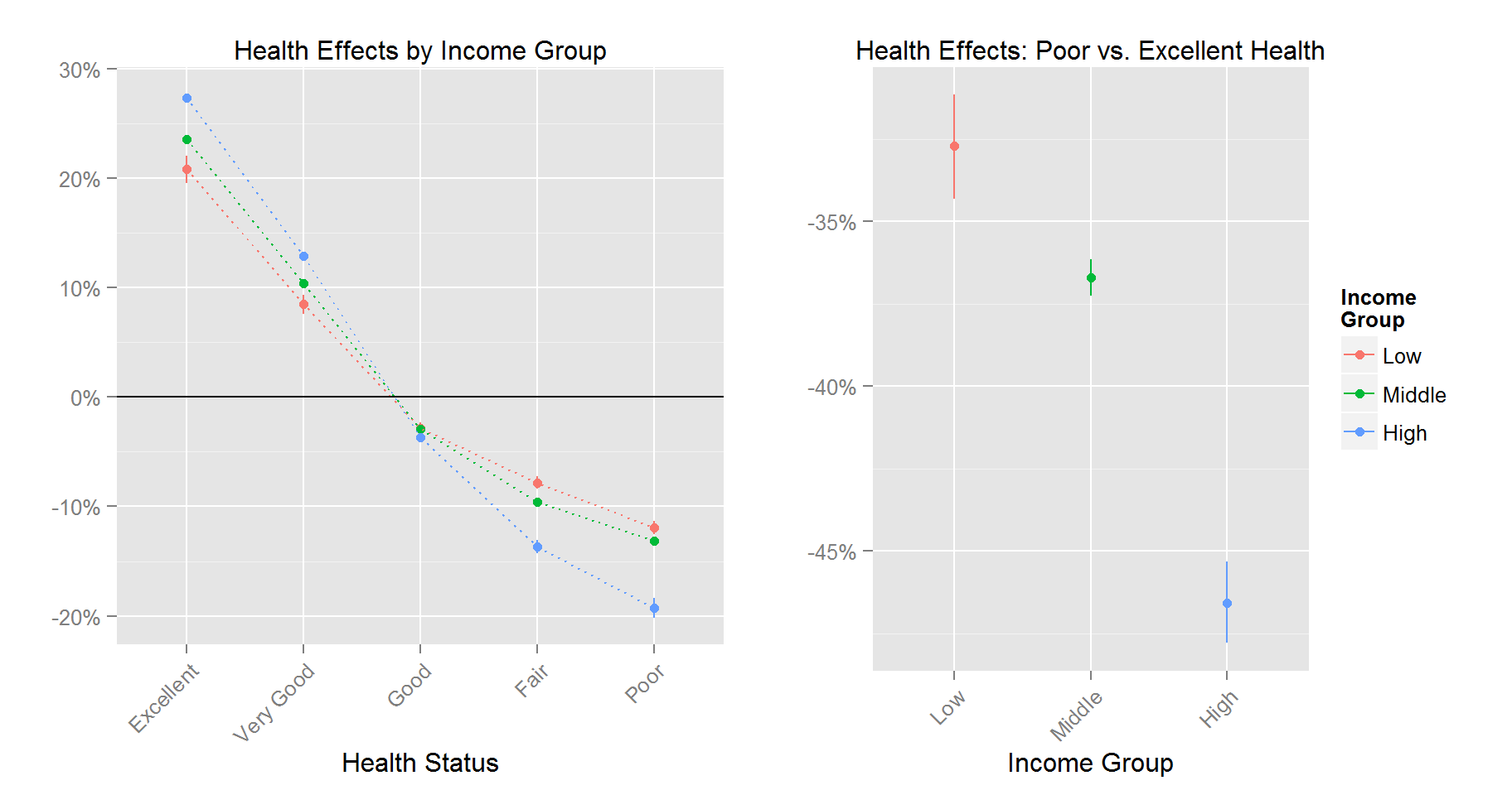
The effects of health status on satisfaction are large. Compared to people of average health status, healthy individuals’ satisfaction probability is over 20 percentage points bigger. The overall range of the effect, i.e., the difference in satisfaction between lowest and highest health status measure ranges between over 30 to over 45 percentage points. It is evident from the results that high income respondents are much more sensitive to negative health outcomes than low income respondents. We saw above that the rich didn’t like to get old. Here we see that they also have a stronger adverse reaction to getting sick compared to lower income groups.
Employment Status
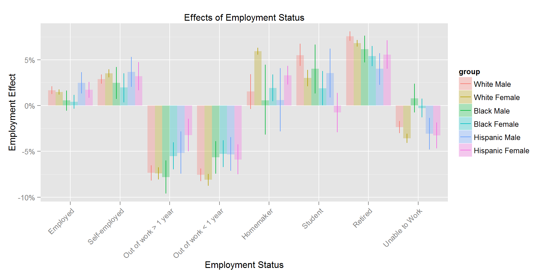
Not suprisingly we find that out of work respondents are less satisfied than the average respondent. The effect is bigger for white respondents. Retired respondents are more satisfied - again the effect is larger for white respondents. White and Hispanic respondents are less happy when unable to work.
Marital Status
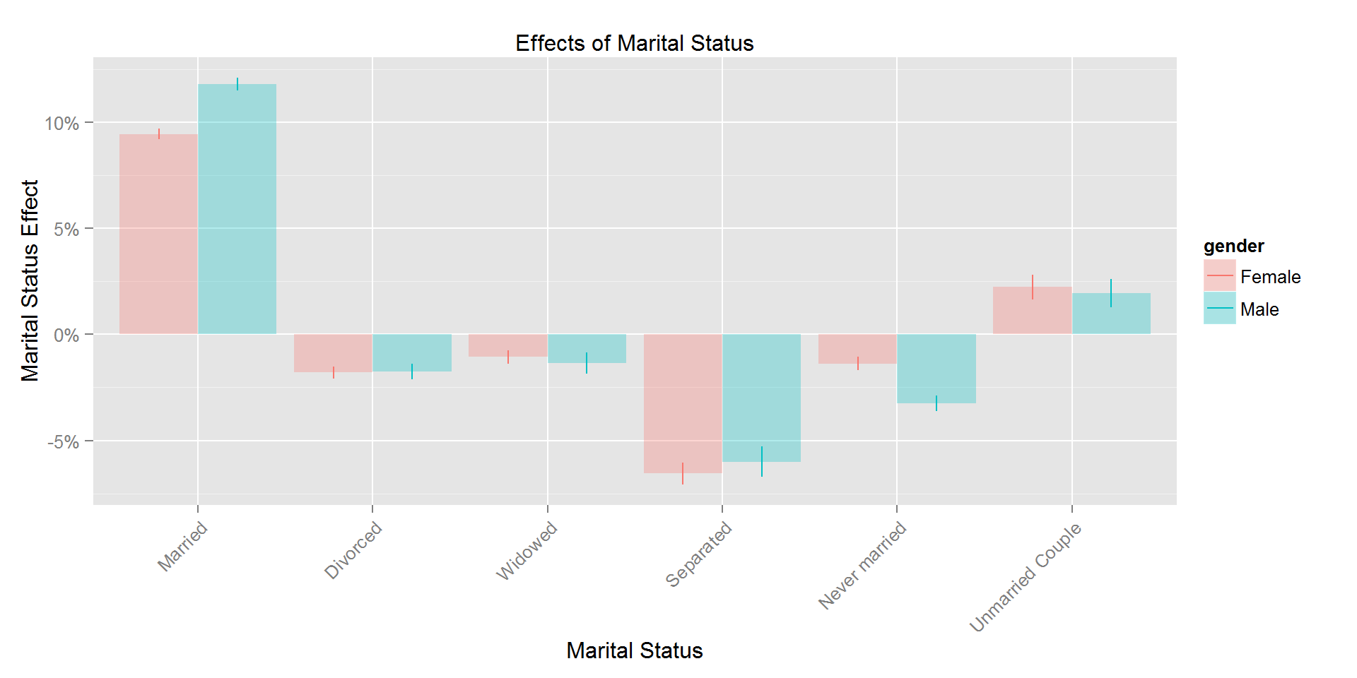
We find large positive effects of being married and negative effects for separated respondents. The remaining marital status categories have small effects.
County Effects
County Socio-economic and ideological characteristics
Next we turn to county effects. First, we show the effect of county characteristics.
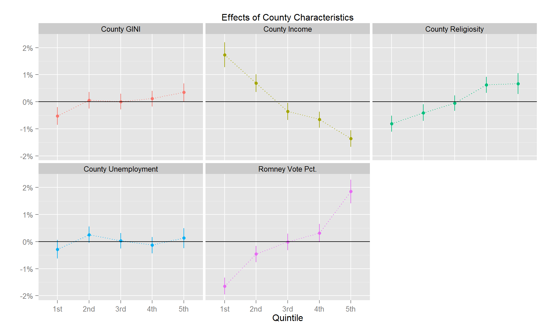
Overall, these are small effects and are completely dominated by the characteristics of individual respondents. Nevertheless, we see a small negative effect of county level income. Note that this is opposite than what we found for individual level income which had a strong positive effect. We also see a small positive effect of county religiosity with respondents in more religious counties being more satisfied (the effects size is less than two percentage points comparing the 20% least religious counties to the 20% most religious counties). Finally, we see a positive effect of conservative/republican ideology with the most convervative counties having satisfaction ratios about 4 percentage points higher than the least converative counties.
County Racial Make-up
Does the racial mix of a county matter for reported life satisfaction of respondents? The figure below shows that the answer to this depends on the race of the individual respondent:
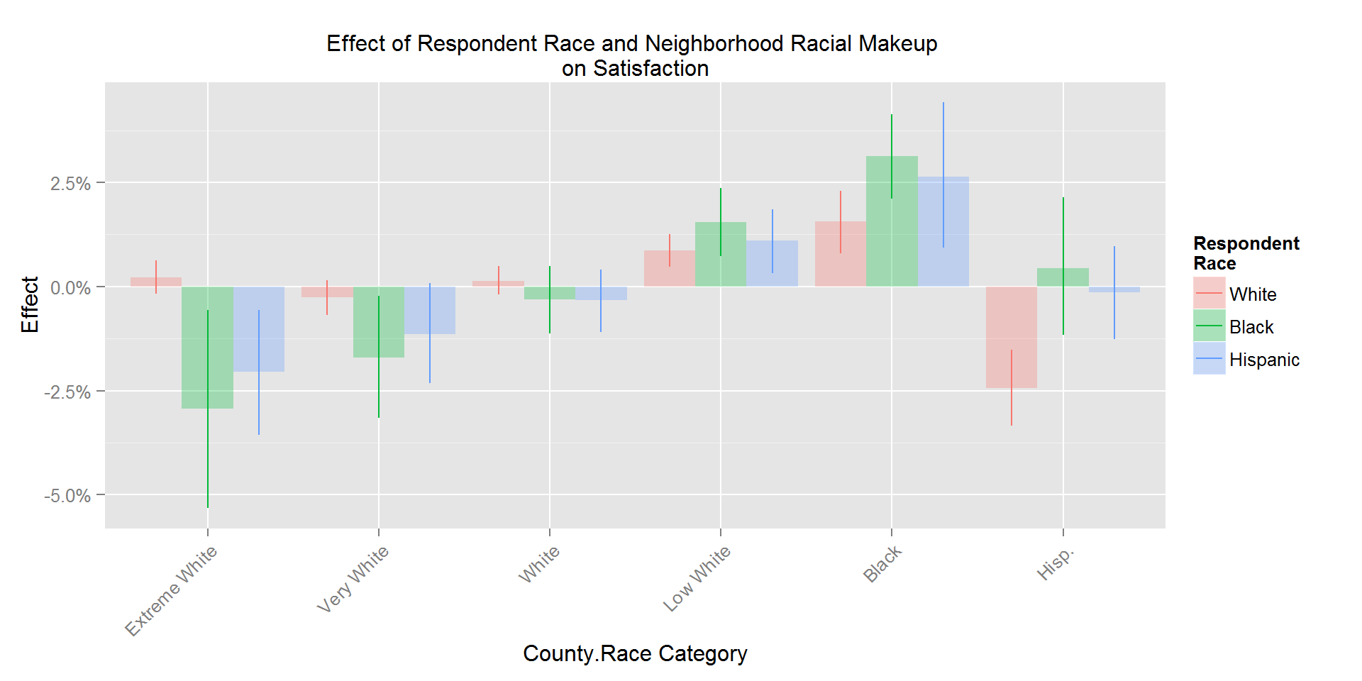
The figure shows that the life satisfaction of minority groups depends on the relative size of the majority group. For example, satisfaction for black respondents is increasing monotonically as the size of the white county population decreases and is highest for counites with a large black population. A similar pattern is seen for hispanic respondents although we don’t see a large positive effect in hispanic counties. Interestingly, white respondents are less satisfied in hispanic counties. While these patters are interesting, they are small compared to the effects of individual characteristics shown above.
County Baseline Satisfaction
We can think of the county parameters \(\theta\) as a measure of latent baseline county satisfaction: When all other measured factors (at least the ones we have included in the analysis) are accounted for, how much residual variation is there in county level life satisfaction? To get a sense of this we can simply calculate \[ \Delta(c) = \Phi\left( \mu + \theta_c \right) - \Phi\left(\mu \right), \] for each county parameter \(\theta_c\). This is the difference in life satisfaction between the average respondent in county \(c\) and the average respondent overall. The figure below shows these estimates along with 95% probability intervals. Actual estimates can be downloaded here.
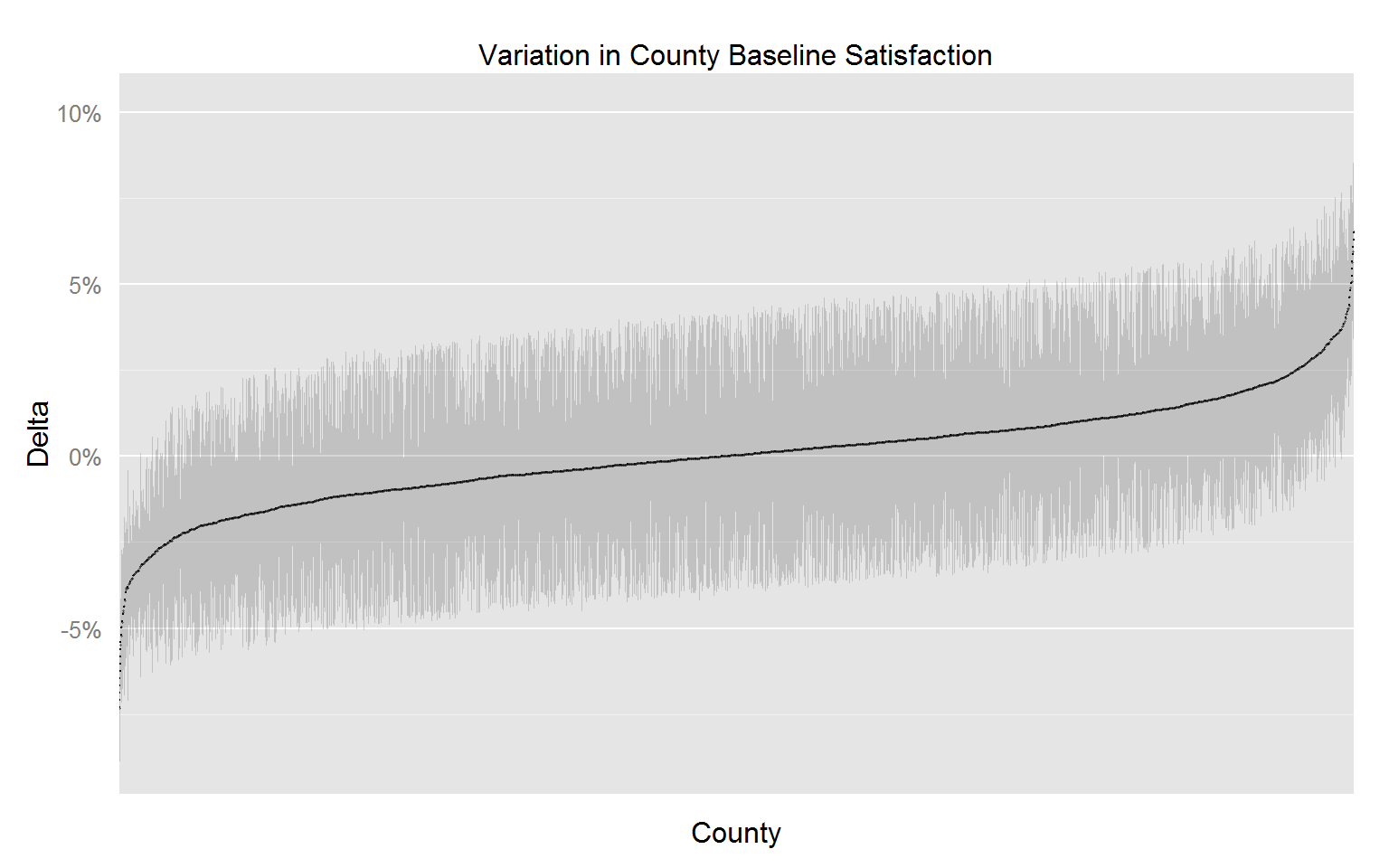
For most counties this residual variation is quite small. However there is a group of counties with substantial below or above average satisfaction. The figure below plots the location of these counties:
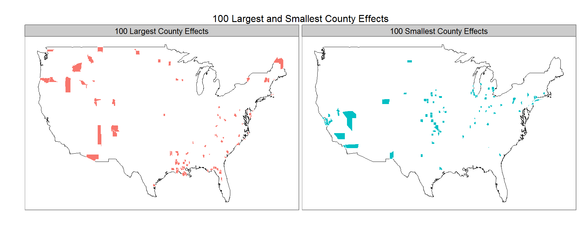
It is quite interesting to compare this plot to the plot of the raw satisfaction rates in the data section.